 Minor League Baseball Logo PNG
The Minor League Baseball logo is a powerful visual element that reflects the excitement and unpredictability of the sport. It reflects the organization’s core values of teamwork, competition, and community involvement. The emblem successfully combines elements that meet the interests of the target audience – those who appreciate the courage and spirit of the underdog in Little League. The emblem builds brand awareness, aids marketing efforts, and plays an important role in merchandise sales.
Minor League Baseball: Brand Overview
Established in 1901, the National Association of Professional Baseball Leagues took on the task of organizing and improving baseball leagues. In the 20th century, major league organizations began partnering with minor league teams to nurture aspiring athletes. In the 1930s, Branch Rickey of the St. Louis Cardinals became a leader in the formation of the modern farm system. He was instrumental in bringing in a large amount of new talent to fill out the major league roster, setting a trend that other organizations soon began to follow.
The 1940s and 1950s were the peak of minor league glory, with more than 400 teams from various leagues in countries such as the United States, Canada, Cuba, and Mexico. In 1949, a record attendance of 39 million was recorded. However, the following years saw a decline in the popularity of the lower leagues. The growth of national broadcasts of MLB games, as well as its expansion, made minor league stadiums less attractive to fans. By the early 1980s, they had dwindled to about 100 teams in 17 leagues, which were primarily used by the major leagues to cultivate talent.
A resurgence of interest in minor leagues was seen in the late 20th century. With the sharp rise in ticket prices for MLB games, emphasis began to be placed on building new stadiums and organizing cost-effective family events. The MiLB has about 160 teams in 11 MLB-affiliated leagues. The minor leagues, which draw more than 40 million viewers per year, continue to play a key role in molding and developing future MLB stars.
Meaning and History
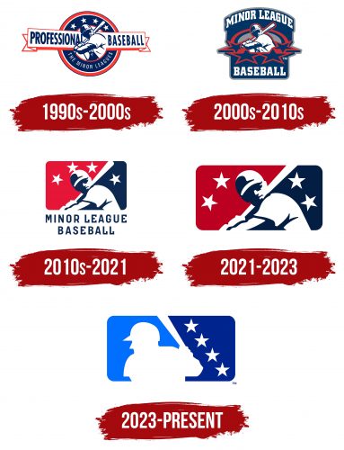
1990s – 2000s
2000s – 2010s
2010s – 2021
2021 – 2023
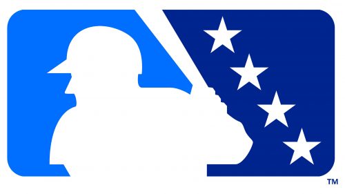
2023 – today
The base of the Minor League Baseball logo is a horizontal rectangle with rounded corners. The inside is divided by color into two unequal halves: dark blue on the right and light blue on the left. Between them, in the negative space, there is a figure of a man ready to hit a flying ball. The athlete’s face is turned to the left; he is holding a bat. On the head can be seen the silhouette of a cap with a long brim. The dark side of the emblem depicts four five-pointed stars located diagonally. The upper star is located closer to the center, and the lower star – in the corner.
The use of stars gives the emblem an element of national pride or aspiration associated with athletic achievement. The contrasting shades of blue give visual depth by highlighting the human figure, thus emphasizing the athleticism and competitiveness inherent in the sport. The diagonal arrangement of the stars adds dynamism to the entire design.
