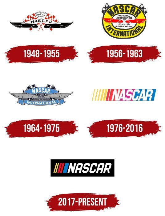
The NASCAR logo demonstrates driving on different types of roads that differ in size and complexity. Alludes to bright and fast cars competing on race tracks. There is a lot of risk, movement, and sharp and sharp turns in the sign.
NASCAR: Brand overview
| Founded: | February 21, 1948 |
| Founder: | Bill France |
| Headquarters: | Daytona Beach, Florida, U.S. |
| Website: | nascar.com |
Meaning and History
The origins of NASCAR go back to the time of Prohibition in the United States and are associated with the distribution of rum or bootlegging – the smuggling of alcohol with its transportation by car. And to do it quickly and evade pursuit, bootleggers used lightweight cars that developed a meteoric speed. At the same time, drivers are constantly improving their cars to go as fast as possible. They modified them to improve speed and handling.
But after the repeal of Prohibition, this business did not disappear: bootlegging began to develop even more actively, as the state imposed a huge tax on the production of alcoholic beverages. Therefore, smuggling flourished, and the improvement of automobiles continued. Towards the end of the 40s of the last century, races involving lightweight and reinforced streetcars were held for-profit and glamor. They were especially popular in the southern region of the United States, particularly in Wilkes County, North Carolina.
In 1935, William France Sr., a mechanic, moved from Washington to Daytona Beach to escape the Great Depression. He was well aware of the history of his new residence with attempts to set a land speed record. And he took over the organization of the races, running several large-scale races before the outbreak of World War II.
In 1936, he took part in the races, seeing in them a huge business perspective. William France was confident that the competition in production cars would appeal to the audience. In 1947, he initiated negotiations with influential racers and promoters. They took place at the Streamline Hotel – in the Ebony Bar. As a result, in 1948, the NASCAR organization appeared with a standing charter, rules, and an emblem. Over the years of its existence, it has changed four logos and is using the fifth one now.
What is NASCAR?
NASCAR is an abbreviation for the National Association for Stock Car Auto Racing. It is a company that provides official authorization for car races manages competitions, and ensures they meet international safety standards. NASCAR is based in Florida, United States, and belongs to the Automobile Competition Committee for the United States sports federation.
1948 – 1955
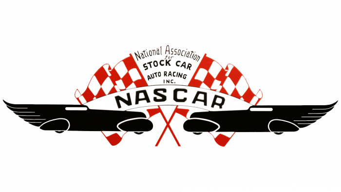
The debut version of the identity contained two elongated cars aimed at each other. They were positioned almost head to head, demonstrating the competitive nature of the event. Each of them was placed against the background of the racing start flag. Their shafts were crossed, and their panels were full of traditional red and white checkerboard squares.
An arched white stripe connected the cars with black “NASCAR” lettering in strict geometric capital letters. The “S” and “C” had all roundings removed, and instead had short, straight lines resembling slices. Above there was another inscription – the company’s full name “Association for Stock Car Auto Racing Inc.”. It occupied five rows and was located in the center. Each line was executed in a separate font.
1956 – 1963
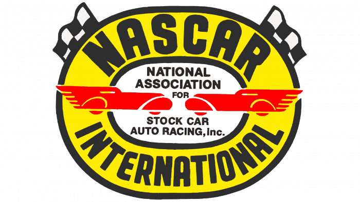
The emblem of those years consisted of the same cars as in the previous logo, but not in black, but in red. They were directed at each other, with long strokes stretching from the opposite side, which added dynamics. The background for the racing cars was a yellow oval with a white center. In the center was the full name of the organization in four lines. The designers unified the typeface by using a sleek sans serif for the lettering.
Further, there was a wide yellow stripe with black edging along the inner and outer edges. It read NASCAR (above) and INTERNATIONAL (below) in large characters. The finishing touch was two signal flags peeking out from behind the oval. They were black and white.
1964 – 1975
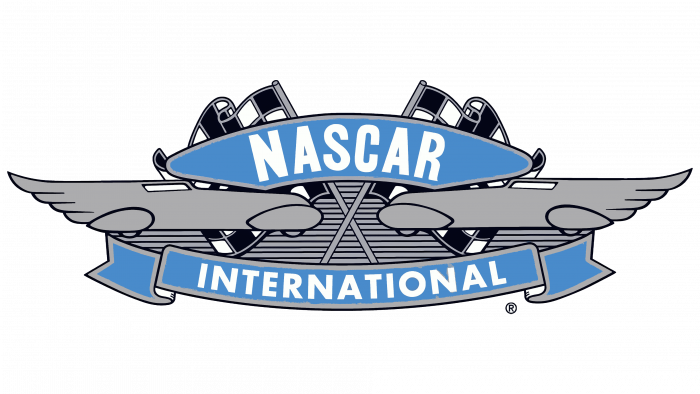
To modernize the logo, the developers completely changed its style, returning the debut version. But they made it not as bright as before, using gray and blue tones. The central elements were two racing cars, which “drove” towards each other, and two signal flags behind them. The top inscription connecting the cars was also the same. But the developers added the lower part: “INTERNATIONAL” was written on the long tape with double ends.
1976 – 2016
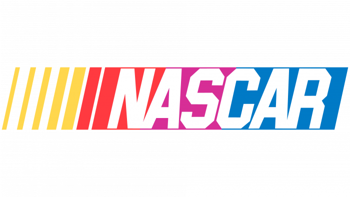
As the world of sports cars has grown and their range has grown, the management decided to redesign the logo to achieve its versatility. For this, the developers turned to a neutral design. They radically changed the content of the emblem, using the shape of a rectangle. The geometric figure was horizontal, elongated, with a slight diagonal shift. It consisted of an inscription (on the right) and stripes of different widths of the same height (on the left).
The authors removed the cars and all other paraphernalia of the races, leaving the only word – “NASCAR.” The style was chosen as the debut emblem: with curly cuts along the edges “S” and “C.” They made them for the letter “R” too. The white text was placed on a rainbow background, including blue, purple, red, and yellow.
2017 – today
The designers removed the background rectangle, painted the lettering black, separated the “NA” and “AR,” and also shifted the color to diagonal stripes. The letters are now all the same style – with smooth cuts at the corners.
NASCAR: Interesting Facts
NASCAR, started by Bill France Sr. in 1948, is a major auto-racing organization in the U.S. It’s known for thrilling races and a dedicated fan base.
- Purpose: Created to organize and promote stock car racing, where everyday cars are modified for racing, making the sport safer and more structured.
- First Race: The inaugural race was on February 15, 1948, in Daytona Beach, Florida, and Red Byron won it in a 1939 Ford.
- Racing Series: NASCAR runs three main series: the Cup Series, Xfinity Series, and Camping World Truck Series, with the Cup Series being the top level.
- Famous Tracks: Races take place on various tracks, including the Daytona International Speedway and Talladega Superspeedway, which are known for their history and excitement.
- Daytona 500: This event, started in 1959, is NASCAR’s most prestigious race, often called “The Great American Race.”
- Safety Measures: NASCAR has led in safety, introducing the HANS device, SAFER barriers, and the Car of Tomorrow with advanced safety features.
- Diversity: Efforts to diversify the sport include the Drive for Diversity program, supporting minority and female participants.
- Environment: Initiatives like NASCAR Green aim for sustainability, with tree planting, recycling, and biofuel blend Sunoco Green E15.
- Fan Culture: NASCAR fans are loyal, often spending weekends camping and tailgating at events, creating a vibrant community atmosphere.
- International Reach: Though mainly U.S.-based, NASCAR has held races abroad and started international series to grow its global audience.
NASCAR’s blend of speed, competition, and constant evolution keeps it at the forefront of motorsports, drawing millions of fans worldwide.
Font and Colors
The evolution of the logo has moved from complex components to simple ones. Whereas in earlier versions, graphic details were key, now it is text. At the same time, the racing theme remained, as did the presence of dynamics. They are conveyed by elongated lines, elongated letters, and a slight slope to the right.
The logo uses a custom Nascar Font. Its closest free counterparts are Hauser and ITC Machine.
The branded palette includes blue, red, yellow, black. Previously, the logo also featured purple and gray.
NASCAR color codes
| Medium Candy Apple Red | Hex color: | #e4002b |
|---|---|---|
| RGB: | 228 0 43 | |
| CMYK: | 0 100 81 11 | |
| Pantone: | PMS Bright Red C |
| Star Command Blue | Hex color: | #007ac2 |
|---|---|---|
| RGB: | 0 122 194 | |
| CMYK: | 100 37 0 24 | |
| Pantone: | PMS 3005 C |
| Medium Yellow | Hex color: | #ffd659 |
|---|---|---|
| RGB: | 255 214 89 | |
| CMYK: | 0 16 65 0 | |
| Pantone: | PMS 122 C |
| Black | Hex color: | #000000 |
|---|---|---|
| RGB: | 0 0 0 | |
| CMYK: | 0 0 0 100 | |
| Pantone: | PMS Process Black C |

