


![]() MLB Logo PNG
MLB Logo PNG
The MLB logo (Major League Baseball) conveys the essence of the famous American organization. The logo’s images, made in the official colors of the oldest league, embody sporting excitement, a desire to win, and professional precision.
MLB (Major League Baseball) is a sports organization in the United States that unites professional baseball players. It is the oldest league, founded in 1903. It now includes 29 American teams and 1 Canadian team, divided into groups. They represent the NL (National League, formed in 1876) and the AL (American League, formed in 1901). Although these two leagues have cooperated since 1903, they have remained legally separate and have had different structures. Their final and official unification into a single organization occurred in 2000. The Commissioner of Baseball leads it. The main office is located in New York, in the center of Manhattan.
In the 1860s, soldiers stationed in camps played baseball during the Civil War. The game gradually captured the interest of many and became a social game. As a result, a governing organization appeared: the NABBP (National Association of Base Ball Players). It was an amateur league that lasted 12 years. In 1867, there were 400 clubs in it.
In 1869, a professional structure emerged in MLB, the first to include athletes from the Cincinnati Red Stockings. After that, a split arose between professionals and amateurs. However, time has shown that amateur teams do not justify themselves by their low level of play and the frequent transfer of successful players (for money). As a result of this friction, the NL (National League) was founded, emphasizing club-based competition.
Following the rivalry and dissatisfaction among athletes, the American League (AL) was established in 1901. Then, an open confrontation broke out between her and the NL, which lasted for many years until a proposal to establish a common organization with a shared charter, emblem, leadership, and game schedule was made.
Meaning and History
![]()
The MLB emblem was commissioned by Bowie Kuhn and adopted to mark the 100th anniversary of Major League Baseball. The new commissioner approved it at a summer 1969 event in Washington. According to some reports, the iconic silhouette on the logo was modeled on footage of several prominent players. According to other sources, it is based on an image of Harmon Killebrew, a Hall of Fame baseball player. Despite the controversy, the symbol was created in a single day. It is presented in a one-piece silhouette. It does not indicate the batter’s nationality or dominant hand. An athlete can be anyone who hits with both hands. This effect was achieved thanks to the angle from the back.
What is MLB?
It is an abbreviation of the full name of the professional sports organization, Major League Baseball, which was created in 1903. There are 30 teams from the United States of America and Canada participating in MLB. They are split between the American League and the National League, each with three divisions.
the 1950s – 1969
The emblem of those years depicts a baseball player in action. He is depicted in the course of hitting the throw, as evidenced by the bat extended in the swing and the position of the arms and legs wide apart. The athlete is on a combined background: the left half of the backboard is red, and the right half is blue. This division refers to the two leagues that make up MLB and the colors of the U.S. national flag. The abbreviation is set in large type and occupies almost the entire upper space; only the sports organization’s full name is set in small, chopped type. The lower inscription, on the other hand, is supplemented with massive serifs.
1969 – 1991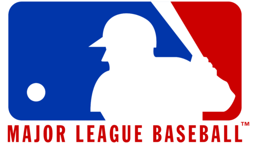
Color immediately catches the eye in the updated logo. Red and blue became brighter but went beyond the borders of the U.S. national flag. The abbreviation that used to be at the top has disappeared. The bottom lettering was set in a sleek sans-serif font.
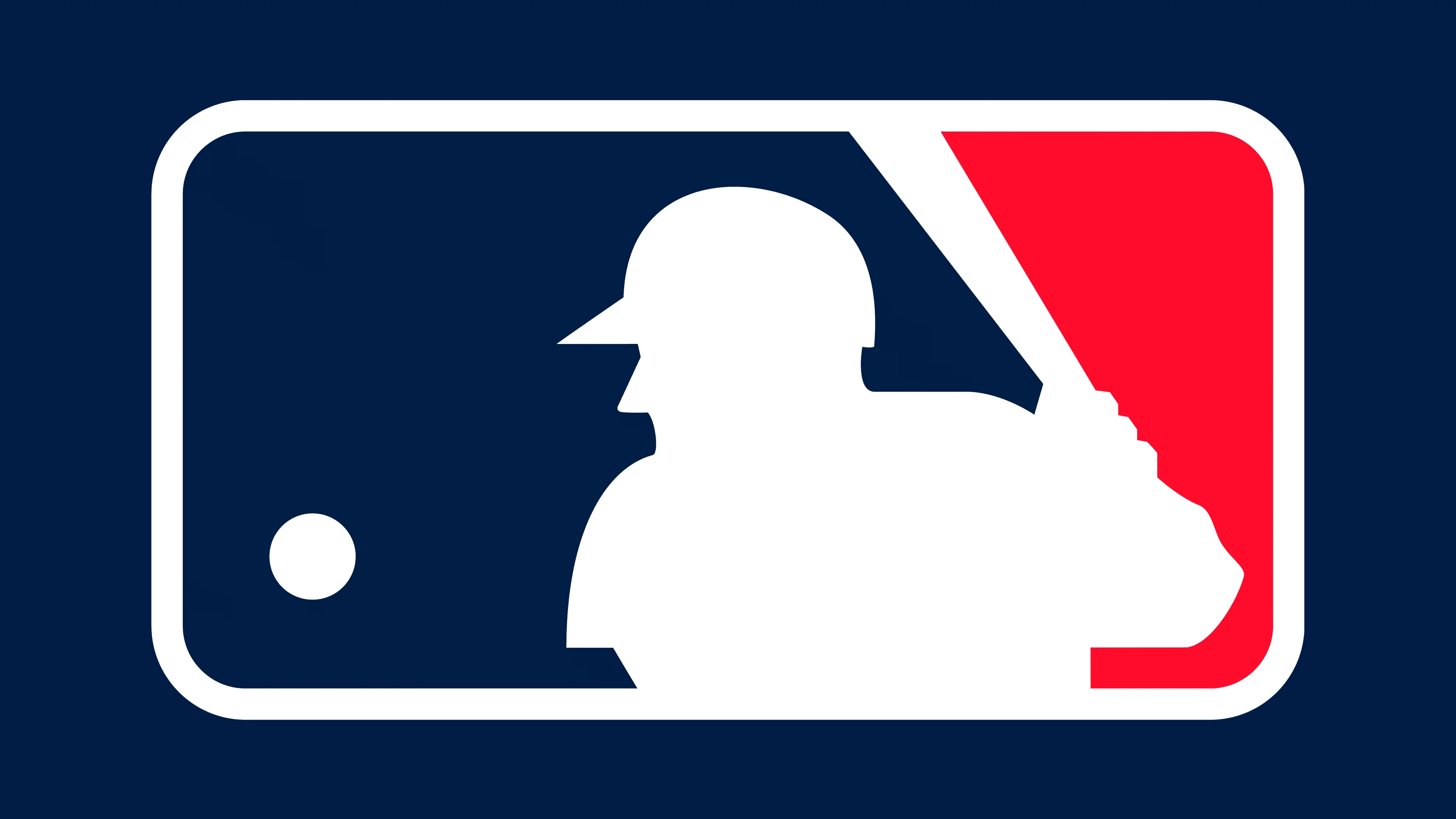
1991 – 2019
![]()
The author of the new logo is designer Jerry Dior. For his version, he used images of several baseball players to sketch a profile and capture common features without being tied to any specific person. However, fans see in the player Harmon Clayton Killebrew, who later entered the Hall of Fame. The emblem is a horizontal rectangle with rounded corners. It shows the light outline of a baseball player: shoulders, arms, head, and back. The athlete froze, then hit the ball as it flew toward him. The player and all sports paraphernalia are painted white; the right side is red, and the left is blue. At the bottom is the inscription “Major League Baseball,” rendered in a grotesque style with capital letters. The developers finally removed the shield.
2019 – today
![]()
Following the redesign, the logo features a darker color palette. Now, instead of blue, it is bluish-black; instead of red, it is maroon.
Despite its long history, the logo has changed little. The most serious modifications occurred in 1969 when the existing elements were rearranged. Moreover, the designer changed perspective, focusing on a different aspect of the game. Since then, the logo has not been updated.
Font and Colors
The logo is written in the grotesque typeface Franklin Gothic Condensed Medium. It was co-developed by Morris Fuller Benton and Victor Caruso and was first published by the ITC.
The corporate palette is designed in the colors of the U.S. national flag, so blue, red, and white have always been predominant.