


![]() FIFA Logo PNG
FIFA Logo PNG
The FIFA logo demonstrates the football organization’s dominant position. At the same time, it indicates leadership for the good of spectators and participating teams. The emblem represents professionalism and a commitment to the quality of the game.
FIFA was founded on May 21, 1904, in Paris by seven European associations, including France, Belgium, Denmark, the Netherlands, Spain, Sweden, and Switzerland. The aim was to standardize rules and coordinate international matches. England joined in 1906, reinforcing its position in global football governance.
In 1930, FIFA organized the first World Cup in Uruguay, with Uruguay winning. During the 1920s and 1930s, membership expanded beyond Europe, adding associations from South America and other regions. Over time, FIFA formed a structure of six confederations covering Europe, Asia, Africa, North and Central America, the Caribbean, Oceania, and South America.
After World War II, expansion accelerated. Under Stanley Rous in the 1950s, FIFA increased the number of international competitions. In the 1970s, João Havelange introduced a more commercial model and expanded the World Cup, adding youth and women’s tournaments.
In 1998, Sepp Blatter became president. His tenure combined revenue growth with controversy, including decisions on hosting the 2018 and 2022 tournaments. In 2015, corruption investigations led to the arrest of officials and their resignation.
Since 2016, Gianni Infantino has led FIFA, focusing on governance changes and tournament expansion. The 2026 World Cup will be hosted by the United States, Canada, and Mexico, with 48 teams. As of 2023, FIFA oversees 211 national associations and is based in Zurich, organizing global competitions and maintaining the rules of the game.
Meaning and History
![]()
FIFA is an acronym for Fédération Internationale de Football Association. The connection with French roots is very important because it originated in France’s capital and only then gained global status. Moreover, the original version of the expanded and abbreviated names is used worldwide only in French.
The need to establish a single supervisory body for football associations’ competitions was acute at the beginning of the 20th century. The reason is the significant growth in the sport’s popularity on the international stage. As a result, FIFA was founded at the headquarters of the USFSA (Union des Sociétés Françaises de Sports Athlétiques). Its first president was Robert Guérin, who was replaced in 1906 by the Englishman Daniel Burley Woolfall. Throughout its existence, the international association has had five emblems.
What is FIFA?
FIFA is an abbreviation for the Fédération Internationale de Football Association. It is an international organization that governs the activities of national football associations. Its tasks include setting standards and organizing major competitions in accordance with accepted norms. Additionally, FIFA promotes sports and finances the development of football in select countries.
1928 – 1977
![]()
The logo emphasizes the service’s global reach. It features the northern and southern hemispheres of the Earth, depicted with a grid of parallels and meridians. The continents are positioned against this grid, showcasing the organization’s worldwide scope. Beneath the globe, the French inscription “Fédération Internationale de Football Association” appears in capital letters, highlighting the association’s international nature and official status.
The hemispheres and grid pattern reinforce the idea of global presence and interconnectedness, aligning with the organization’s mission to govern football worldwide. Including both hemispheres signifies inclusivity and extensive influence across all continents.
The French inscription at the bottom adds formality and tradition, acknowledging the organization’s roots and heritage. The capital letters enhance readability and convey authority and prestige.
1977 – 1998
![]()
In 1977, FIFA redesigned its emblem to emphasize its international status and football’s global nature. The new design replaced traditional parallels and meridians with a honeycomb grid pattern typical of a soccer ball’s surface. This change merged the imagery of the world with the sport, making the connection between FIFA’s global reach and football clear.
By turning the hemispheres into soccer balls, the emblem maintained the idea of worldwide presence while highlighting football’s universal appeal. The hexagonal grid pattern symbolized unity, teamwork, and the sport’s global popularity. This redesign celebrated both FIFA’s international role and the essence of football, creating a cohesive, visually appealing emblem that powerfully represents FIFA’s mission and identity.
1998 – 2009
![]()
During this period, FIFA introduced a color version of its logo, marking a significant change. The continents were painted yellow, symbolizing energy and optimism, while the oceans were colored blue, representing trust and stability. A white hexagonal grid with medium-thickness stripes maintained the classic soccer ball design, ensuring that the continents and oceans stood out.
This new color scheme enhanced the logo’s visual appeal and made it more recognizable. The connected hemispheres symbolized FIFA’s unity and global reach, highlighting its role in bringing together diverse nations through football.
Introducing color to FIFA’s logo added vibrancy and clarity, making it a more powerful symbol. The yellow continents and blue oceans, framed by the white hexagonal grid, created a striking visual effect that reinforced FIFA’s identity and mission, emphasizing international unity and the dynamic nature of football.
2004 – 2015
![]()
During FIFA’s 100th anniversary, a special emblem was used alongside the main logo. This emblem featured a soccer ball on a wave, symbolizing the dynamic nature of football. The design had a high blue base and a sweeping blue stroke, giving an impression of movement and energy.
At the center of the emblem was a white soccer ball with blue lines, representing the essence of the sport. The ball appeared to ride the wave, adding excitement and forward momentum. This imagery conveyed football as a powerful, unifying force that continues to grow.
The sports association’s name was displayed at the bottom, grounding the design and linking it to FIFA. The blue elements symbolized trust and stability, while the white ball with blue lines stood out against the background, drawing attention to the sport.
2009 – today
![]()
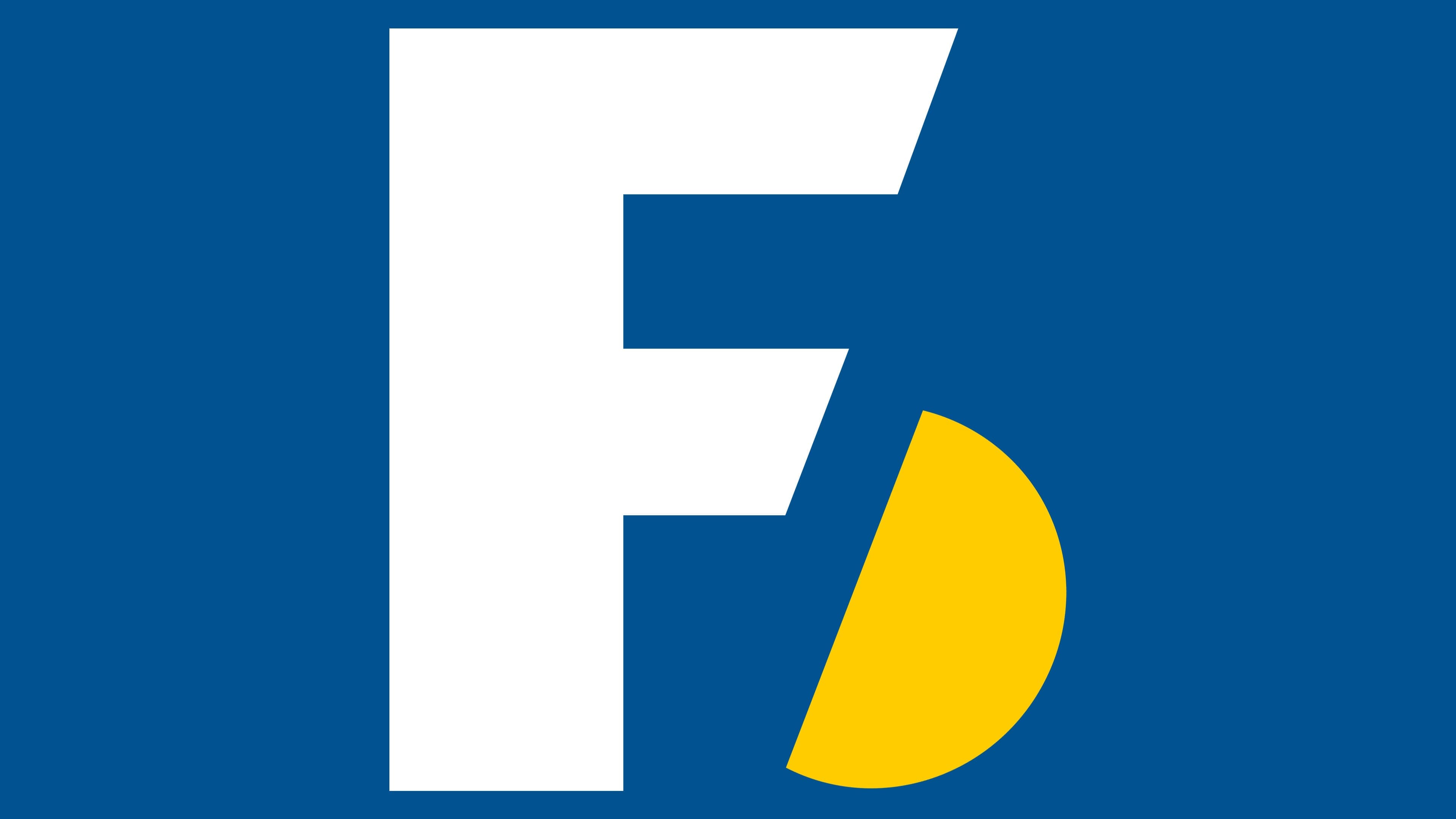
The current logo consists only of text, specifically the names of international organizations. The design is memorable for its distinct letterforms. Following established guidelines, the abbreviation is presented in French without additional explanations or decoding. Every character in the logo is uppercase and colored in bold blue.
The standout feature of this logo is the unique design of the letter “F.” Both of its protrusions are angled, creating a distinctive shape that enhances the logo’s recognizability. This unusual modification of the “F” adds a touch of modernity and style to the overall appearance.
The use of blue for all characters conveys professionalism, trust, and authority, aligning with the values and image of the international organizations they represent. The uppercase text format reinforces the importance and stature of these entities, making the logo both authoritative and legible.
Font and Colors

The hallmark of an international football organization was almost always the presence of two connected hemispheres. Initially, they were depicted as world maps, and later as balls. The current version, which features the inscription as its predominant element, stands separately. It was taken from the logo marking FIFA’s 100th anniversary.
The logo used a modified typeface, a combination of smooth and grotesque styles, similar to the Arazati Negra Expandida Regular font. After the 1998 redesign, the letters are much wider and bolder, with oblique cuts on the “F” tabs. This version resembles Vaccine Sans Black.
In terms of color scheme, the association prefers a uniform or minimalist approach. Therefore, at different times, logos were dominated by black, blue, and yellow.