In a hot but fair fight, the teams that make up the league defend the honor of America. The NFL logo communicates that players compete with each other but always achieve the goal – the audience’s pleasure from a bright and exciting game.
The NFL logo, with its shield, “NFL” letters, and the stars and stripes, shows how much the league has done since it started in 1920. It’s not just a picture; it tells how the NFL grew, especially when it joined the AFL to become the top football league in the U.S.
Over time, the NFL got bigger, from just a few teams to being all over the country, from Michigan to New York. The NFL started with teams like the Decatur Staleys and grew into a huge competition that ended with the Super Bowl every year. The Super Bowl isn’t just another football game. It’s a big celebration of what football means in America and shows how great the NFL has become.
NFL (National Football League): Brand overview
The NFL (National Football League) is a professional American football league with 32 teams from the NFC (National Football Conference) and AFC (American Football Conference). It represents the highest level of football globally and organizes the Super Bowl elimination matches (held on the first Sunday in February). The competition occurs between representatives of two main groups—the NFC and the AFC. The league was founded in 1920. The headquarters are located in New York City.
The NFL’s journey from its modest beginnings in Canton, Ohio, in 1920 as the American Professional Football Association (APFA) to becoming the powerhouse National Football League (NFL) in 1922 tells a tale of perseverance, evolution, and triumph. Initially struggling to find footing among competing leagues, the NFL’s early days were marked by a battle for survival and relevance.
The turning point came in 1949, when the NFL merged with the All-America Football Conference (AAFC), solidifying its place in the sports world. The 1960s saw the NFL capitalize on the burgeoning medium of television, bringing the game into living rooms across America and creating a new level of fandom. Icons like Jim Brown and Johnny Unitas weren’t just athletes; they became household names, symbolizing the growing appeal of football.
The 1966 merger with the American Football League (AFL) was pivotal, birthing the Super Bowl and setting the stage for football to become a national obsession. The 1970s and 1980s saw the emergence of legendary figures like Roger Staubach, Joe Montana, and John Elway, whose exploits on the field captivated millions.
The introduction of free agency in 1993 marked a new era, reshaping team dynamics and the league’s competitive landscape. Yet, as the NFL marched into the new millennium, it faced unprecedented challenges. The issue of concussions and their long-term effects on player health cast a shadow over the game, prompting the league to adopt new safety measures and address legal battles with former players.
Today, the NFL stands as a colossus in American culture, a testament to its ability to adapt, innovate, and captivate. With billions in revenue from various channels, it’s more than a sports league; it’s a cultural institution. Despite ongoing controversies, the NFL’s story is resilient, reflecting the sport’s and society’s evolution.
Meaning and History
This sports organization was called APFA (American Professional Football Association) in the early years. But in the 1922 season, it was renamed the National Football League. In 1933, the NFL introduced a playoff system, at the end of which the remaining teams competed for the championship. This was until 1966 – before the AFL (American Football League) merger.
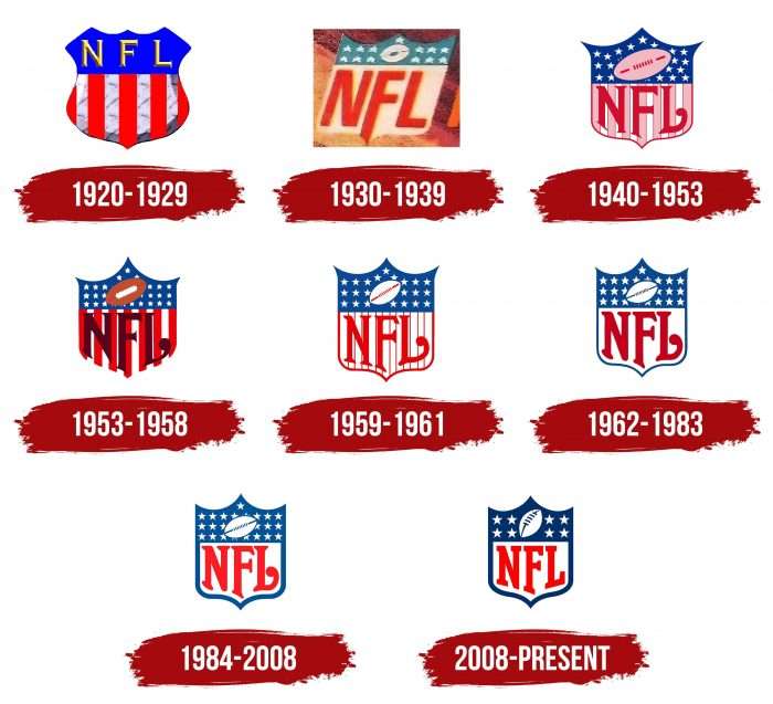
In 1967, the Super Bowl occurred for the first time, defining the winner among the best players in two competing leagues. It proceeded according to this scheme until 1970 when the merger was completed. Today, the Super Bowl is the largest and most visited event in big-time sports, with many individual events. The National Football League has become the most profitable event and organization, with the most valuable teams. Over the entire period of its existence, she has repeatedly changed the emblems she had eight.
What is NFL?
The NFL, or National Football League, is a professional American football league with 32 teams, split evenly between the National Football Conference (NFC) and the American Football Conference (AFC). It’s one of North America’s four major professional sports leagues and the top professional level of American football worldwide. The NFL’s regular season runs from early September to late December, with each team playing 17 games and taking one bye week. After the regular season ends, six teams from each conference (four division winners and two wild card teams) go to the playoffs, a knockout tournament ending in the Super Bowl, typically held on the first Sunday in February. The Super Bowl is a huge global sporting event, drawing millions of viewers. The NFL is notable for its significant influence on American culture and its major economic role in the sports industry. The NFL is a multibillion-dollar industry, generating revenue from TV contracts, sponsorships, ticket sales, and merchandise. It remains the most popular sports league in the United States.
1920 – 1929
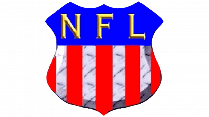
The debut version of the logo is a heraldic shield decorated in the colors of the American flag. The figure with teeth at the top and a point at the bottom is horizontally divided into two parts. One of them is blue with a yellow inscription “NFL.” Printed letters, classic, with miniature serifs. They are widely spaced apart. The second half contains alternating stripes – four white, three full red, and two more trimmed side pieces.
1930 – 1939
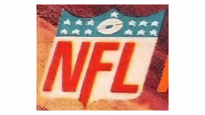
During this period, a different type of emblem was used. The designers retained the original shape of the shield but changed its configuration, which remained for all subsequent years. The logo has lost its barrel-shaped appearance and received straight sides, tapering at the bottom into a sharp spike. On the badge of those years, the blue stripe became narrow. A diagonal American football ball appeared on it, surrounded by 13 white stars – 6 on the right and left and another at the top in the center. The developers painted the lower zone white and added a large red inscription “NFL.” At “F,” they extended the leg to make it look like a strip. The rest of the letters also resemble wide lines but do not go beyond their height.
1940 – 1953
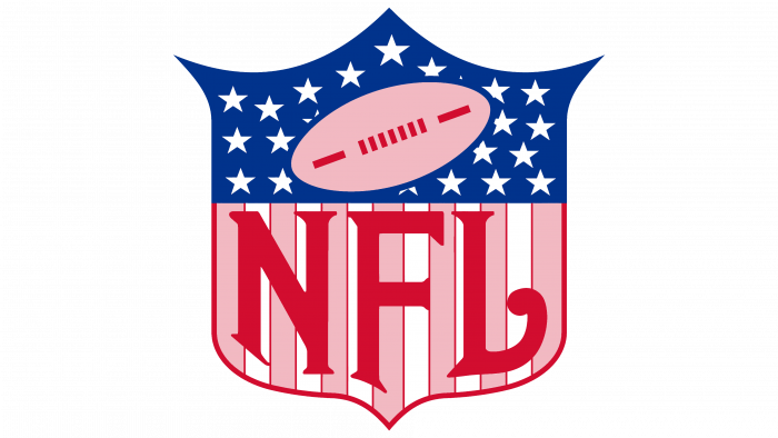
The design of the emblem has become much more expressive. The authors have extended the upper projections, making them long and sharp (especially the lateral ones). They also increased the number of stars and placed a pink ball with red lacing on the background. The developers have narrowed the lines on the bottom margin and recolored them: now there are six white stripes and seven pink ones on the logo. They are the abbreviation of the sports league, made in the old English style – with large serifs, curly “L,” with a bold dot at the end.
1953 – 1958
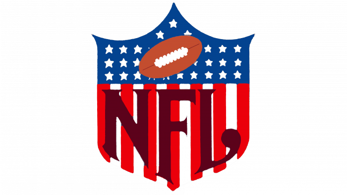
First, the authors updated the font: they sharpened and extended the serifs and cut off the lower part of the right leg, “N,” making it a triangle with an acute angle. They also tweaked other details:
- Repainted the ball a golden beige.
- Replaced the red lacing with white.
- Removed the pink.
- Arranged the stars in a row.
- Made the letters maroon.
In addition, the designers corrected the upper part of the shield, increasing the central protrusion and reducing the side ones.
1959 – 1961
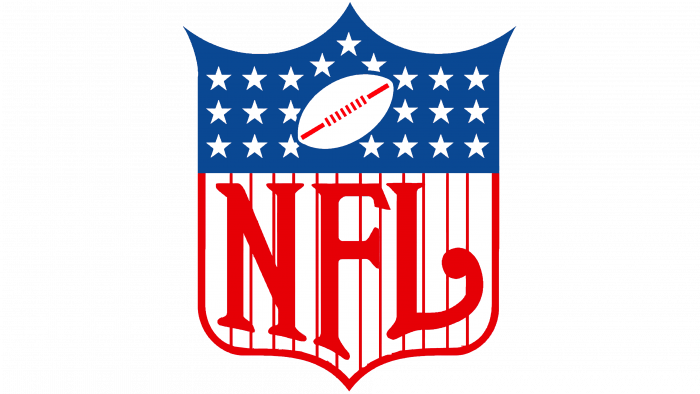
In 1959, the league approved a terse version of the logo. It had far fewer color spots than before. The ball and stripes have turned white, and the top points on the backboard are equal in height. A thick red border appeared at the bottom.
1962 – 1983
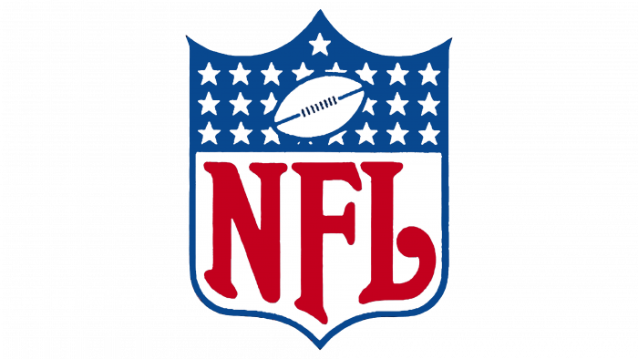
The authors of the emblem enlarged the stars and letters and replaced the red lacing with blue, making it in the background color with the stars, like the edging line. They finally removed the inner stripes at the bottom.
1984 – 2008
The developers trimmed the shape of the side spikes at the top, widened the line along the edge, and changed the colors. As a result, the logo appeared scarlet instead of deep red and light blue instead of dark.
2008 – today
The most important transformation occurred in the upper block: the designers removed 22 small stars and drew eight large ones. They represent eight divisions and are divided into two parts – 4 on each side. As conceived by the developers, this is a symbol of two conferences. The authors also redesigned the font, replacing the rounded font with a geometric one with wide serifs. In addition, the ball in the upper part received a three-dimensional effect for the first time. It is three-dimensional due to the reduced inclination angle and repositioned lacing.
NFL: Interesting Facts
The National Football League (NFL) is a cornerstone of American sports culture, rich in history, tradition, and memorable moments.
- Founding: The NFL was established on September 17, 1920, in Canton, Ohio. Originally, it was called the American Professional Football Association (APFA) before being renamed the National Football League in 1922.
- First Super Bowl: The first Super Bowl took place on January 15, 1967. The Green Bay Packers defeated the Kansas City Chiefs 35-10. Initially, the Super Bowl was a game between the NFL champions and its younger rival, the American Football League (AFL), before the two leagues merged in 1970.
- Largest Attendance: The largest attendance for an NFL game was recorded during Super Bowl XIV in 1980. The game played at the Rose Bowl in Pasadena, California, had an attendance of over 103,000 fans.
- The Longest Game: The longest NFL game ever played was on Christmas Day in 1971, between the Kansas City Chiefs and the Miami Dolphins. It went into double overtime and lasted 82 minutes and 40 seconds of game time. The Dolphins won 27-24.
- TV Impact: The NFL’s growth in popularity has been significantly boosted by television. The 1967 NFL Championship game, also known as the “Ice Bowl,” was one of the first to showcase the impact of the NFL on TV, drawing millions of viewers despite the bitterly cold conditions.
- The Draft: The NFL Draft was first held in 1936 to ensure competitive parity by allocating college football players to teams. The Philadelphia Eagles selected Jay Berwanger as their first Pick, although he never played a game in the NFL.
- Team Relocations: Several NFL teams have relocated over the years. For example, the Raiders have moved cities multiple times, from Oakland to Los Angeles, back to Oakland, and most recently to Las Vegas in 2020.
- Perfect Season: The Miami Dolphins hold the record for the only perfect season in the NFL. In 1972, they finished the season 17-0, culminating in a Super Bowl victory.
- Thanksgiving Tradition: The Detroit Lions have hosted a game on Thanksgiving Day since 1934. This tradition has become a staple of the NFL season, with millions of Americans tuning in or attending games during the holiday.
- Most Championships: The Green Bay Packers hold the record for the most NFL championships, with 13 titles (including four Super Bowl victories). The franchise’s success dates back to the league’s early days, with their first championship win in 1929.
These facts underscore the NFL’s profound impact on American sports and culture, highlighting its history of competition, innovation, and unforgettable moments.
Font and Colors
The evolution of the NFL’s visual identity has come in parallel with internal changes in the league. However, the design moved from a complex to a simple one, with minimal elements. As a result, a blue-red-white version appeared in the color of the American flag. However, the number of stars on them does not match because the National Football League has its gradation of stardom. She chose the designation for the number of divisions, not states.
The typeface used in the modern logo is reminiscent of William Boyd’s Freshman typeface—letters in a strict design, geometric, with straight lines and large serifs. Earlier, the emblem used a typeface in the Old English style – with curly symbols and curved elements.
The NFL logo’s corporate palette was originally associated with the color of the US national flag. It consists of several white, red, and blue shades, which changed several times during the redesign.
