The LaLiga logo represents power, professionalism, and athletic stamina. It demonstrates the fearless spirit and determination of footballers, endurance, and physical resilience, which help them rise to the top of the tournament table. The emblem shows how popular football is in the country and how highly the population values it.
LaLiga: Brand overview
| Founded: | 1929 |
| Headquarters: | Spain |
| Website: | www.laliga.com |
Meaning and History
Creating a top football division in Spain has been around for a long time because many footballers with undeniable talent were emerging in the country every year. A special organization was required to inspire them to improve their skills, interest in professional growth, and in the development of a sports career. The director of Arenas Club de Getxo proposed its establishment.
Preparatory work lasted several years – from 1927 to 1929. During this time, the founders approved the admission criteria to the top league, agreed on the size of the football club and the number of teams in it, specified the conditions for awarding the highest qualification category and developed symbolism. The final version of the logo was adopted later.
What is LaLiga?
LaLiga is Spain’s top-tier football organization, comprising the country’s 20 best professional teams. The idea of its emergence first appeared in 1927. Jose Maria Acha Larrea, the head of the Arenas Club de Getxo, suggested this. His idea was implemented in 1929 after thorough discussions and lengthy development of the rules. Today, the league is managed by the Liga Nacional de Fútbol Profesional.
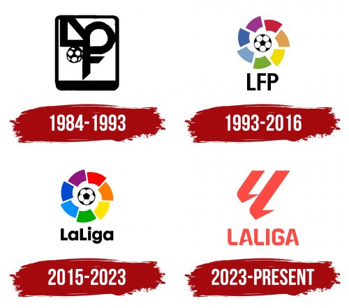
1984 – 1993
The emblem represents a monogram in a geometric style. Essentially, it includes an abbreviation of the most significant words: you can see “L” (Liga), “P” (Primera, Profesional), and “F” (Fútbol). A diagonal line is drawn at “L,” making it look like a triangle, while “P” is merged with “F” and is above the horizontal bars. But from a design perspective, this construction cannot be called a monogram: it’s too “technological.” The business atmosphere is diluted only by the football ball located in the corner – at the junction of the letters “L” and “F.” All elements are placed in a vertical rectangle with a black frame, extended downwards.
1993 – 2016
During this period, a complete rearrangement of the logo took place. It was modernized by removing the cumbersome construction. The designers lightened the badge and made it more friendly, understandable, keeping key details. As a result, the football was moved to the center. Around it appeared a multicolored ring formed from seven wide fragments placed sideways. They are colored in dark green, gray-blue, blue, plum, burgundy, brown, and olive. The abbreviation “LFP” from “Liga Fútbol Primera” moved down. The inscription is typed in a flat grotesque in uppercase.
2015 – 2023
Designers strengthened the colors, making the palette very bright and impressive. The colors have become much richer, more saturated. Among them are sky blue, blue, purple, orange, scarlet, yellow-lemon, and the light green shade of spring grass. The pattern on the football (the old-school attribute remains in the center) has softer features: the lines between the pentagons are not solid but broken, with a taper at the end. The inscription “LaLiga” appeared at the bottom. It is black, semi-bold, and chiseled.
2023 – today
The top-tier football organization of the Spanish league underwent a complete rebranding, abandoning the iconic ball with wide circular stripes. In the summer of 2023, it got a new logo, color, name, and slogan to fit into the modern framework and become closer to the fans. Now it will be called LALIGA EA Sports FC. It got a different motto: “The Power of Our Futbol.” The official palette has been reduced to coral red. The emblem has become a symbolic sign, connecting footballers with fans of this spectacular sport.
The double spelling of “LL” is an abbreviation for “LaLiga” and a reflection of passion for football. One letter represents the triumphant players after a scored goal, falling on their knees on the field and sliding across it. That is, the silhouette of their bodies perfectly matches the shape of “L.” The second glyph in the monogram represents ecstatic fans at the moment of celebrating the success of their favorite team: they form a semblance of “L” with their hands, passionately clenching their fists. As noted by the league’s management, it’s a tangible expression of emotions that rage during competitions.
The glyphs have a short and sharp bottom, which makes them reminiscent of a cursive inscription made by hand. Below them is a line with the word “LALIGA” in continuous spelling and capital letters, indicating the equivalence of both parts. The outer corners of the letters are cut off; the inner ones are preserved. The crossbar of “A” is sharpened on the right side, so it looks like a spike.
Fonts and Colors
The Grávita studio, which worked on the new visual identity of LaLiga, chose an original typeface closer to a graphic drawing than to the symbols of the alphabet. They used a custom font, maximally adapted to the project. Earlier in the logos, inscriptions were made with Futura Maxi by Victor Caruso and Orbi Sans Bold by ParaType.
Early logo versions were very colorful and consisted of shades of blue, lilac, red, yellow, green, and brown. Everything is reduced to monochrome in the updated version: it is painted in coral Pantone Red 032C. This variety of red symbolizes football excitement, energy, and passion.
