The NHL logo demonstrates the readiness to defend the honor and dignity of the country in the arena. The emblem combines ice, courage, pressure, and sharp struggle. The sign represents leaders in their field, strong in spirit and invincible.
NHL: Brand overview
Meaning and History
The history of the NHL logo dates back to 1917, when four Canadian teams teamed up to form a new league to replace the National Hockey Association. The NHA has been suspended due to a disagreement with the owner of Toronto Blueshirts. The National Hockey League ranked the NHA on par with other professional sports organizations. Over time, the rest of the teams became part of it, so in 1926, no one but the NHL fought for the Stanley Cup. By then, the league had already included teams from the United States, although most players were Canadians. This ratio has persisted for many years, but the number of Europeans and Americans has increased recently.
Since the 1960s, the NHL has been actively expanding because it feared possible competition from the Western Hockey League. Later, it absorbed the West Hockey Association, entering into a merger agreement. The NHL now has over 20 franchises in the US and only 7 in Canada. In the season 2021-2022. Another team (from Seattle) was expected to debut, and it was to join the league by a decision made at the end of 2018.
The rapid change in the composition of the sports organization and the emergence of new franchises had almost no effect on its identity. Even if the logos changed, they always remained recognizable and looked the same. The same form unites them – the Baroque coat of arms (16-18 centuries), called the “stretched skin.” This heraldic element has a curly top and a slightly elongated teardrop-shaped bottom.
What is NHL?
It is the professional hockey organization of the United States, the fifth largest in the world in terms of income. It unites 32 teams: 25 American and 7 Canadian, between which the Stanley Cup is played at the end of each season. The prize goes to the champion of the playoff league. The NHL was formed in late 1917 and took the place of the NHA.
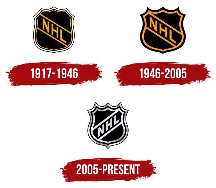
1917 – 1946
In the early years of its existence, the league used an emblem with a smoother shield. Its protrusions were not as noticeable as they are now. Inside was a yellow “NHL” sign running diagonally from top to bottom. The designers emphasized it on both sides with wide parallel lines of the same color. They merged with the yellow stripe drawn along the shield’s border. Then, a thin black outline followed. A white frame with another dark line along the outer edge surrounded it.
The letters were written in bold, sans-serif capital type. The logo’s creators had to tilt strongly to the left to balance their uneven positioning inside the shield. At the same time, the background behind the text was black, making the league’s name immediately evident.
1946 – 2005
In 1946, the developers simplified the frame, leaving only two wide stripes: orange (inside) and black (outside). The word “NHL” and the diagonal lines that frame the lettering have turned orange. After the redesign, the shield’s shape changed: it acquired sharp-angled protrusions and was compressed at the edges, so its elements moved slightly up to the left corner.
2005 – today
The designers kept the shield’s shape because it looked elegant anyway. However, they made it more difficult to frame it by increasing the number of stripes to four. Black remained the primary color, while orange was replaced by silver. Moreover, this version’s frame is framed with a gradient that looks like a metallic sheen.
The position of the word “NHL” has changed: it is now written from the bottom up. The two parallel lines also have a new direction. The letters are slanted to the right and decorated with short triangular serifs.
The logo used in Canada looks the same but has a different abbreviation: “LNH.” As for the symbol, which was created in honor of the 100th anniversary of the league, in addition to the shield, it contained a stylized number “100”, entwined with a ribbon with the inscription “1917 2017”.
NHL: Interesting Facts
The National Hockey League (NHL), a cornerstone of professional ice hockey in North America, unites teams from Canada and the United States. It is a key professional sports league in both nations, cherished for its deep-rooted history, traditions, and fervent fan base.
- Founding Moments: The NHL was born on November 26, 1917, in Montreal, Quebec. It emerged following the suspension of the National Hockey Association. Initially, it featured four Canadian teams.
- S. Inclusion: The Boston Bruins, introduced in 1924, was the first U.S. team, signaling the NHL’s evolution into a league spanning two countries.
- The Iconic Six: The “Original Six” describes the ensemble of teams from 1942 to the 1967 expansion: Boston Bruins, Chicago Blackhawks, Detroit Red Wings, Montreal Canadiens, New York Rangers, and Toronto Maple Leafs.
- Canadiens’ Legacy: The Montreal Canadiens lead with 24 Stanley Cup victories, showcasing the team’s historical prowess and dominance.
- The Prestigious Stanley Cup: Awarded to the playoff champions, the Stanley Cup is the oldest trophy in professional sports. It was introduced by Lord Stanley of Preston in 1892.
- Global Talent: Initially dominated by Canadians, the NHL celebrates players from over 20 countries, highlighting the league’s growing international presence.
- Celebrating Outdoors: Since 2008, the NHL Winter Classic, an outdoor game on New Year’s Day, has become a beloved event known for its nostalgic essence and distinctive setting.
- A Marathon Match: In 1936, the longest game unfolded between the Detroit Red Wings and Montreal Maroons, extending to six overtimes, totaling 176 minutes and 30 seconds, until Detroit clinched the victory.
- Gretzky’s Unmatched Records: Wayne Gretzky, “The Great One,” holds numerous records, including for most career goals (894), assists (1,963), and points (2,857), cementing his legendary status in the sport.
- Television Milestone: The NHL’s television debut occurred in 1952 in Canada, with the scope of broadcasts now reaching a worldwide audience.
- Championing Diversity: Through initiatives like “Hockey Is For Everyone,” the NHL promotes inclusivity, ensuring the sport welcomes participants from diverse backgrounds.
The NHL’s journey from its modest inception to a global sporting phenomenon underscores its lasting allure and the deep passion of its players, teams, and fans.
Font and Colors
Like many professional sports organizations, the National Hockey League uses the shield emblem. This is a tribute to heraldic traditions that originate from national symbols. The shape of the crest has never changed, apart from minor adjustments. This consistency has made the NHL logo famous: it can be easily recognized even by its outline.
The league’s sign is distinguished by non-standard typography because the designers opted for an individual font, adapting it to the shape of the shield. All three letters are bold, capitalized, and have one short serif in the upper left corner.
The emblem’s main colors are black and silver, but the palette is not limited to them because the gradient contains many shades, including white, dark gray, and light gray.
FAQ
How many NHL teams have hockey sticks in their logo?
In the National Hockey League (NHL), six teams include hockey sticks in their logos:
- Washington Capitals: The logo features an eagle with W-shaped wings holding a hockey stick.
- New York Islanders: The logo includes an outline of Long Island and a hockey stick forming the letter “I.”
- Vancouver Canucks: The logo uses a stylized killer whale with a hockey stick-like tail.
- San Jose Sharks: The logo features a hockey stick bitten by a shark.
- Minnesota Wild: The logo combines a forest scene with hockey, turning the bottom of the tree into a hockey stick.
- Tampa Bay Lightning: The simpler logo features a small stylized hockey stick as part of the lightning bolt.
What NHL team has a star logo?
The Dallas Stars, an NHL team from Dallas, Texas, has a star as the main element of its logo. They play in the Central Division of the Western Conference. The team began as the Minnesota North Stars in 1967 and moved to Dallas in 1993. In Texas, the team adopted the “lone star” symbol, which is important to the state’s identity and signifies excellence.
What is the NHL logo?
The NHL logo is a shield representing the league’s competitive spirit and honor. It is pentagonal with sharply protruding corners. The original logo featured black and orange stripes, but it has been updated to a black and silver scheme with a double border for a modern look. The league’s name is written diagonally across the shield, highlighting its role as a leading sports organization.
When did the NHL change its logo?
The NHL last updated its logo in 2005. This edition was a significant transformation, although it retained the basic concept of the shield. The designers reshaped the shield with taller, sharper edges, giving it a more defined shape. They added double silver trim to modernize the look. Additionally, the text inside the shield was slanted to the left, emphasizing a sense of forward and upward movement. This redesign aimed to update the brand’s image while maintaining its traditional elements.
What is the most iconic NHL logo?
Three NHL logos are particularly notable for their iconic designs:
- Hartford Whalers: Known for its clever design, combining a whale’s tail with a stylized W to form an H in negative space.
- Detroit Red Wings: Features a stylized wheel with wings, reflecting the city’s automotive history, resilience, and speed.
- Toronto Maple Leafs: Displays a maple leaf, symbolizing the team’s Canadian roots and serving as the national emblem.
What is the NHL slogan?
The league updated its slogans to reflect its spirit better. The previous slogan, “It’s all about the TEAM,” emphasized that hockey success comes from teamwork and individual skills.
The current slogan is longer and reflects the diversity of skills in the league. It states, “We believe that a player who leads the league in penalty minutes is just as impressive as a player who leads the league in goals.” This shows that excelling in various areas, such as penalty minutes, is as commendable as scoring goals.
