


![]() Masters Tournament Logo PNG
Masters Tournament Logo PNG
The emblem conveys the scale of the competition and the pleasure athletes and spectators can derive from it. The Masters Tournament logo is based on the game’s climax, when the ball enters the hole, symbolizing the prestige and exclusivity of one of golf’s most important tournaments.
The Masters is an acronym for the traditional Masters Tournament of golf. It is also known as The Masters or the U.S. Masters. The event is usually held in the first decade of April at the National Golf Club in Augusta, Georgia.
The Masters Tournament began with legendary golfer Bobby Jones. After retiring following his Grand Slam victory in 1930, Jones and financier Clifford Roberts established Augusta National Golf Club in Georgia, designed by renowned architect Alister MacKenzie.
The first tournament took place in 1934 and was won by Horton Smith, with a $1,500 prize. The name “Masters Tournament” was officially adopted in 1939. A memorable moment occurred in 1935 with Gene Sarazen’s historic shot, known as “the shot heard ’round the world.”
Since 1949, the winner has traditionally received the famous green jacket. The event’s popularity increased significantly after the first televised broadcast in 1956. In the 1960s and 1970s, legends like Arnold Palmer, Jack Nicklaus, and Gary Player dominated the tournament.
In 1997, Tiger Woods won with a record 18-under-par, becoming the youngest champion. Woods later secured four additional Masters titles. In 2020, Dustin Johnson set a new record of 20-under-par.
Today, the Masters remains an iconic event held annually at Augusta, carefully preserving traditions like the champions’ dinner and honorary tee shots by golf legends.
Meaning and History
![]()
What is the Masters Tournament?
It is a prestigious annual golf competition held at a famous course in Georgia. The tournament, attracting top professionals, takes place in early April. Known for its strict traditions and conservative rules, the winner receives a green jacket and the right to select the menu for the following year’s Champions Dinner. Spectators are required to follow a strict dress code and refrain from using mobile phones. Affordable food options, including the famous pimento cheese sandwich, are available. Each hole on the course is named after a historical event. Blooming azaleas and dogwood trees decorate the venue.
The Masters Tournament has traditionally had the fewest participants of the four majors. Officially, it is an invitation-only sporting event. However, competitors are selected based on a set of qualifying criteria for entry to the main golf course. Players are allocated according to the category to which they are assigned.
Thus, the 2020 game was played over three rounds, culminating in a final match. Matches were often interrupted for several hours due to thunderstorms and rain. Additionally, the NFL competition was broadcast on multiple television channels simultaneously, which affected interest in the Masters. In 2020, demand dropped to 1957 levels, as evidenced by Nielsen’s viewing ratings. Only 5.59 million American viewers enjoyed the final round.
The blame for this situation was not only COVID-19, which prevented golf fans from attending in person. Due to the need for live competition broadcasts, television personnel had to strictly monitor daylight hours and select them for broadcasts, including evening events. And since the NFL also focused on the hours most convenient to broadcast, the timing of two important sporting events unwittingly coincided. The Masters was shown on CBS Sports, opening with a stylish, thematically clear logo that debuted in 1934.
1934 – today
![]()
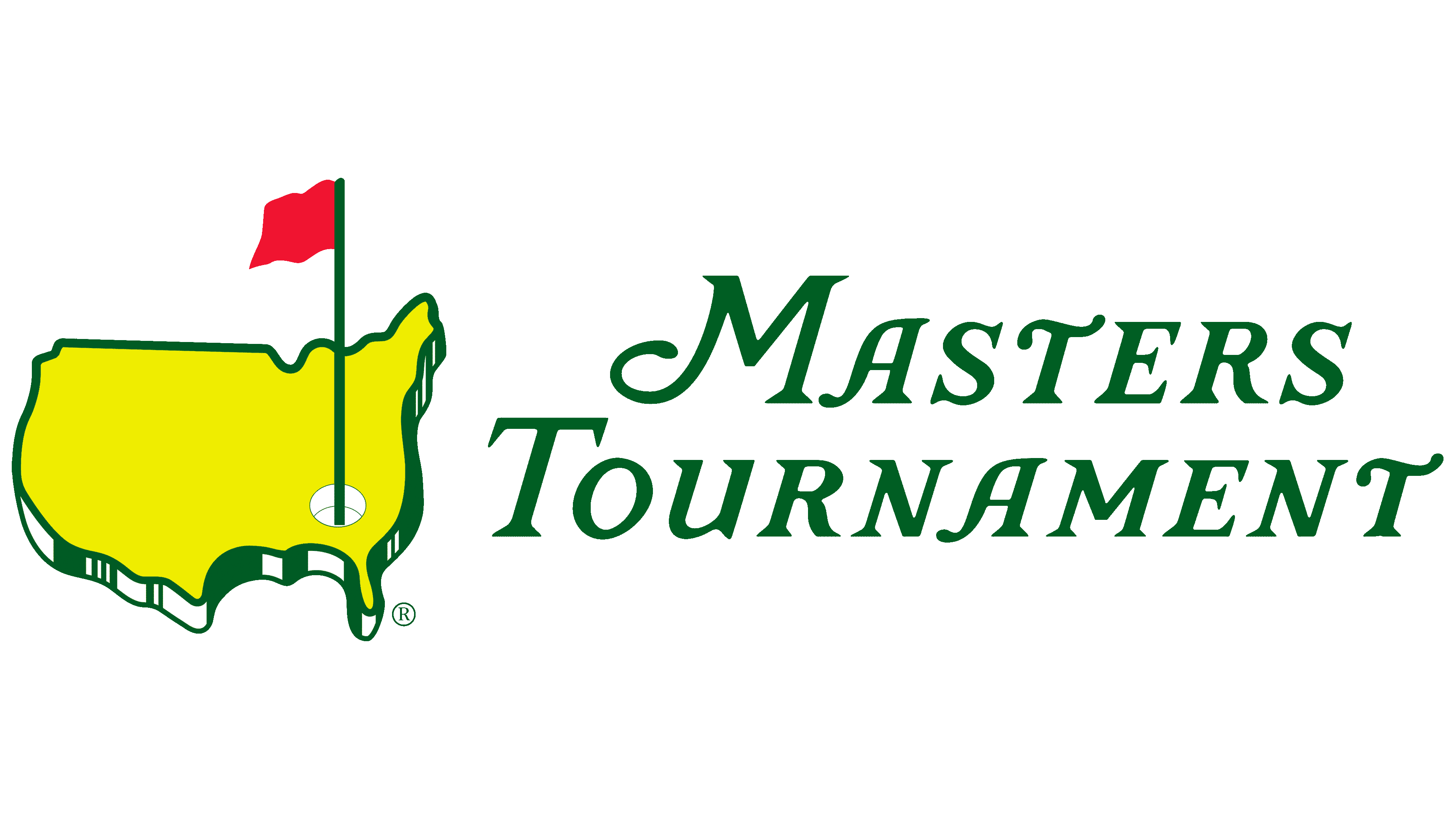
The Masters Tournament emblem is among the most iconic and recognizable symbols in international golf. Its origin is closely tied to Augusta National’s internal identity: a club that did not engage external agencies and developed its branding in-house. The creation of the emblem is attributed to Clifton James, one of the tournament’s earliest organizers and a close associate of Bobby Jones, a key founder of Augusta National Golf Club.
The design centers on a stylized depiction of the United States map, presented as a flat yellow outline bordered in green, with an added visual impression of depth and relief. Carefully drawn edges make the image resemble a terrain layer, figuratively evoking the course’s actual landscape. This emphasizes the unique features of golf, in which surface contours, textures, and rhythms are particularly important.
In the southeastern part of the map, corresponding to the state of Georgia, a stylized golf hole is positioned, from which a long, finely drawn flagpole extends vertically upward. The bright red flag stands out as a key accent in the composition, serving as a focal point that symbolizes the game’s ultimate goal and the pursuit of sporting achievement.
The typographic part is executed in an elegant italic typeface with classical serifs, reminiscent of fonts such as Garamond or Bembo, yet featuring individually adapted elements that suggest handcrafted customization. The letters attract attention with distinctive curves and calligraphic elegance, reflecting the tournament’s traditional style and prestige. The text is arranged in two lines, gracefully intersecting the flagpole’s vertical axis.
The color palette includes bright yellow, deep green, and vivid red, symbolizing the freshness of the grass, the brightness of the sun, and the game’s dynamics. The contrast of these colors draws attention to details and strengthens the perception of depth.
Since its initial creation, the logo has undergone only minimal adjustments to its contours and subtle refinements in color shades, while preserving its fundamental structure and visual symbolism. Today, this emblem is widely used across official tournament materials, including players’ apparel, souvenir merchandise, informational and television graphics, and landscape decorations throughout Augusta National, demonstrating the importance of tradition and historical continuity in the brand’s identity.
Font and Colors
The Masters Tournament logo font is set in an italic serif typeface with smooth, gently curved serifs, highlighting the elegance and unpredictability inherent in golf. Subtle curves and refined strokes symbolically reflect the nuances of sporting strategy and the skill of tournament participants. The uppercase letters (“M,” “T”) stand out prominently in the typographic composition, demonstrating sophisticated handcrafted styling with harmoniously balanced proportions.
The logo’s color palette features a striking combination of rich green, vibrant yellow, and red. A neon-yellow color fills the outline of the United States, chosen for its high visibility and to evoke the atmosphere of an open golf course. The deep green used for the contours, lettering, and flagpole associates with traditional grassy surfaces and the game’s heritage. The red flag completes the overall color scheme as a key visual marker, drawing attention and symbolizing the competition’s ultimate objective.