The Premier League logo demonstrates the participants’ greatness, nobility, and patriotic spirit. The emblem indicates that the organization is honored to represent the country at the international level, and the teams are ready to do it in the best way.
Premier League: Brand overview
| Founded: | 20 February 1992 |
| Headquarters: | England |
| Website: | premierleague.com |
Premier League is the association of the top 20 English soccer teams, the most famous of which is Manchester United, Liverpool, Chelsea, and Manchester City. Executive Director Richard Masters. The Premier League logo is the most famous and popular worldwide.
The league is the result of the departure of the best teams from the Football League of England. Each year the clubs have two meetings with each of the participants. A total of 38 games for a team. 4-winners play in the UEFA Champions League; the last three places fight for relegation with members of a lower level – the EFL (English Football League). More than 14 billion people attended the Premier League performances. This is the highest figure of any European league.
Meaning and History
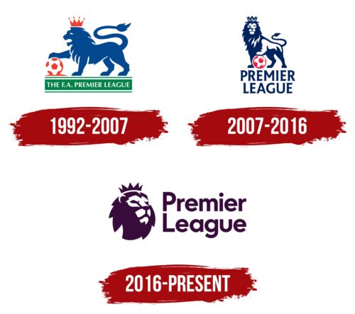
The logo has been changed twice, but the lion has always been integral to it.
What is the Premier League?
The most famous European association of soccer clubs, which includes teams of the first English division. Almost 5 billion people watch its television broadcasts. Each of the clubs is a shareholder of the organization.
1992 – 2007
The first logo shows a majestic roaring lion in profile with its paw on the ball. At the bottom, on a green band with a white border, it reads The F.A. Premier League.
The acronym is related to the organization’s legal name, which sounds like the Football Association Premier League. The league’s formation was caused by the desire to increase revenue and the confrontation between the Football Association and the Football League. The leading clubs already received the lion’s share of all EFL revenues (more than 75%), but if they were split into a super league, they could earn even more. Therefore, the Football Association supported the formation of the Premier League and led it. The rights to broadcast matches were sold for five years for £ 304 million.
The highest symbols of English power are used for the emblem: the Berber lion and the crown. The lion is considered the national animal and is depicted on the country’s coat of arms, and the crown of St. Edward is used for the coronation of monarchs.
The image shows that the league represents the country in the highest-class international competitions. The paw on the ball symbolizes the patronage of the country’s monarchs and their blessing to win. The composition promises: Premier League representatives are the best and will fight like lions.
The green ribbon symbolizes the soccer field, and the white stripes – markings on it.
2007 – 2016
Premier League won the confrontation with FIFA, which demanded to reduce the number of teams to 18 and managed to lose only two teams, entering the 2007 season with 20 members instead of 22. That same year the league shortened its name by removing the word England.
The new visual sign is majestic and realistic. The glorious lion faces the viewer, proudly holding the ball with his paw. His fur ripples in the wind as if he were standing on a pedestal. At the bottom, in large capital letters on two levels, is the name of the Premier League. The whole composition is made in noble navy blue.
The sign shows that the organization is in its prime. It has gained considerable weight in the world of soccer and claims to be not just an English league but a world one on account of the Premier League’s about 10 European Cups. The organization’s affiliation with Great Britain can only be guessed from the lion.
2016 – today
In 2016, the multi-year contract with Premier League’s title sponsors ended, and no new ones were contracted. The organization wants to be free from promoting any brand other than its own.
The league’s new image also retains the lion, but now it’s just the head of the beast looking over viewers into the future. To the right of the king of the beasts is a two-tiered Premier League inscription that begins with capital letters.
The logo no longer has a sense of superiority and dominance but reads confidence, courage, and resilience. The sign foreshadows a long existence and is a symbol of future victories.
Font and Colors
The last color of the logo is dark purple. It reflects the strength of spirit, venerable age, and creativity. The league is making history and has enough potential to maintain its leadership position.
The font of the Kontora Black inscription.
Premier League color codes
| Eggplant Purple | Hex color: | #360c3b |
|---|---|---|
| RGB: | 54 12 59 | |
| CMYK: | 8 80 77 | |
| Pantone: | PMS 2627 C |
