When creating the F1 logo, designers considered that it would be used alongside the emblems of numerous sponsors. As a result, they produced a universal symbol that still reflects the rich heritage of auto racing. The emblem connects the past with the future, heralding new thrilling competitions and resounding victories.
F1: Brand overview
Meaning and History
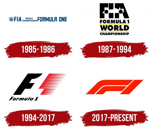
As Formula One evolved, its logos changed, adapting to new trends. If, in the mid-1980s, the wordmark was simple and blue, then bold and experimental versions began to be used. Designers placed either a stylized image of a car (1987) or the number “1” (1994) in the negative space. The emblem created by Carter Wong became legendary, but in the digital age, it was found to be unsuitable for display on small screens. At least, that’s what the new owner of the Formula One Group, Liberty Media, decided.
At their request, a new logo was created in 2017, versatile enough to be paired with various sponsors’ advertisements. However, it had one significant flaw: it turned out that the Futuro symbol (a 3M brand) looked exactly the same. To settle the dispute, it was decided that Formula One would not use its emblem for selling sports clothing and equipment.
What is F1?
F1 is a brand of prestigious auto racing competitions. It emerged as a set of rules for cars. Over time, Formula One became associated with the World Championship, although they are not the same thing. The Formula One Group, which has been owned by Liberty Media since 2017, promotes these competitions.
1950 – 1980
In 1950, the first-ever World Championship for Drivers took place. At the same time, numerous Formula One races unrelated to the official championship were conducted. Among the participants were teams from famous car manufacturers and private racers who could afford such luxury. By 1968, the FIA allowed unlimited sponsorship support, which commercialized F1. Logos from this era have not been preserved.
1981 – 1985
In 1981, the World Championship for Drivers was renamed the FIA Formula One World Championship. And in 1983, the last race unrelated to the main championship occurred as part of F1. This period is also remembered for important innovations: chassis made of composite carbon fiber and the active suspension system were developed.
1985 – 1986
In the mid-1980s, the logo contained the full name, FIA Formula One World Championship. The phrase “WORLD CHAMPIONSHIP” was reduced, split into two lines, and placed in the center – between the three-letter acronym and the words “FORMULA ONE.” All parts of the text were in dark blue and rendered in bold grotesque. To the left was the graphic symbol of the International Automobile Federation: a globe complemented by a ribbon with the white inscription “F. I. A.”
1987 – 1994
The “FIA” acronym became illegible because a white racing car was depicted directly over it. The black wheels were positioned where the horizontal strokes of the letters “F” and “A” were supposed to be. The other words acted as a three-level “pedestal.” The first line was occupied by the inscription “FORMULA 1,” the second by “WORLD,” and the third by “CHAMPIONSHIP.” Thin, horizontal yellow lines separated them. The text itself was black, with different parts varying in size: designers intentionally enlarged short words to occupy as much space in width as the longer ones.
1994 – 2017
In 1994, a distinct F1 emblem was developed. The head of the London agency Carter Wong Design depicted the number “1” in the negative space formed by a black “F” and red speed lines. Certainly, the short, pointed lines themselves resemble a unit, but according to the author’s idea, the real number was located in the empty white area. The slanted letter, as well as the speed lines, convey a sense of speed. At the bottom is a small black inscription, “Formula 1,” executed in bold italics.
2017 – today
Although the old logo had become iconic, it encountered a problem: due to its large number of details, it looked poor in the digital space. According to Sean Bratches, F1 decided to follow the lead of other global brands and simplify the symbol to adapt it for mobile device screens. Another reason for the redesign was that Formula One Group changed ownership: in January 2017, it was purchased by Liberty Media.
The creation of the new logo was undertaken by the London company Wieden+Kennedy, known for the famous Nike slogan “Just Do It.” They found that viewers see not so much the athletes in the races but the cars, while the “human” side of the competitions remains off-camera. Therefore, designers decided to focus on emotions. Initially, they did not intend to use the “F1” inscription in the emblem, but it turned out that among hundreds of options, the favorite was a symbol with the letter “F” and the number “1.”
This emblem is composed of three red stripes, two of which are curved, like a sharp turn on a racetrack. W+K employees depicted two cars racing toward the finish line. The geometric pattern conveys high speed and looks simple and sporty. Its style has a vintage echo, associated with the old era of motorsport graphics.
Font and Colors
In 2017, a new Formula One logo was introduced, and a new set of custom fonts, including F1 Regular, F1 Torque, and F1 Turbo, were developed by Marc Rouault. However, they are not used in the logo’s main version, where the brand’s abbreviated name is depicted. Both the letter “F” and the number “1” are formed by geometric shapes. The bright red color symbolizes the dynamics and speed characteristic of racing.
