The FIFA World Cup 2026 logo, unveiled in the spring of 2023, features a prominent emblem that encapsulates the spirit and international reach of the tournament. The main focal point of the design is a soccer ball, which also doubles as a globe, emphasizing the global significance of the competition. The ball sits atop an improvised splash, making it the undeniable centerpiece. Below this, an improvised pedestal carries inscriptions indicating the organizer and the type of the sports event. These inscriptions are encircled by wide green rings adorned with patterns resembling malachite. Positioned behind the entire design in a vertical white rectangle is the championship year, “26”.
The soccer ball turned globe unequivocally speaks to the universality of soccer as a sport that transcends borders, languages, and cultures. Being both a ball and a globe symbolizes the prize and the global unity that the sport promotes. This fusion indicates that the tournament is more than just a sporting event; it’s a universal gathering that carries emotional weight for fans and nations worldwide.
The improvised splash under the ball adds a dynamic element to the design. It conveys a sense of motion and excitement, echoing the bursts of energy and momentum one feels while watching a live game. It’s as if the ball has just been kicked with great force, sending ripples through the world, further emphasizing the impact of the FIFA World Cup 2026 on the global stage.
Green rings containing inscriptions and patterns serve a dual purpose. First, green is often associated with a soccer field, anchoring the emblem firmly within its sporting context. Second, the malachite pattern adds an element of luxury and exclusivity, pointing to the high stakes involved and the monumental effort required to secure the coveted trophy.
A white background and a vertical rectangle to house the year “26” imparts simplicity and clarity. The number stands boldly, representing not just a year but a milestone in soccer history that participants and fans will remember.
The FIFA World Cup 2026 emblem succeeds in representing multiple layers of meaning within a single visual narrative. Each element has been carefully selected to capture what makes the event monumental, from the ball that symbolizes both the game and global unity to the intricate malachite-patterned green rings. The logo serves as a concise yet comprehensive representation of an event that brings the world together through sport, competition, and a shared love for soccer.
World Cup 2026: Brand overview
Founded: | June – July 19, 2026 |
Founder: | FIFA |
Website: | fifa.com |
In an unprecedented move, the 2026 FIFA World Cup will be co-hosted by three nations: Canada, Mexico, and the United States. The story behind this extraordinary event began in April 2017, when the trio of countries, known collectively as the United 2026, officially presented their joint bid to FIFA to host the 2026 tournament.
By June 2018, FIFA member nations had approved the United 2026 bid as the only proposal for the tournament, given the absence of rival bids. The appeal of this collective bid lay in the pre-existing infrastructure and facilities spread across all three host nations, negating the need for significant new construction. The World Cup matches will occur in stadiums scattered throughout Canada, Mexico, and the U.S.
Sixteen cities spanning the three host countries have been chosen as match venues, with ten hailing from the U.S. and three each from Mexico and Canada. The U.S. has been selected to host both the opening match and the tournament final.
Another historic feature of the 2026 World Cup is the expansion of participating teams, rising from the usual 32 to 48. The tournament will comprise 80 matches, a significant increase from previous tournaments.
Set to commence in June 2026, the tournament’s grand finale is scheduled for July 19, 2026. The tournament is anticipated to draw millions of visitors to North America. The 2026 FIFA World Cup is already shaping up to be the largest ever in its history, uniquely hosted by three separate soccer federations. Preparations are well underway for this monumental event.
Meaning and History
The World Cup 2026 emblem is a storybook cover above and beyond its role as a mere logo. It primes us for the drama, camaraderie, and sheer athletic brilliance that awaits in the tournament. This is not just a logo; it’s a promise of the epic scale and spirit of what World Cup 2026 is destined to be.
The emblem serves as an evolving narrative. From the trophy that signifies the pinnacle of achievement in soccer to the 48 geometric shapes representing participating teams, it encapsulates the essence of what the competition is set to offer.
What is World Cup 2026?
World Cup 2026 is the 23rd FIFA World Cup, scheduled for June-July of 2026. The host countries will be the United States, Mexico, and Canada. The sports event will unfold simultaneously across 16 cities and will feature 48 teams that are members of FIFA.
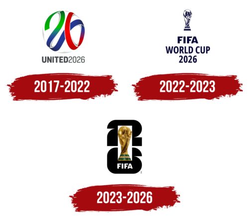
2017 – 2022
2022 – 2023
2023 – 2026
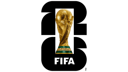
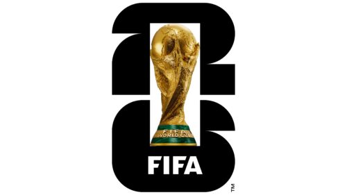
The World Cup 2026 logo takes a fresh turn by incorporating a hyper-realistic image of the FIFA World Cup Trophy for the first time. The golden statuette features two human figures holding a globe. While such a detailed image poses challenges for reproduction on souvenir merchandise, it sets the emblem apart uniquely. On the backdrop, black numbers “2” and “6” are stacked vertically. When these numbers are visually dissected into squares and quarter-circle fragments, 48 geometric shapes emerge, and the same number of teams are expected to participate in the competition.
The trophy at the forefront is not just an object; it embodies the aspirations and dreams of athletes worldwide. The human figures holding the globe symbolize global unity, an ideal that competitive sports, particularly soccer, strive to achieve. The choice to make it hyper-realistic adds an extra layer of gravitas. This is not an abstract symbol; it’s the actual prize, vivid and tantalizingly real.
The numbers “2” and “6” don’t just signify the year; they’re cleverly designed. Cut them up geometrically, and you’re staring at 48 pieces, one for each team in the tournament. It’s as if every team is a building block of the event, crucial to the whole. This design element doesn’t merely indicate the tournament date; it also tells us about its scale and inclusivity.
The World Cup 2026 logo takes a bold step by choosing an intricate image, steering away from more simplistic or stylized versions in the past. This is in sync with what is anticipated to be one of the most inclusive and diverse tournaments in the event’s history. The complexity of the trophy’s depiction makes it less suited for simple merchandise like keychains or mugs but transforms it into an artwork to be admired and discussed.
The use of black for the background numbers is strategic. Black not only complements the gold of the trophy but also infuses the emblem with a sense of gravity and importance, fitting for a tournament of this stature.