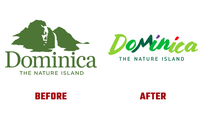
Tourism in Dominica plays an important role in the country’s economy. To ensure the efficiency and development of this sector, special attention is paid here. For this reason, the Discover Dominica Office was created, whose task is to oversee and ensure the development of tourism in the country. Starting in 2016, the Commonwealth of Dominica embarked on a new program and improved its own visual identity. This global study showed that a logo change would help meet the challenges. The new identity considers the demands of modern technology and the peculiarities of implementing visual solutions. It emphasized that Dominica and the Dominican Republic are completely different countries, as well as a more accurate and complete reflection of the peculiarities of tourist destinations in this Caribbean zone.
The new logo effectively continues the brand evolution that began four years ago. It was adapted to the use of modern digital devices. The execution technology fully meets the requirement of high-quality text and image reflection through digital technology and platforms, especially social media. The quality of images, text, color reproduction ensured the clarity and ease of handling the information transmitted in any dimensional version. As the region’s nature, its identity is characterized by naturalness and natural saturation of colors, naturalness and “pristine” typography, luxury, and an unparalleled atmosphere of warmth, hospitality, a sense of liveliness, and serenity. With this display, it is easy for the viewer to imagine being invited to a place where nature meets nurture and culture.
The text block is in a handwritten script as unique as the island itself. The letters, reminiscent of the towering Morn Trios on the island, are designed in several shades of green, characteristic of nature itself and the lush landscape covering the entire country. They ensure the formation of a memorable and easily recognizable composition through the use of accent strokes of lilac, characteristic of the local parrot, and red, the favorite color of Creole culture. Keeping the slogan – “Nature island” allowed us to significantly strengthen our position in the highly competitive global tourism market. In turn, the slogan provides a clearer transfer of the overall picture of the island, its self-determination.
And all this was done in strict compliance with the requirements of modern minimalist style, which brought the entire design into better compliance with the images and modern aesthetics, giving it flexibility and ease of perception.


