The new visual image of Maryland-based Penn-Mar Organization, Inc is a broader and more understandable presentation of its business. The service provides software support in health care for people with various types of disabilities in their development. Educational and professional, special, and developmental programs for people with disabilities of various degrees and ages living in Northern Maryland and Southern Pennsylvania. The new identity demonstrates innovation, responsiveness, and dedication to its work, confirming the well-deserved reputation. By forming a new style, Penn-Mar better reflected its tone and style, which have become more daring and simple in recent years. Thanks to continuous improvement, providing information and the programs themselves have become easier and more understandable for assimilation and use.
The merger with Change, Inc. in 2019 played a large role in the changes that occurred, which became one of the main reasons for the rebranding. This important task was entrusted to the design company Cut Once, which took advantage of this merger to create a fresh look with a stronger voice, communicating new opportunities and brand promises. Another factor that influenced the decision to change its visual identity was the fortieth anniversary of Penn-Mar. Forty years ago, an organization was created to serve 12 families, which has become a salvation for more than 400 thousand people.
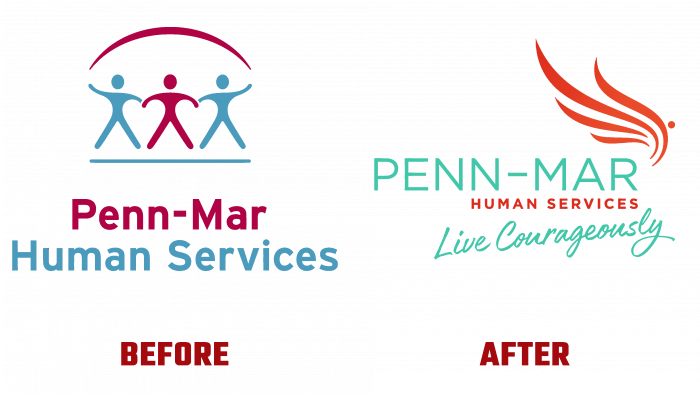
Today’s emblem is the result of the creative work of Cut Once and the employees of the brand itself, which demonstrates the integrity of the entire association – all team members, its location, and prospects for further development. The emblem and the new style were worked out for six months. The changes that took place affected the logo and the color scheme, the method of feedback and the presentation of targeted messages on the company’s website, the display of information on social networks, and all the image material accompanying the company’s activities.
The essence of the two associations was revealed in a new way. The essence was the slogan – Live Courageously, depicted in italic capital handwritten under the company name and the brand name – an open wing consisting of several elements. Its color is a gradient execution of a red hue from lighter at the bottom to dark at the top. The accent element was the name – Penn-Mar, executed in a “slender” lowercase font in a turquoise hue, in which the slogan text is presented. Immediately below it, in the color of the wing, there was an inscription – HUMAN SERVICES, revealing the essence of the services provided.


