Surrey Domestic Abuse Partnership received a new visual identity from WMH&I. The team faced a complex task. The brand is connected with domestic abuse, help, protection, trust, and confidentiality. The logo needed a symbol centered on a person and safety, with a careful presentation and a calm style.
SDAP brings together four independent charities in Surrey. The partnership includes North Surrey Domestic Abuse Service, East Surrey Domestic Abuse Services, South West Surrey Domestic Abuse Service, and Your Sanctuary. Together, they help people who have experienced domestic abuse. Their work includes counseling, refuges, helplines, specialist support, and help for different communities.
Earlier, SDAP’s shared role was less visible than the work of the individual services. People more often encountered the organization names separately, while the wider support network remained less clear. The update helps present the partnership as one unified structure.
The new logo expresses this idea concisely. A human figure appears inside large color forms, created through negative space. The image has no gender, age, origin, or other identifying traits. The neutral figure is suitable for different people facing domestic abuse.
The figure appears protected by the surrounding forms. The mark suggests an embrace, support, connection between people, and a safe space. The logo presents help as a calm, organized, and accessible system with the person at the center.
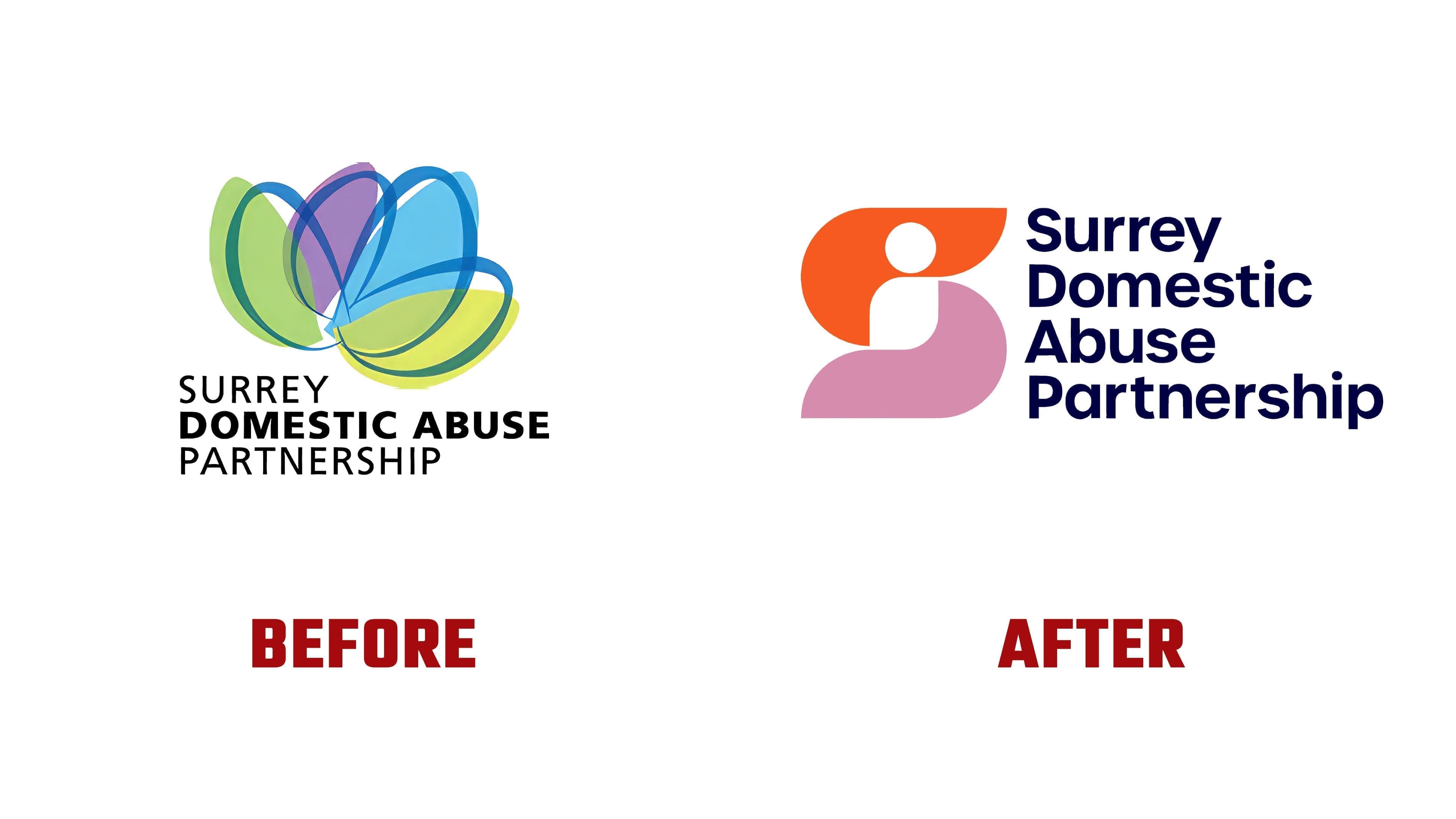
The previous logo with translucent petal shapes recalled the visual style of social projects from the early 2000s. It conveyed collaboration, but the brand’s role was less clear. The new emblem conveys its meaning more precisely. The colors became richer, and the dark blue sans-serif name feels like part of the mark.
The brand is based on the phrase “Our Differences Make the Difference.” It reflects how the partnership works. Different services bring different experiences, and together they meet the needs of people seeking help. Each person’s path through abuse and recovery is different, so support is built with flexibility.
The formula “Unique and United” helps explain the new image. The brand remains a union of independent organizations while sharing a name, a mark, and a clearer role.