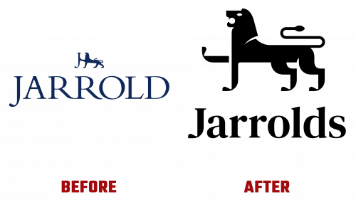
Jarrolds, a vintage family-run department store based in Norwich, has stepped into the future without forgetting its roots. Working with design studio The Click, who they have previously worked with on food and drink packaging, Jarrolds has created a brand identity that is both cutting edge and has a deep history.
What immediately catches the eye in this updated style is the Jarrolds logo, which features an updated lion. This isn’t just window dressing: the lion symbol has been part of the Jarrolds brand for over half a century and pays homage to the heraldic lions created by sculptor Alfred Hardman in 1938 for Norwich City Hall. The updated logo cleverly removes previous ambiguities: whereas previously, the lion’s paw could be confused with the letter H, the limbs are now cleverly drawn with the letters ‘J’ for clarity and brand unity.
The subtleties of the new Jarrolds logo are not limited to the iconic lion. The design team also strategically utilized modern geometric shapes and negative space to give the lion’s features and tail a more appealing look. The wordmark has also been redesigned with capital letters, and the serifed Lapture font gives it a luxurious look.
The new color scheme adds another layer to this sophisticated branding. The introduction of Jarrolds Purple and Verdigris Blue adds visual appeal and serves specific branding purposes. While purple is meant to evoke a sense of luxury, Verdigris Blue pays homage to the Hardman’s bronze lion statues and the store’s historical connection to Norwich. Moreover, these colors will be used in specific combinations – purple with white and blue with black – to provide visual clarity and versatility.
The nuances of the rebranding even extend to the store’s name. In a nod to the local community and historic naming traditions, Jarrolds has moved from various variations of the name “Jarrold” to the plural “Jarrolds,” making it more accessible and community-oriented.
The inclusion of ink-inspired artwork is a tribute to the company’s historic achievements in printing and publishing in the 19th and 20th centuries. These artistic elements will be heavily utilized in advertising and brand campaigns.
With these changes, Jarrolds reaffirms its commitment to finding a harmonious balance between its distinguished past and an ambitious, forward-looking future. Whether it is the hand-drawn “Js” in the Jarrolds logo or the ink-inspired artwork, the brand represents a masterclass in honoring its heritage and dynamism for the 21st century.


