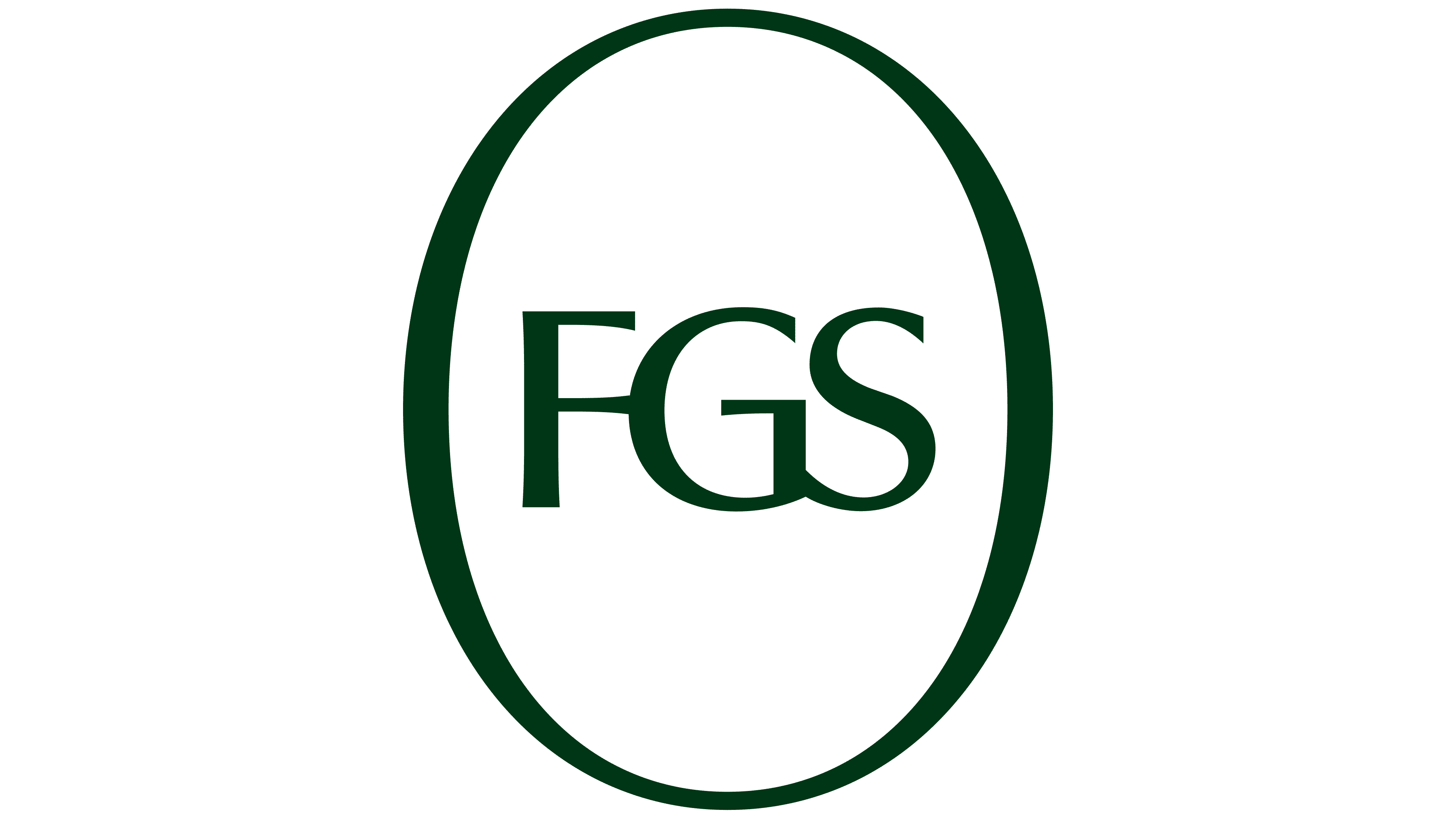
FGS Global updated its logo. Athletics handled the brand work. The new mark was introduced in April 2026.
The previous logo recalled the style of the late 2000s. The system included a dimensional symbol, a mix of different typefaces, and a dark purple color. The new version became cleaner and stricter. The separate symbol gave way to the FGS Global name.
The logo is set in uppercase letters. It uses a strict serif typeface. With this presentation, FGS Global feels closer to organizations connected with politics, law, analysis, and consulting for major clients.
The brand color changed as well. A dark green shade became the main color. It suits a field in which the brand works with businesses, government structures, and public opinion.
The update reflects the growing complexity of the company’s work. Business and government organizations are affected by geopolitics, digital processes, public criticism, and pressure from different groups. The brand needed a strict and mature look.
The company’s work remained consistent with its previous direction. It helps clients with reputation, regulation, data, artificial intelligence, and international politics. The new logo shows the brand’s readiness to work with topics that require precision, order, and coordinated action.