


Imperial Leather brought back logo details that many people had remembered for years. In the 2026 update, created by Brandon Consultants for PZ Cussons, the focus is on the crown, the red ribbon, and the new rendering of the name. The brand once again turns to its heritage, connected with personal care, quality, and the familiar image of British bath and shower products.
Imperial Leather makes soap, shower gels, bath products, and Foamburst. Over the years, the brand changed along with the market, moved away from earlier cues, and lost part of its former look. The new image brings back elements that help shoppers recognize the product’s origin and level faster.
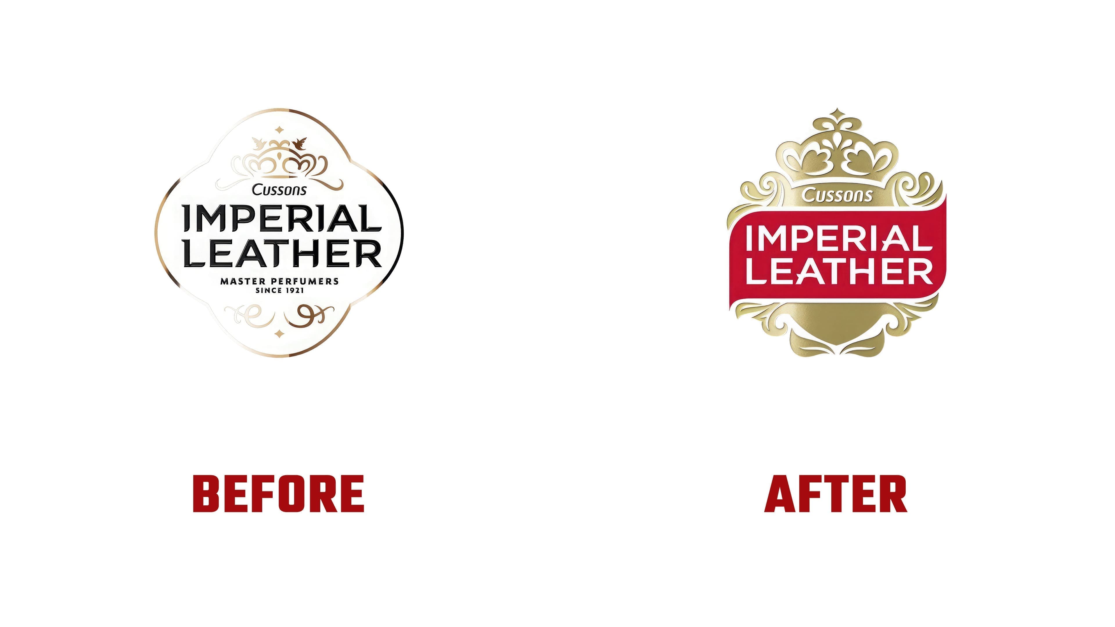
The main change in the logo centers on the crown. It has returned above the name and works as a sign of heritage and quality. The previous version looked lighter, thinner, and more in line with a fragrance aesthetic. The white-shaped label, the Master Perfumers Since 1921 line, and the fine decoration evoked classic toilet soap and a vintage shelf.
The new version looks denser and brighter. The name is placed inside a red block; the white lettering becomes the main focus, and the gold ornament around it strengthens the connection to care and the brand’s long history. The red ribbon has become a brand asset again. Red and gold against paper white help the mark look stronger on bottles and boxes.
The name was redrawn toward a cleaner sans-serif. The letters became wider and more even, while the previous thinness and dryness were removed. The typeface supports the company’s new tone while keeping a link to the brand’s classic image.
For shoppers, the new logo signals a familiar brand on the shelf. For PZ Cussons and its partners, it supports the shift toward a unified masterbrand.