


![]()
Prolaio has introduced a new brand identity, reflecting its growth in precision cardiology and its dedication to developing innovative solutions. The rebranding includes a redesigned logo and visual system to create a fresh, modern connection with its audience while staying true to its mission of advancing healthcare.
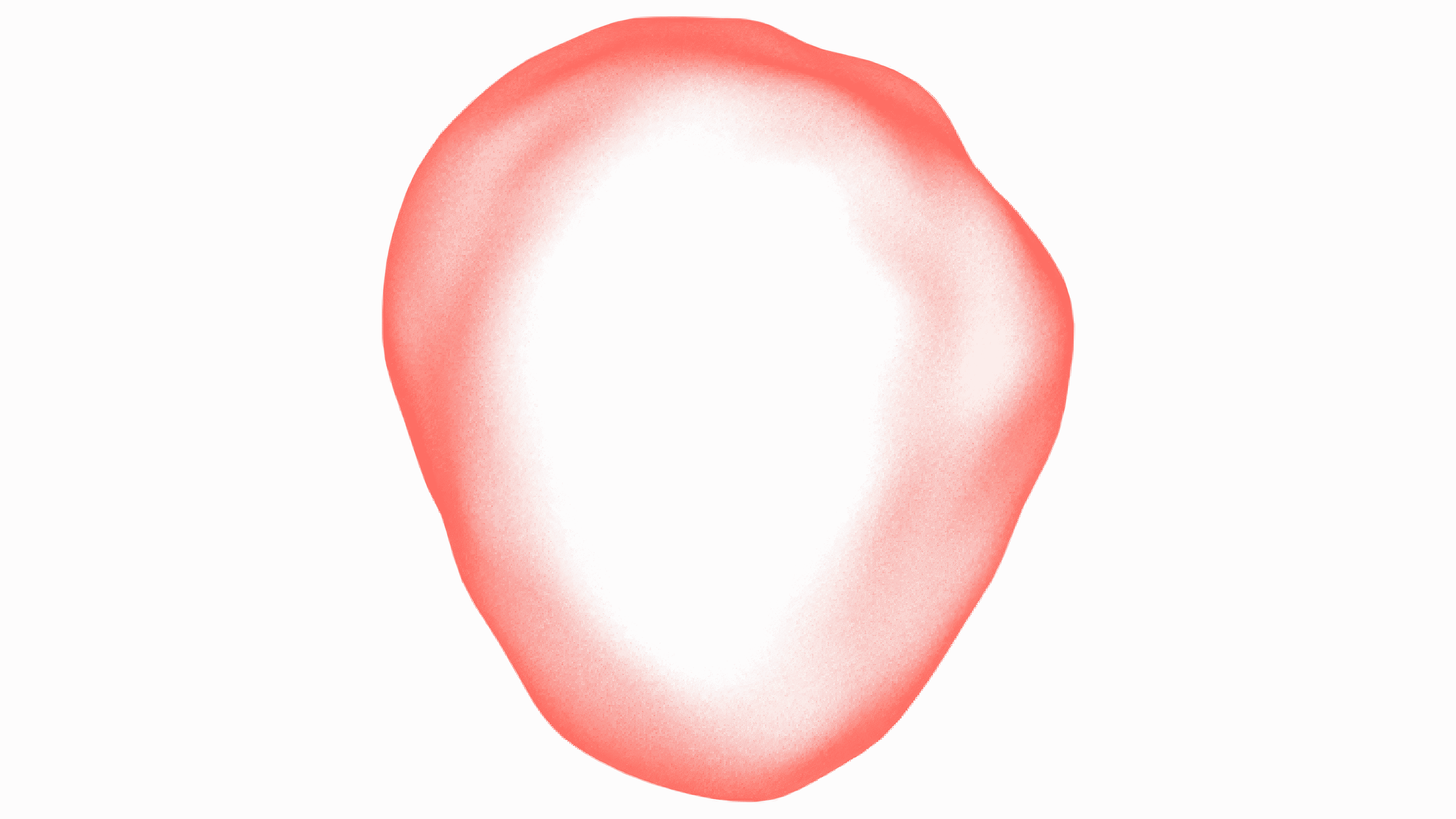
The updated logo features a dynamic, heart-shaped emblem that symbolizes the company’s focus on cardiovascular health and represents life and vitality. The heart design conveys movement and depth with its organic, translucent look and smooth gradients. It balances a stable form and a rhythmic, heartbeat-like motion, especially when animated. This element adds a human-focused dimension to the identity, aligning to transform care delivery.
![]()
The logo also includes a wordmark in a geometric sans-serif typeface. The absence of stems in the letters gives it a more casual feel, contrasting with the heart emblem’s high-tech aesthetic. Together, these elements create a modern and welcoming look, marking a departure from the previous design.
The color scheme has been revamped, focusing on bright coral. This vibrant shade communicates energy, innovation, and a focus on people. It contrasts sharply with the metallic blues of the earlier branding, which emphasized reliability and technology. The new palette offers a warmer, more hopeful tone, reflecting the mission to enhance lives through precision healthcare.
![]()
The updated visual identity extends beyond the logo to include monotone photography and heart-inspired textures. These design elements unify the brand’s materials, although some of the chosen images—like generic shots of people in unrelated settings—detract from the overall impact.
The rebranding emphasizes simplicity and innovation. The heart emblem and supporting textures highlight the dedication to scientific advancement and patient-centered care.
This new identity marks a pivotal moment for the organization as it continues to work toward making healthcare more precise, accessible, and impactful. The refreshed logo and design system underscore the organization’s forward-thinking approach while strengthening its connection with patients and healthcare providers.