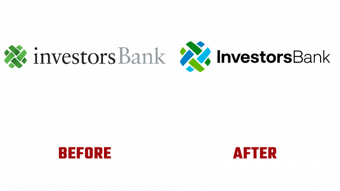
Founded back in 1926, Investors Bank as the Washington Rock Building and Loan Association, located in Short Hills, New Jersey, United States, has decided to change its own identity. Providing a wide range of financial services, and in its history, having undergone many changes, renaming and expanding offers, becoming a public company in 2014, the bank felt the need to adjust its corporate identity. Referring to the conservative structures, considering their actions sinless, the enterprise did not go for cardinal changes, allowing only cosmetic changes and additions reflecting the applied changes. Despite this attitude towards self-advertising, the brand understands the characteristics of the modern consumer, who perceives the information presented in a completely different way.
For this, changes were made to the saturation of shades and increased colors in the logo palette. The sign that forms a circle of intertwined ribbons has grown in size and acquired another color. Now the ribbons are made in dark and light shades of two colors – blue and green, which has expanded the conceptual understanding of the tasks and goals of the bank as a financial structure whose activities are aimed at the benefit of clients.
The text part of the logo has become a little smaller in size and made in a different font while preserving the traditional colors – black and gray. The saved combination of the text image in the form of combining two words of the brand name into one is visually separated by contrasting colors and execution of different types of fonts, differing in thickness. The first word is in bold with reduced tracking like Jam Grotesque Bold by JAM Type Design, instilling confidence, responsibility, and commitment. The second part of the text is in Armin Grotesk Ultra-Light by W Type Foundry; the letters are larger but much thinner, creating a sense of trust and humanity.
All letters, like colors, have acquired the clarity and contrast of their contours, which makes them easily perceived and readable in various sizes. The modern design of the logo considers the features and requirements of all methods of logo placement – both in printing and in digital, in combination with various advertising elements. Because the logo has not undergone significant changes, its memorability has remained at the same level, and its recognition has slightly increased due to an increase in image quality.


