



The new Palais club brought nightlife back to the old building on Rye Lane. The 500-capacity venue in Peckham took over a 1897 building. It was once home to the Jones and Higgins department store, and later to the Peckham Palais club, known for house and dubstep. After 2011, the space stood empty. Night Group restored it and opened Palais as a place for music, gatherings, and urban culture. The identity was created by the Manchester studio “Only.”
The main part of the new image is tied to the logo. Only drew from the building’s architecture rather than random club clichés. The name Palais is set in a Gothic style. The letters have angular forms, a dense silhouette, and a strict structure. The mark connects to the Victorian Gothic character of the facade. The club received a sign tied to a specific place.
The logo shapes the first impression of Palais before anyone even enters. It conveys a nighttime atmosphere, music after midnight, and the feeling of a place with history. Sharp lines and tight proportions translate the Gothic motifs of the facade into the image of a modern Peckham club.
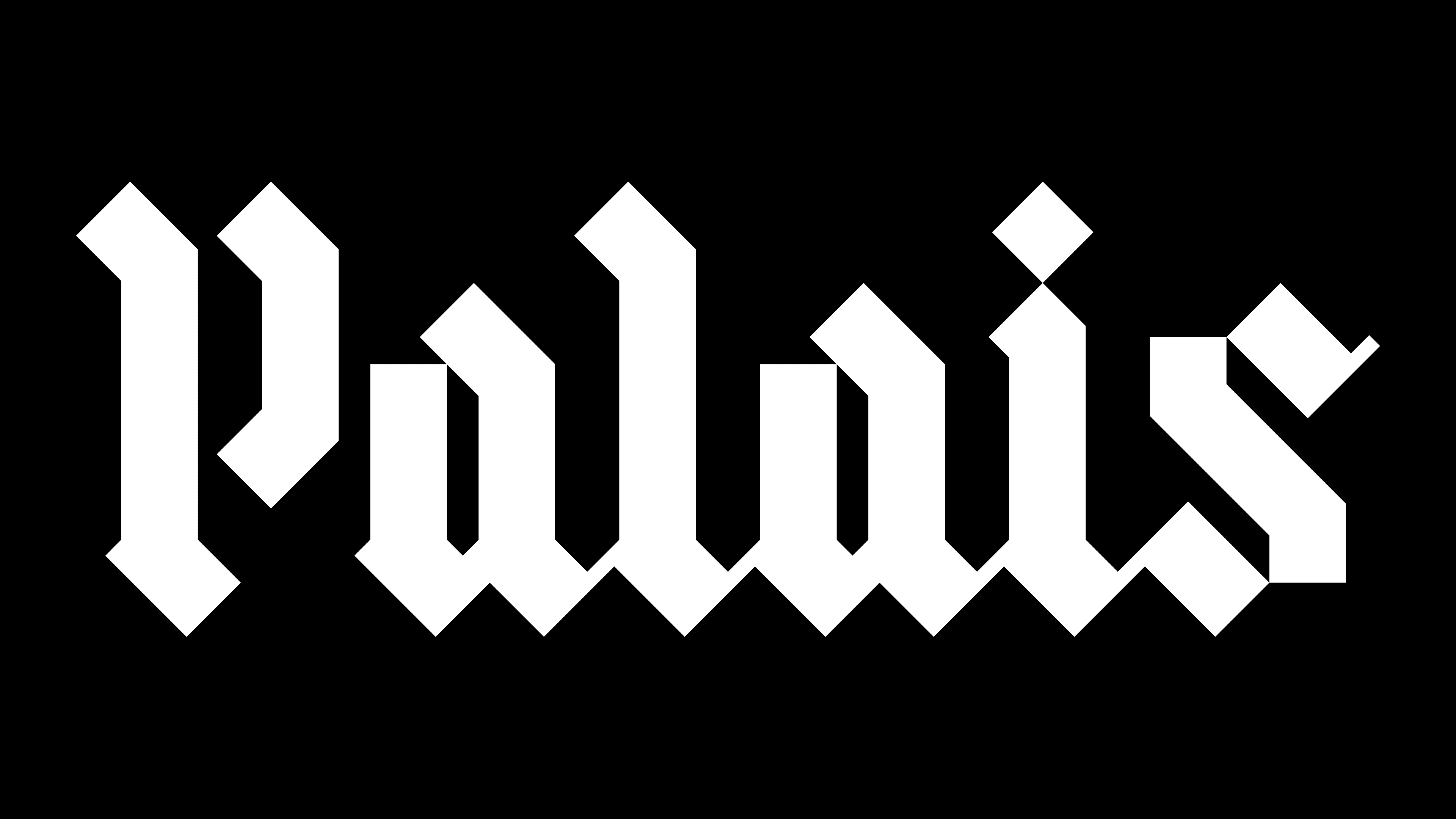
The Palais logo is connected to the idea of returning the building to the urban environment. The brand presents the old building as a living part of the neighborhood and a destination for residents. Music brings people together around a shared experience, while the name refers to the image of a palace. The wordmark connects the memory of the former venue with the club’s new role.
Palais has an additional emblem in the form of an abstract crown. It is connected to the building’s name and status, but the main role remains with the wordmark. The Gothic lettering is what holds the brand image together.
The new image of Palais is built on the connection between the building’s history and nightlife. The logo takes architectural motifs from the building, turns them into a strong typographic sign, and helps Palais begin a new chapter.