Founded 50 years ago, the Canadian Mountain Equipment Company (MEC) suffered financial losses in 2019 due to COVID. She was forced to sell her assets, including retail stores. The new owner was the American Kingswood Capital Management, which fought with MEC for each buyer for a long time. The main activity of the company was the sale of street equipment, specialized clothing. In 1971, the company was a mining equipment cooperative, which is reflected in the graphics of the new logo. Remaining a structure of a cooperative type, where everyone can become a member of a cooperative over the years, the company has more than 5 million members. In 2020, a flagship store was opened in Vancouver. This year, the company’s network includes 20 stores across Canada. The design agency Vancouver-based Hulse & Durrell developed a new image, style, and strategy.
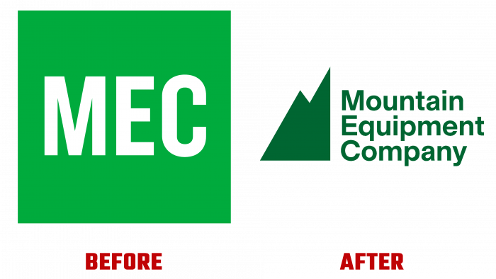
The changes made in 2013 led to the loss of the historical essence – the graphic mountain in the logo. This turned out to be ineffective and led to the loss of a whole layer of the brand’s history. As a result, the visibility has acquired a green square, which has lost the uniqueness and essence of the brand’s features. A simple green square did not play any serious role, did not evoke any associations. The return of the “green mountain” set a precedent for creating a new perception of the visual image, which became more intense and special. The mountain will now remain an important component of the logo, a graphic accent element. Her comeback is a mix of the brand’s past and new features. While the differences between the mountains between 2013 and 2020 are small, the new mountain has a stronger visual mesh, while snapping the Bezier points to the mesh is spectacular.
These features are reinforced by the Mountain Sans typeface, designed by Julien Hébertin at Montreal, which takes the company’s full name. It is lowered by one register, giving the logo a better text perception. All three words are left-aligned in the same green color as the mountain silhouette. The first and last words are the same length. Medium – Equipment is longer and very effectively reinforces the overall unity of the entire composition. Deep green is a tribute to the classic shade of workwear and equipment – backpacks, special jackets. The overall minimalist style only enhances the perception of the entire composition.


