The authentic French bakery Café d’Avignon has been operating in New York since 2017, created by the initiators of Pain d’Avignon, which has supported Michelin-star restaurants and upscale hotels for 25 years. There are already six café locations in the business city of the United States of America, which indicates a great demand and growing popularity for French gourmet pastries.
Designed by Mucca and Jeffrey Fisher.
The founders of the brand put the idea of rest, tranquility, a relaxing French atmosphere of unhurriedness, and enjoying the company’s atmosphere with real crispy bread and delicious coffee. Foods from the Old World are abundant in the assortment, making Café d’Avignon a very successful culinary experience.
Based on the conducted analytical work, strategic cooperation with the client, it became clear that the most important thing in the brand is the uniqueness of the bread itself. Softness, moisture, and the warmth of bread dough are alluring French charm, sophistication, and grace. This is a magnet for a business person rushing to work in the morning and a long-awaited island of relaxation for a tired employee at the end of the day.
Together with illustrator Jeffrey Fisher, the creative team created an eye-catching identity. And suddenly, the brand began to play with new colors, was reborn like bread just taken out of the oven.
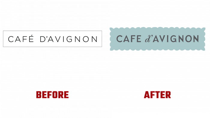
Previously, there was just a name without color shades – the name is enclosed in a rectangle, a black and white uninteresting logo.
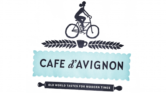
The world of Café d’Avignon is light, playful lines, a greenish-gray shade of a rectangle that does not have even edges, like a tablecloth with rounded ends. These are two fonts, with italics used for the d ‘prefix for better visual perception and emphasis.
In its current appearance, Café d’Avignon is a cozy, atmospheric, romantic corner of France, presented with all the richness of tastes and images.


