


![]()
The New York City Football Club (NYC FC) has redesigned its logo as part of its refreshed brand identity. The updated design highlights the organization’s growth and vision, including the upcoming soccer-specific stadium for Queens in 2027.
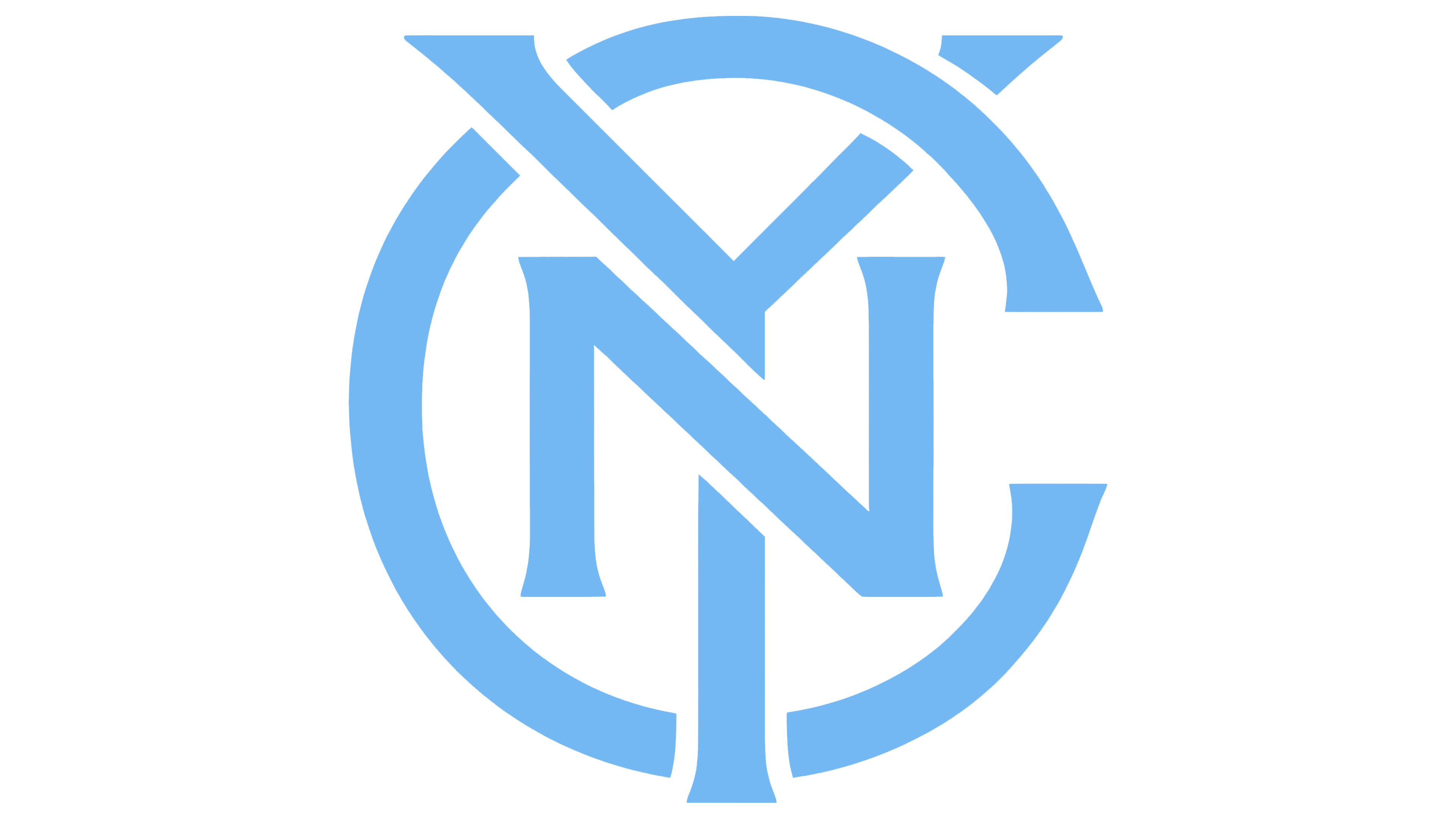
The new logo maintains the recognizable circular badge while introducing several refinements for a sleeker, more modern appearance. At its core, the “NYC” monogram has been redesigned with a flared-serif style, giving the interlocking letters a sharper and more balanced look. The adjusted alignment of the “N” and “Y” diagonals creates a cohesive composition that reflects the club’s strong connection to its city.
![]()
The outer ring has been fine-tuned to address earlier inconsistencies, such as uneven spacing and excessive gaps. The surrounding text, “New York City Football Club,” now features a custom typeface called “Local,” developed by Frere-Jones Type. With its subtle flared serifs, this font adds elegance and intention to the badge while fitting snugly within the ring for a more unified design.
The club’s signature colors—light blue, navy blue, and orange—have been enhanced for greater vibrancy and contrast. The light blue is brighter, the navy deeper, and the orange more intense, giving the badge a sharper, more dynamic appearance. These adjustments strengthen the badge’s connection to the NYC subway token, which inspired the original logo while improving visibility across various formats.
Removing the inner white ring simplifies the badge, allowing the monogram and updated colors to stand out. This streamlined approach ensures the logo adapts easily to different media while emphasizing the organization’s identity. The bold design captures the grit and pride of the city, reflecting the club’s commitment to representing New York both locally and internationally.
![]()
This rebranding comes as the organization prepares for its new stadium and aims for broader success in Major League Soccer. By modernizing its visual identity, the team underscores its role as representing New York’s energy and cultural diversity. The redesigned logo symbolizes its ambitions for the future while staying true to the vibrant spirit of the city it calls home.