Partech, a global investment firm managing €2.5 billion in assets, recently unveiled a vibrant new corporate identity. Known for its comprehensive investment strategies that combine capital with operational wisdom and strategic guidance, Partech aims to stand out in an increasingly cluttered investment universe.
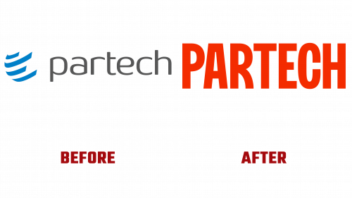
This is primarily the case with Partech’s new logo, which is a deliberate departure from its previous, often criticized, high-contrast, spur-free sans-serif font and familiar symbols. The new logo utilizes a compressed letter structure with unique elements in the letter “R,” striking a balance between familiarity and originality. Interestingly, the use of the sawtooth (¶), a symbol commonly associated with the publishing industry, introduces an element of mystery. Given that Partech’s investment portfolio is focused on technology, this choice opens the door to various interpretations.
The inspiration for this aesthetic transformation comes from the titles of French filmmaker Jean-Luc Godard’s movies, particularly “Made in U.S.A..” While such a reference may seem odd for a company with technology roots in San Francisco and headquarters in Paris, Partech claims that the raven symbolizes “the beginning and end of the story.” This is in keeping with their signature “Reliable Storyteller” style, though the concept may require a steep contextual interpretation curve for the audience.
In addition to the Partech logo, the rebranding reveals a unique color palette, including orange-red, black, and light peach hues. Combined with customized fonts FK Screamer and Lora, as well as artificial intelligence-generated illustrations, this set of visual elements allows for a unified branding across the company’s extensive portfolio. Partech’s investment activities span 220 companies across four continents and 40 countries, which required a brand identity that unified all of its extensive operations.
This bold rebranding has been met with mixed reception. Some welcomed the fresh, out-of-the-box aesthetic, while others questioned its enigmatic and fragmented nature, especially for a financial investment company. Whatever the case, the refreshed look signals Partech’s desire to become a prominent player in a field often criticized for its lack of differentiation.
Overall, while the effectiveness of the new brand, which reflects the subtle nature of a technology investment company with global operations, has yet to be evaluated, it certainly positions Partech as a company unafraid to break conventions. Whether or not the new visual style succeeds in conveying the company’s philosophy, one thing is clear: Partech is moving away from the ordinary in an effort to stand out in the world of high-stakes investing.


