Partech’s logo is a symbol of financial ingenuity and leadership. It conveys experience and expertise in an industry characterized by complexity and risk. It is a mark that reassures stakeholders that they are working with a top-tier financial organization that puts results and innovation at the heart of its business. It serves as an assurance that their capital is not only secure but also ready to grow.
Partech: Brand overview
Founded in 1982 in San Francisco, Partech began as the entrepreneurial arm of Paribas Bank. It came about through the collaborative efforts of John Sung Kim, Thomas G. McKinley, and Vincent Worms. The shift towards European technology ventures signaled the opening of Partech’s Paris branch in 1996. After becoming a stand-alone company, Partech weathered the tumultuous dot-com bust of the early 2000s and, by the end of the decade, had survived with new capital and sponsors.
During its tenure, the company has invested in more than 300 different companies in various stages of development, from nascent to expansion. Some of the company’s most notable financings include Dailymotion, EcoVadis, Kyash, and Sigfox. Partech boasts of having more than €1.4 billion in funds invested in technology ventures worldwide.
The company has recently expanded its global presence by opening bases in Berlin and Dakar. This has expanded the company’s presence in Europe and Africa. With more than 50 financial experts on staff, Partech operates globally, channeling funds into different technology sectors and at different stages of business development. After four decades, Partech is thriving with a continued commitment to supporting digital enterprises.
Meaning and History
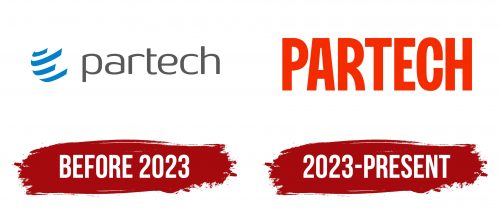
Before 2023
2023 – today
Partech, an international investment company, upon launching a franchise, required all participants to use an official logo with its name. Thus, the text logo consists of a single lettering. The letters are large, tall, and bright red in color to effectively attract attention. The font is very bold, uppercase, blocky, that is, solid and monolithic, without noticeable ligatures. The glyphs are spaced minimally apart, but this does not interfere with reading. Only the letters “P,” “R,” and “C” have rounded edges; all other symbols are angular.
The bright red color attracts attention and symbolizes energy, passion, and action, which fits well with the investment orientation of the company. The block style and monolithic appearance convey stability and trust – important features of an investment company. The slightly rounded features of the individual symbols add softness to the rigid and formal design, making it more accessible. This combination of elements makes the logo both commanding and easily recognizable.
