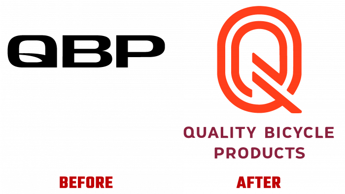
The rebranding of Quality Bicycle Products (Q), announced Thursday, promotes the brand by more accurately reflecting the company’s goals and objectives. The new logo was a reflection of a new vision and a new strategy and goals, which became a reflection of an innovative approach to joint development with partners. The challenges that the brand has been pursuing since its inception by Steve Flagg and Mary Henrickson in 1981 have helped retailers develop and succeed through the proposed solutions and selecting the most effective proposals. One of the important points of the company’s activity is connecting its partners with the necessary suppliers of raw materials, products, or services. Integrity is especially important for the company rather than the total quantity. The brand tried to demonstrate this moment in its visual identity, which is developed on its own.
In its structure and spirit, “Q” is a common thread that connects all the industry representatives – retail, suppliers, organizations and communities, employees, users, and passengers. Starting as a distributor of bicycle components, the company has gradually outgrown this direction, expanding its horizons far beyond this direction. Today the brand is showing innovation in many other ways. The rebranding process consisted of developing a new monogram, which represents the first letter of the first word of the brand name. The letter is made in the form of a stadium track symbol, where the brands’ best models of sports bikes demonstrate their qualities. The laconicism of the monogram, provided with a minimum of graphics and the absence of unnecessary visual overload, made the logo easy to remember.
Red is not just a tribute to the palette used on sports tracks but also creates the necessary accent on the logo itself, its main element – the lettering. The full brand name is printed under the monogram in mauve-gray. The color of the letters matches the color of some tires from the world’s leading manufacturers and the coating on many sports bike tracks. This combination of shades and symbols of the logo effectively reflects the essence of the company, its goals, and objectives, confirming the commitment to the quality and high level of manufacturability of the products offered.


