


![]() New York City Logo PNG
New York City Logo PNG
The round emblem, the New York City logo, demonstrates the uniqueness of the only club playing in all five boroughs of New York. The original monogram design and color palette symbolize the team’s unity and close connection with the city.
New York City FC is the first and only American professional soccer club in Major League Soccer (MLS), competing across all five New York boroughs. NYCFC became the twentieth team in the league on May 21, 2013. The team played its first match at Yankee Stadium on March 8, 2015.
MLS was interested in placing a second team in New York as early as 2006, but couldn’t find investors. In 2012, Commissioner Don Garber contacted Ferran Soriano, former Vice President of Barcelona and newly appointed CEO of Manchester City.
In 2013, Manchester City, from the English Premier League, partnered with the New York Yankees to pay $100 million for league expansion. New York City Football Club, LLC was registered with the New York State Department on May 7, 2013, and was named after its location.
City Football Group, which also owns and manages the Premier League’s Manchester City football club, is the principal investor of New York City FC and owns 80 percent of the club’s shares. The remaining 20 percent belongs to Yankee Global Enterprises (the company that owns the New York Yankees).
City Football Group is the principal investor of New York City FC and owns 80 percent of the club’s shares. The Chinese firms CITIC Capital and China Media Capital each hold a partial stake in this holding company. The remaining 20 percent belongs to Yankee Global Enterprises, which is controlled by the family and partners of businessman George Steinbrenner.
Meaning and History
![]()
Initially, the team used a temporary image of a blue circle with the inscription “New York City FC.” On February 4, 2014, it was announced that an official club logo would be selected. Originally scheduled for March 3, the voting was postponed as the Yankees vetoed one of the potential emblems for violating their trademark. Two logos, variants for New York City FC, were presented on March 10. Over four days, more than 100,000 votes were cast, resulting in the emblem selection that now forms the basis of the club’s style. The winner was announced on March 20, 2014.
What is New York City FC?
New York City FC is a professional soccer club in the USA. It participates in the Eastern Conference and competes in MLS. The team was established in 2013 and competed in Major League Soccer in 2015 as the twentieth expansion franchise. The team’s primary owner is City Football Group, which holds 80% of the shares, with the remaining 20% held by Yankee Global Enterprises.
2014
![]()
The New York City FC logo, introduced in 2014, was a temporary design used during the club’s pre-launch phase. It was one of two prototypes featured on the official website on March 20, 2014. These prototypes were presented as potential emblems of the team’s future identity.
The design of this temporary logo featured a light blue circle with text arranged in three lines: “New York City FC.” The font was simple and minimalist, emphasizing clarity and readability. The use of light blue, combined with white and dark navy, linked the logo to the colors commonly associated with New York City.
This logo was intended to represent the team until its final brand identity was confirmed. It served an informational purpose, temporarily signifying the club’s identity during its formative stage.
2015 – 2025
![]()
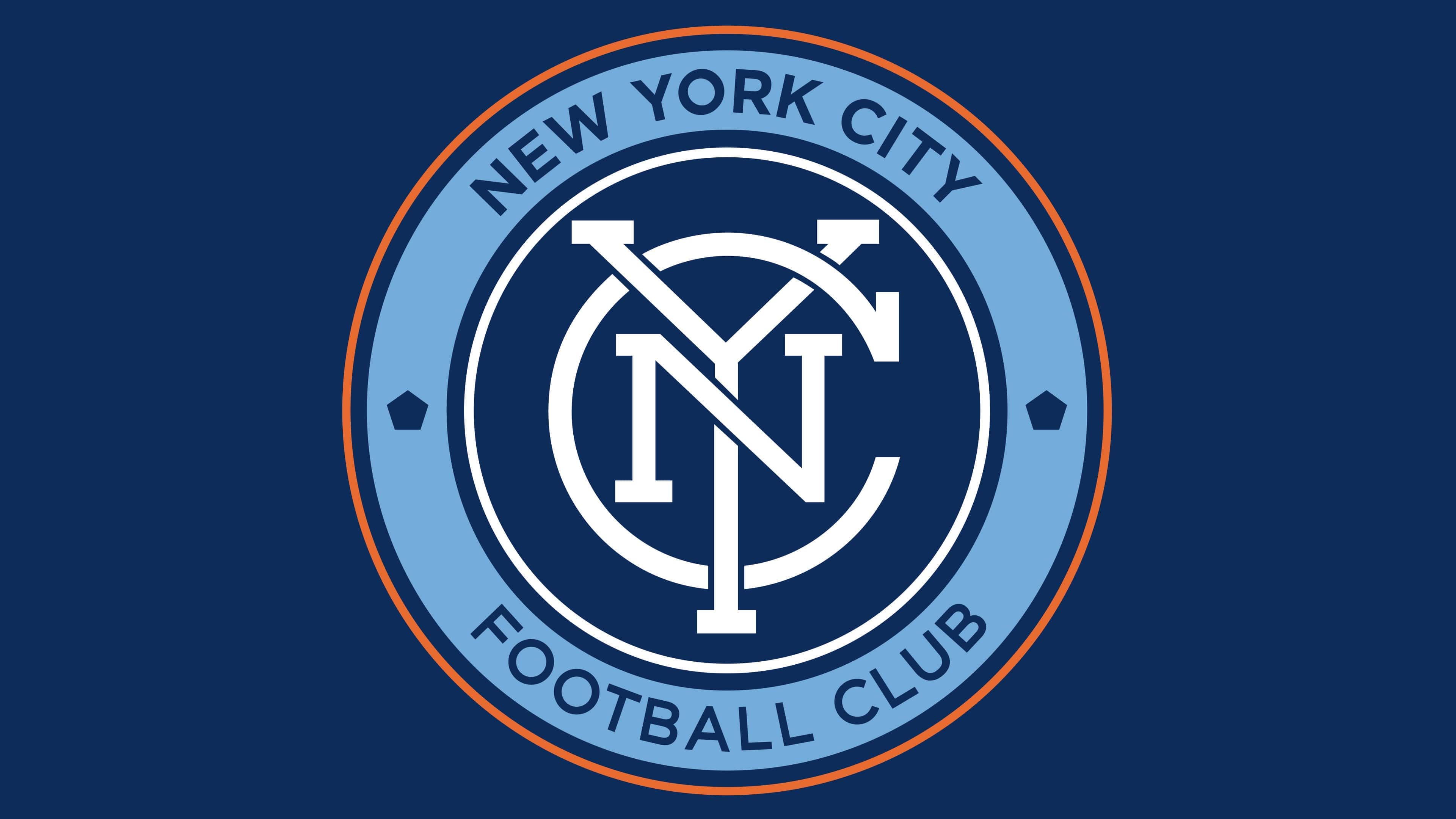
The debut logo of New York City FC reflects the club’s connection to the city’s culture and history. Its design incorporates several key elements crafted by two designers. Rafael Esquer of Alfalfa Studio created the graphic symbol, an interwoven monogram of the letters “N,” “Y,” and “C.” This monogram symbolizes the team’s unity and its integration into the fabric of New York City. Matthew Wolff was responsible for the club’s visual identity, placing the monogram at the center of concentric circles.
The circles are rendered in light blue, navy blue, and orange. These colors correspond to the official shades of the New York City flag, emphasizing the club’s ties to the city. The contrast between orange and blue creates a dynamic and memorable image.
The logo’s design was inspired by the vintage New York City subway token created by the Transit Authority in 1953. This token was used as the standard fare payment method for 50 years. The final version of the token featured a pentagonal cutout representing New York City’s five boroughs: The Bronx, Brooklyn, Manhattan, Queens, and Staten Island. This element is echoed in the club’s emblem through two pentagons on either side of the monogram, reinforcing the club’s connection to every corner of the city.
The club’s full name, “New York City Football Club,” is displayed within the wide light-blue circle. The text is set in the classic Gotham font, developed by the American type foundry Hoefler & Co. This typeface draws inspiration from urban signage typography.
The visual emblem conveys the city’s history, dynamism, and energy, strengthening the club’s bond with its fans and underscoring its status as an integral part of New York’s sports culture.
2025 – today
![]()
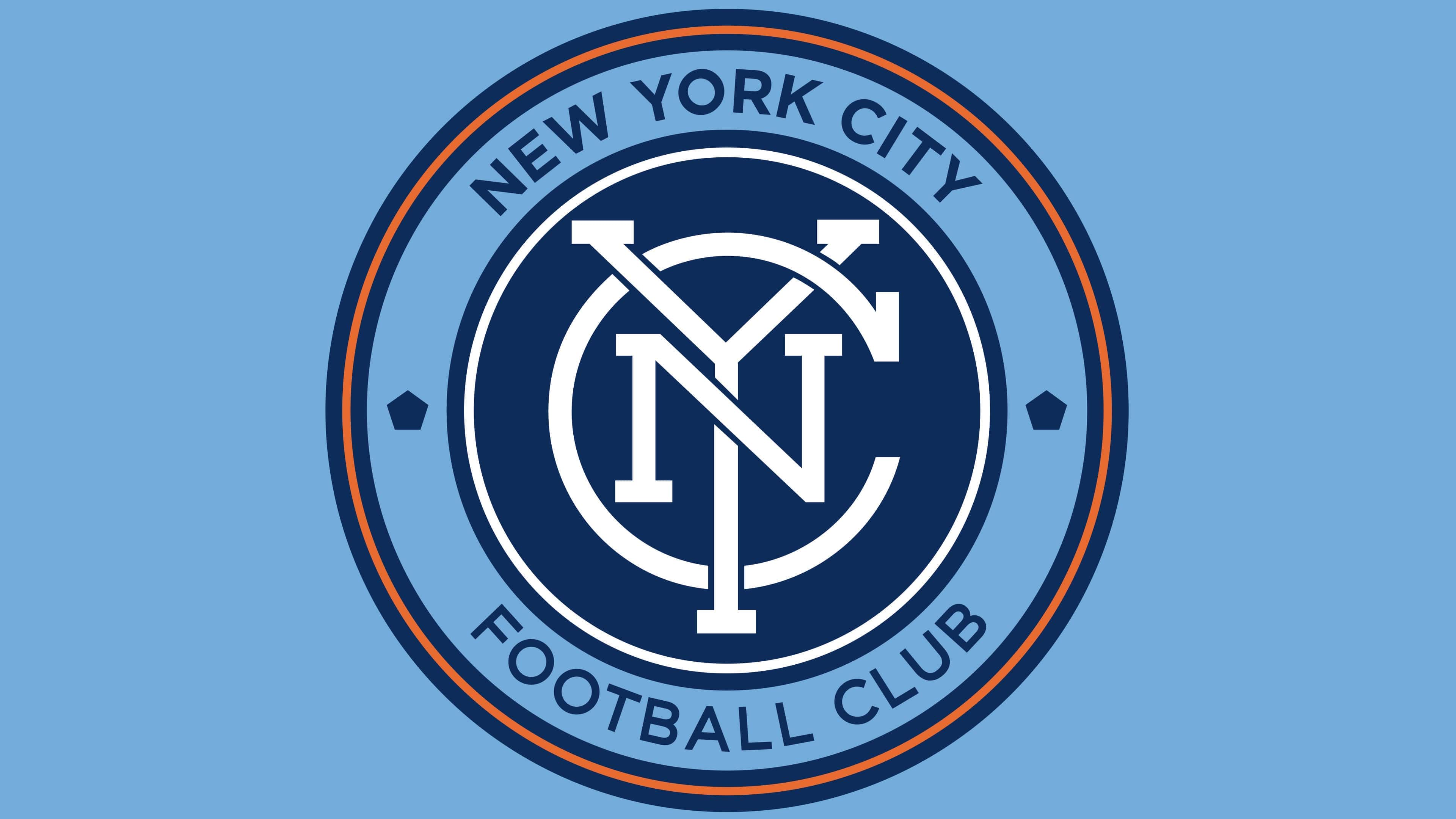
The new logo of New York City FC remains true to the original design while incorporating enhancements that give it a modern appearance. The update focuses on improving aesthetics and functionality without radical changes, ensuring continuity and respect for the club’s visual heritage.
The central element of the logo, the interwoven “NYC” monogram, has been redesigned by renowned typographer Tobias Frere-Jones. The letterforms are now thicker and more stylistically integrated with the surrounding textual elements. This enhances visual harmony and improves the monogram’s readability while maintaining its recognizability. The monogram symbolizes the club’s unity and cohesion, reflecting its connection to New York City.
The text in the logo uses a custom typeface designed by Nina Stössinger at Frere-Jones Type. This typeface draws inspiration from pre-war tiled signage in the New York City subway, emphasizing the club’s deep ties to the city’s history.
The outer rings of the logo have been updated to be thicker, adding boldness and visual balance. The contrast between the light blue and navy blue sections has been heightened, making the logo brighter and more eye-catching. The orange stripe along the edge remains, adding dynamism and energy.
These changes reflect New York City FC’s commitment to progress. The logo continues to symbolize the club and the city of New York, drawing inspiration from their history and diversity.
Font and Colors
New York City Football Club demonstrates patriotism even in small details. Tiny pentagons on its logo represent the five boroughs, and the large circle symbolizes the local subway token, reinforcing the club’s connection with its hometown. The most prominent feature is the monogram, the intertwining of the letters “N,” “Y,” and “C.” It can be considered a standalone element of the emblem, as it appeared first and was not initially placed in a circle. Due to the numerous colored rings, the image resembles a rondel, not a classical one, but rather a modern interpretation.
In the wide light-blue ring are written the city’s name (“NEW YORK CITY”) and the status of the sports organization (“FOOTBALL CLUB”). The geometric font with serifs belongs to the Gotham Medium family. It was created by Tobias Frere-Jones, an American typographer and owner of the Frere-Jones Type studio. He made the font One Hundred 100 New York, using local construction signs as references.
The color palette is also not as simple as it seems: designers tried to convey New York’s cultural and historical heritage using several colors. The logo utilizes Obsidian Blue (#28295C), Sky Blue (#78A5DB), Orange (#E76B31), and White. A similar color scheme is present on the city flag, a three-striped banner with a seal.
The only difference is that the football club emblem has two shades of blue. This allowed the image to be transformed and more colorful rings to be added, so the graphic symbol didn’t appear monotonous. Matthew Wolff took responsibility for this innovation, creating part of the logo without the monogram.