The Manchester United football club logo is distinguished by its original design, recognizability, and ease of remembrance. A striking color palette and a mascot in the form of a red devil, symbolizing the “devilish” fight for victory, enhance the visual impact.
Manchester United: Brand overview
| Founded: | 1878 |
| Founder: | Manchester United plc |
| Headquarters: | Manchester, England |
| Website: | manutd.com |
Manchester United was founded on the basis of the Newton Heath LYR football club in 1878. The management of the railway depot in the Manchester area of Newton Heath established the club. During this period, the team mainly consisted of employees of the railway company and played against teams from other departments, and in 1888, the club joined the local league.
In 1902, Newton Heath was in debt of £2,670, and creditors obtained an order to liquidate the club. Captain Harry Stafford and four local businessmen invested £500 and managed to save the team from disbandment. To mark the beginning of a new chapter in the team’s history, they changed the name to Manchester United.
Meaning and History
Newton Heath didn’t have an emblem, and even after renaming to Manchester United, the club’s logo wasn’t created. Distinctive marks on shirts at that time were mostly only made for final cup matches. As United first won the FA Cup in the 1908/09 season, the team’s first emblem appeared on the shirt for that match. It was the red rose of Lancashire.
The second Manchester United logo was based on the coat of arms of the Manchester Army Consulate and first appeared in 1948 when the team played in its second FA Cup final. The same “red devils” logo was depicted on United’s kit in the final against Aston Villa in 1957.
The period between the First and Second World Wars was unsuccessful for the team. Players didn’t participate in cup finals, so no logos appeared on the shirts. Only 39 years after the first FA Cup triumph did Manchester United reach the final again, where they defeated Blackpool 4:2. The Manchester coat of arms became the club’s emblem, depicted on the shirt in that match.
The Manchester emblem features a ship, and this attribute has appeared on all “red devils” logos. Why exactly a ship? Manchester is one of the main port cities in England. The Manchester coat of arms is done in red and yellow tones, and these historical colors have carried over to further club emblems.
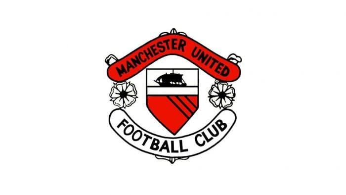
In the 1960s, logos were not as common for every team as before. Manchester United invited artists who developed outlines very close to the current Manchester United logo.
Only the ship and color palette were preserved from the Manchester emblem. There was the name “Manchester United” and below it “Football Club”. According to team historians, the logo was inspired by the antics of Matt Busby’s team. For several months, Manchester United had a rather ambiguous red-black crest, though it didn’t last long.
In 1970, the image of the devil replaced the yellow-red diagonal stripes on the Manchester United logo. Long before the club’s emblem was updated, the team was called the “Red Devils.” The team owes its nickname to the famous Sir Matt Busby. He was inspired by the nickname of the rugby team “Salford City” and decided to apply it to Manchester United. The new nickname was splendid and even earned the right to be on the logo.
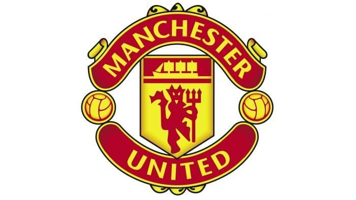
The modern Manchester United logo appeared in 1998. It wasn’t much different from the previous one. As a result of a minor “cosmetic repair,” the inscription “Football Club” was removed, and the word “United” was placed at the bottom. The inscription on it was compressed horizontally and added a black outline.
For a long time, Manchester United didn’t have a consistent emblem. During the final matches of the F.A. Cup, players wore shirts with the image of the Lancastrian Scarlet Rose. Then – with the city’s emblem. Everything changed when Matt Busby suggested playing the nickname “Red Devils” in the symbolism. He hoped it would intimidate opponents.
What is Manchester United?
Manchester United is a professional football team from Great Britain based in Greater Manchester. This sports club is one of the oldest in the country, founded in 1878. Its current name was adopted in 1902, before which it was called Newton Heath LYR. Today, the team competes in the Premier League. Home matches and training take place at Old Trafford (since 1910).
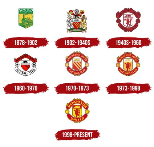
1878 – 1902
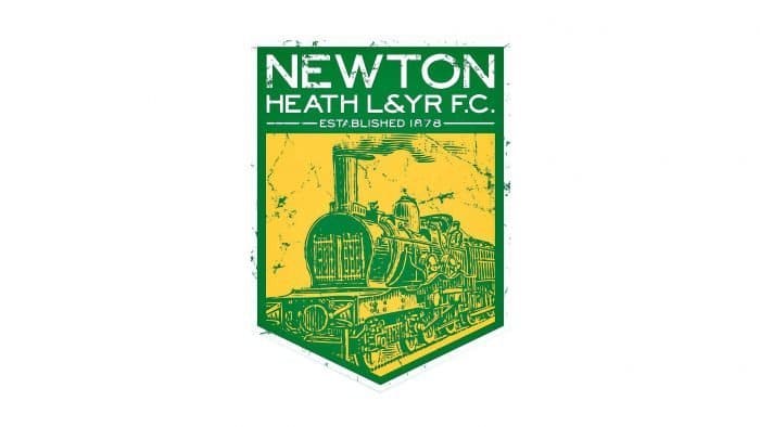
A train is drawn on a green and yellow shield because the club’s founder was the railway management of Manchester’s Newton Heath, and among the players were railwaymen. Above are the team’s name (“Newton Heath L&YR F.C.”) and the founding year (“Established 1878”).
1902 – 1940s
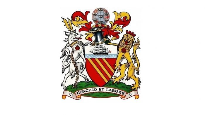
At the turn of the century, Manchester United used the emblem of its hometown as its logo. The main elements of the emblem are a shield with three yellow stripes, a ship, a heraldic hoof of a wolf with moose horns, a lion, bees, a knight’s helmet, and the motto “Concilio Et Labore.” Manchester City had the same club badge.
1940s – 1960
In the mid-20th century, the team got a new emblem officially introduced in 1948. It features a rectangular shield with a sharp base divided by a horizontal line. In the top part, there’s a ship – a symbol of city trade. Below is a devil, reflecting the nickname “Red Devils.” To the right and left are footballs. The balls are placed between semi-circular frames with the inscription “Manchester United Football Club” on them.
1960 – 1970
In the 1960s, the club changed its logo, inspired by the city’s coat of arms. Instead of the devil on the shield, three diagonal stripes appeared. Instead of balls, flowers were drawn. They are white, like the Yorkshire roses, although Manchester is located in Lancashire.
1970 – 1973
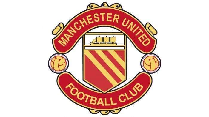
The version of the emblem used before 1960 was restored. Three yellow lines cross the lower part of the shield, as in the city’s coat of arms. The design predominates in red and yellow tones.
1973 – 1998
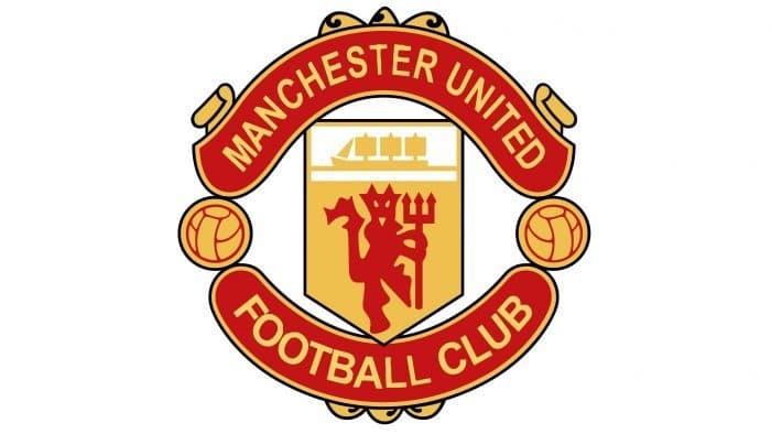
In 1973, the shield on the emblem became yellow. A red devil with a trident reappeared on it.
1998 – today
Shortly before the new millennium, the inscription “Football Club” disappeared from the logo. It was replaced by the word “United,” which was supposed to make the brand more international. Fans didn’t like this decision, so team owners Avram and Joel Glazer promised to consider restoring the old logo.
The lettering on the 1998 Manchester United logo is done in a sans-serif font, roughly similar to ITC Stone Sans SemiBold. This sans-serif font was created by American typographer Sumner Stone while working at Adobe. The palette of the emblem fully replicates the official colors of the professional football club: black (#000000), gold (#FFE500), and red (#DA020E). Each of them has a rich shade.
Manchester United: Interesting Facts
Manchester United is a famous soccer team that’s known all around the world.
- How It Started: The team was started by some railway workers in 1878 called Newton Heath LYR Football Club. In 1902, they changed their name to Manchester United because they were having money troubles, and things started to pick up.
- Their Home: They have played at Old Trafford since 1910. It’s a big and famous stadium, but it was damaged during World War II and had to be fixed up again by 1949.
- Winning A Lot: Manchester United has won more English league titles than any other team. They also have many FA Cups, League Cups, and Community Shields.
- Champions in Europe: They’ve won the UEFA Champions League a few times, a big deal in Europe. The first win 1968 made them the first English team to do that.
- A Sad Time: In 1958, there was a plane crash called the Munich Air Disaster. Twenty-three people died, including eight players from the team. They had a tough time but managed to come back strong.
- Sir Alex Ferguson: From 1986 to 2013, Sir Alex Ferguson managed the team, which won many titles, including 13 Premier League titles and 2 UEFA Champions League titles.
- Famous Young Players: The “Class of ’92” is a group of players who came from the team’s youth academy and became important for the team. This includes players like David Beckham and Ryan Giggs.
- Fans Everywhere: Manchester United has fans worldwide, making it one of the most supported teams in the world.
- Ahead of the Game: They were among the first soccer teams to participate in the stock market. They’re known for doing business in new ways and have many partners and fans worldwide.
- Big Buys and Sales: The team is known for spending a lot of money to bring in new players and selling players for a lot.
Manchester United has come a long way from its beginnings to being a huge name in soccer, thanks to many wins, overcoming challenges, and always trying to be the best.
Font and Colors
The Manchester United emblem features a red devil, more resembling a clot of blood. This reflects the club’s old nickname – “Red Devils,” earned by the players because of the color of their uniform. The mythical creature appears as a comical cartoon character, speaking more to self-irony than an attempt to intimidate opponents. The evil spirit stands on one leg, holding a spiked trident in its hands.
Designers also didn’t forget the city’s symbolism: the shield with a ship clearly reminds them of Manchester’s state coat of arms. This is quite expected since, until the 1940s, the team used it as an emblem. In the 1960s-1970s, an attempt was made to bring the logo design closer to the original, for which the developers removed the devil and replaced it with diagonal lines. However, the modernization was not successful because the “Red Devils” were very attached to their nickname.
As a result, the cartoonish little devil with a trident once again took its rightful place in the lower half of the shield and never disappeared again. There are two more elements without which the Manchester United emblem would be incomplete – footballs. They are part of the decorative framing.
The emblem features the inscription “MANCHESTER UNITED.” The neat font with serifs resembles ITC Stone Sans SemiBold, created by American graphic artist and typographer Sumner Stone. It has the same uneven, thick lines, rectangular edges, and smooth rounding.
The club remains true to its traditions: since 1970, all emblems have necessarily included red, yellow, white, and very little black. The last three versions differ from each other in shades. For instance, the current emblem’s palette includes bright red (#DA291C) and lemon yellow (#FBE122). Moreover, these colors have a slight gradient.
Manchester United color codes
| Maximum Red | Hex color: | #da291c |
|---|---|---|
| RGB: | 218 41 28 | |
| CMYK: | 0 81 87 15 | |
| Pantone: | PMS Bright Red C |
| Cavendish Yellow | Hex color: | #fbe122 |
|---|---|---|
| RGB: | 251 225 34 | |
| CMYK: | 0 10 86 2 | |
| Pantone: | PMS 108 C |
| Black | Hex color: | #000000 |
|---|---|---|
| RGB: | 0 0 0 | |
| CMYK: | 0 0 0 100 | |
| Pantone: | PMS Process Black C |
