


![]() Blackburn Rovers Logo PNG
Blackburn Rovers Logo PNG
The Blackburn Rovers logo reflects the character of the team from Lancashire and its connection to the history of its hometown. It conveys the hard work and fighting spirit of a club accustomed to achieving everything through perseverance and fair play.
Blackburn Rovers were founded in 1875 after a meeting of local school graduates at a Blackburn hotel. Unlike many early football teams, the club was not linked to a church and did not emerge from a cricket side after the summer season. At first, the players financed everything themselves. During the first year, they raised £2.40, enough to buy a ball for 75 pence and goalposts for 44 pence.
The first playing field was built by the team itself. The players marked the lines by hand, while part of the ground included a water pit used for cows. A barrier was covered with boards, soil, and grass so matches could be staged. Because of such rough conditions, Blackburn changed grounds several times before settling permanently.
In 1890, the club acquired Ewood Park, which remains its home. Blackburn Rovers were among the founders of the English Football League, joining 11 other clubs to create it, and remained one of the stronger sides in English football until 1936.
The name Rovers reflected a wider football naming tradition of that period and was associated with the idea of progress toward victory. The club is also known as the Riversiders because Ewood Park stands near the River Darwen. Another nickname, the Blue and Whites, comes from the team’s traditional colors, which have remained largely unchanged for more than a century.
Meaning and History
![]()
The Blackburn Rovers club is a proponent of historical traditions. Over the past century and a half, the club has changed its logo only a few times. Moreover, three of them are similar in style and differ only in color design.
What is Blackburn Rovers?
It is a professional football organization. Founded in the UK in 1875, it currently competes in the English Football League Championship. The club was incredibly successful at one time, winning several championships and cups.
1875 – 1878
![]()
The blue Maltese cross on the football team’s emblem is connected to the history of its founders, John Lewis and Arthur Constantine. Both studied at a public school associated with the Order of St John. The order’s symbolism was part of the school environment and later carried over into the club’s identity, symbolized by a cross with sharp points.
The logo is a flat, blue shape with no decorative elements or sense of volume. A single rich shade of blue is used throughout. The image is based on a simple form and a strict visual approach.
The cross is built on symmetry. Four equal arms resemble elongated triangles with slightly concave sides. All arms meet at the center, forming the intersection of a vertical and a horizontal axis. The origins of the symbol, linked to the school’s past and the founders’ biographies, cemented the emblem’s sense of continuity and the team’s roots.
1960 – 1974
![]()
Blackburn Football Club reached the 1960 FA Cup final with an updated emblem connected to regional history and local traditions. The logo is a shield that features civic and territorial symbols.
The shield is divided into three sections. The top area is green, with two brown diamonds on either side. Between them is a white hunting horn with a strap and a cross. The middle section is white. On the sides are two bees with yellow-and-black stripes and elongated wings. The lower section is separated by a dark, wavy line, below which another bee of the same type is shown.
Around the shield is a symmetrical ornament made of green and brown scrolls. At the bottom is a ribbon bearing the motto ARTE ET LABORE, set in large sans-serif letters. Above the shield, a dove holds a green branch in its beak. It stands on a base resembling a cluster of rounded stones. The bees refer to the region’s working traditions, the hunting horn to local customs, the motto to the value of skill and labor, and the dove to a theme of peace and calm.
1974 – 1989
![]()
In 1974, Blackburn Rovers introduced a new emblem featuring a red rose. The motif was taken from the historic flag of Lancashire. The rose is well known in English heraldry during the period of dynastic conflict and has become an integral part of regional symbolism.
The flower is shown flat, without shadows or volume. The petals are colored a deep red and outlined in black. They are arranged in two layers, with larger outer petals and smaller inner ones.
At the center is a blue circle with yellow dots marking the core. Small green elements are added around the edge, including leaves and sepals. Below the rose is the club’s abbreviation, B.R.F.C., in large sans serif letters that match the color of the petals. The entire emblem emphasizes the team’s connection to Lancashire and its historical heritage.
1990s
![]()
A club emblem often tells more about a team’s past than a list of trophies. During the 1990s, Blackburn Rovers adopted an updated badge that linked the club’s history to Lancashire.
The emblem is centered on a circular shield with a red rose. The flower is slightly turned to the left, with mild asymmetry. The petals are bright red with a black outline. The leaves are deep green with yellow veins and sharp edges. The stem is slightly curved and shifted to the right. Even with a simplified drawing style, the rose appears full and lively.
Around the flower is a blue ring with the inscription BLACKBURN ROVERS F.C. The text is set in an orange sans-serif typeface. On the lower sides are the numbers 18 and 75, which together form 1875, the club’s founding year. At the bottom is a ribbon with the motto ARTE ET LABORE. The phrase, which translates as “skill and diligence,” is associated with the club and appears on the city’s coat of arms. The ribbon is white, with an orange line along its edge that echoes other elements of the emblem.
1990s – today
![]()
In the early 2000s, Blackburn Rovers updated the logo while keeping its key motifs. The red rose remained the central element, but the design became brighter and visually simpler.
The Lancashire rose received a more saturated color and more generalized forms. The red bloom is shown larger, with black outlines enhanced by yellow strokes. The leaves and stems are green with yellow veins. The foliage became heavier, and the overall drawing looks more vivid.
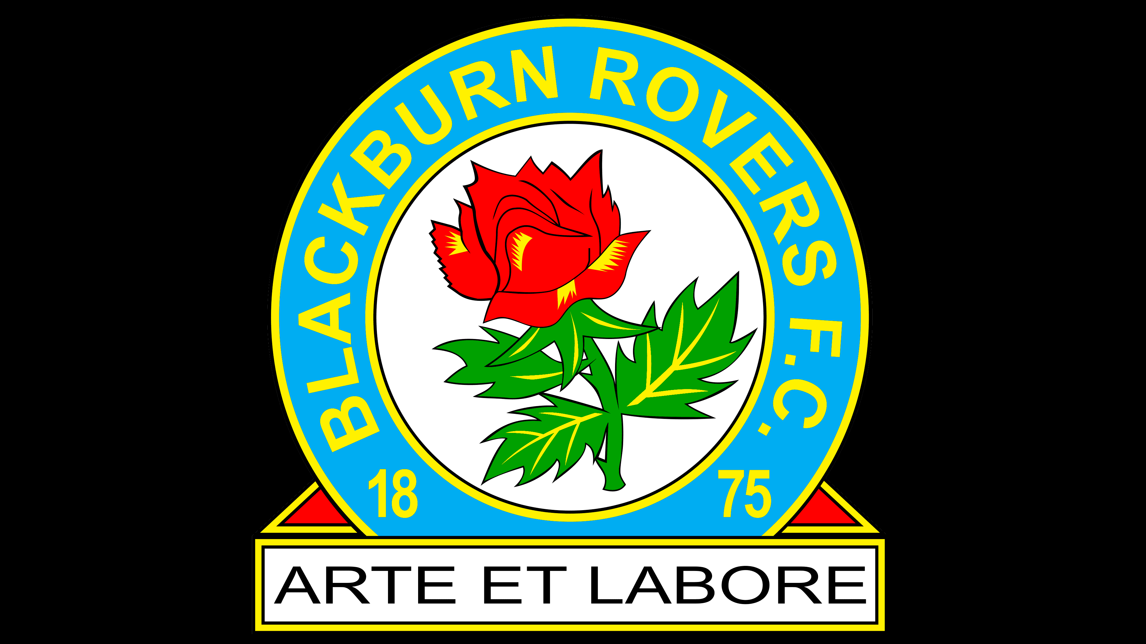
The blue ring around the flower shifted to a lighter shade. At the top is the inscription “BLACKBURN ROVERS F.C.” and, on the sides, the numbers 18 and 75, which together form 1875. The letters and numbers are set in uppercase characters and colored yellow. The ring is outlined with a double line, a yellow inner line, and a black outer line.
Below the circle, the ribbon with the motto ARTE ET LABORE was retained. The ribbon has a white background with dark lettering, and its outline matches the circle’s outline. The motto dates back to Blackburn’s civic symbolism, long before the club was founded in 1875. The name “Rovers” refers to an early period in the club’s history, when the team did not have a permanent ground and played matches at various venues. The rose recalls Lancashire, the traditions of the House of Lancaster, and the 15th-century conflict known as the Wars of the Roses.
Font and Colors
The modern club graphic features a white circle enclosed within a blue ring, outlined by two yellow lines. But this is just the base that gives it a classic shape. Other elements are responsible for the meaningful part. For example, a red rose is placed in the circle, symbolizing the House of Lancaster and the county of Lancashire. On the inside of the ring are the words “Blackburn Rovers F. C.”, “18,” and “75”. This phrase is the full name of the team. It is believed that the players received their nickname before they had their own football field.
The numbers add up to “1875,” the year Blackburn Rovers made their debut. Below is a white rectangle inscribed “ARTE ET LABORE.” The club now uses this phrase as its official motto, but it was previously the emblem of the City of Blackburn. It can be translated as “Skill and Diligence” or “By Art and Labor”.

All logos use a grotesque sans-serif font. It’s called Helvetica Bold and was first published by Linotype AG. Its authors are typographers Max Miedinger and Eduard Hoffmann.
The emblem looks harmonious in terms of color combination:
- The circle is neutral white.
- The ring is pastel blue.
- The inscription is restrained yellow.
- The contours are thin and black.
Against their background, the red rose with a green stem and leaves looks excellent. It turns out that the drawing is not overloaded with bright elements; at the same time, all attention is focused on the important flower for Lancashire.