The simple yet memorable “Juventus” logo symbolizes the path to victory, a journey that professional footballers must undergo to become famous. The emblem also references one of the team’s old nicknames. The minimalist style speaks to a desire to keep up with fashionable trends.
Juventus: Brand overview
| Founded: | 1 November 1897 |
| Founder: | Agnelli family |
| Headquarters: | Turin, Piedmont, Italy |
| Website: | juventus.com |
Juventus (full name Juventus Football Club, abbreviated as Juve) is a professional football team from the Italian city of Turin, founded in 1897. It is the most titled in Europe, owned by the Agnelli family, and managed by Maurizio Sarri.
On November 1, 1897, 13 students from the Turin D’Azeglio Lyceum sat on a bench between the lawns of King Umberto and Prince Victor Emmanuel. And they came up with the idea of organizing a football team. In their language, it sounded like “Calcio Fiorentino.” The club was named in their honor – “Juventus.”
But there was a dilemma with the headquarters: they had nowhere to gather together. Twenty-year-old Eugenio Canfari proposed using his parent’s bicycle repair workshop for meetings. He also went down in history as the first president of “Juventus.”
Turin translates from Latin (Taurus) as “bull.” This horned creature “stamped” itself a place on the capital of Piedmont’s coat of arms and the club’s emblem. And in the year of the Bull, in 1985, “Juventus” won the first of its two Champions Cups. In the bloody final at “Heysel,” where 39 fans died, the Turin side beat “Liverpool” 1:0.
Speaking of the color of the players’ uniforms, the “Juventus” team started playing in pink shirts. In 1903, the factory mistakenly made black-and-white shirts instead of pink. But there was no time or money to make new ones, so it was decided to leave the defective ones for the next 112 years. According to another version, they abandoned pink because it didn’t withstand washing. Englishman John Savage (one of the team members) brought the black-and-white stripes from “Notts County.” Thus, the oldest currently playing club in the world turned “Juventus” into “bianconeri.”
For many years, the “Juventus” emblem featured a zebra, and the team’s players were also called “zebras.” But the most popular was the nickname Vecchia Signora (“Old Lady”), received, according to legend, from “Torino” fans. In the 1930s, teenagers played in shirts a couple of sizes too big, which created a hump in the wind. That’s why they were called “old ladies.”
Meaning and History
A bright, recognizable emblem has always distinguished the legendary European football team. It’s unified with its visual appearance and reflects its spirit, essence, and individuality. The logo was developed in 1905, but its original version and original color palette have been preserved. At the same time, it has changed several times.
The 2004-2007 “Juventus” logo featured an oval shield with seven vertical stripes inside: three black and four white. The upper part of the emblem had a dark “Juventus” inscription on a light background. The fierce white “Bull” from the lower part of the emblem, a symbol of Turin, was placed on a dark background and adorned with a black crown. The golden stars were removed since they were considered the domain of sports results, not an element of club individuality.
In 2012, “Juventus” removed the stars from the logo. On principle, since 2 of the club’s 33 scudettos were deemed to have been bought.
In mid-January, “Juventus” presented a new logo. It’s pointless to try to find any parallels and connections with history. Now, you won’t find a bull, zebra, or shield there. Fans are shocked by the new “Juventus” logo. However, the club’s management insists that the new logo will make “Juventus” a real club. Allegedly, “Juventus” should now not only be associated with Turin, but in reality, this is quite a controversial decision. Only time will tell whether the “Old Lady” will benefit or not.
What is Juventus?
“Juventus” is an Italian football team competing in Serie A (the top division). It ranks sixth in Europe in terms of the number of confederation titles won. The club is located in the city of Turin, where it was founded by a group of students in 1897. The football club’s uniform is adorned with black and white stripes, which have predominated since 1903.
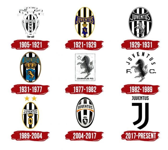
1905 – 1921
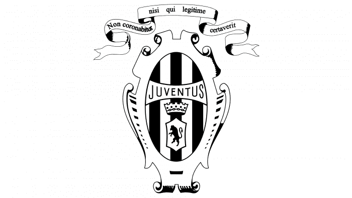
The initial version resembles a heraldic sign. It’s a vertically striped oval with a bull standing on its hind legs, above which, on a white background, is depicted a large crown and the inscription “Juventus.” The central figures are surrounded by curved elements in the shape of goblets. Above them is a stylized ribbon with the Latin motto “Non coronabitur nici qui legitime cartaverit.” The primary colors of the logo are black and white.
1921 – 1929
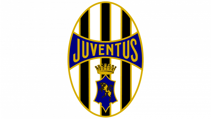
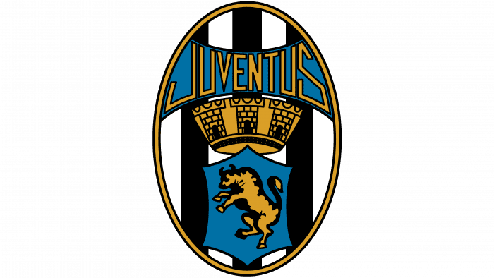
This period features a colored emblem. Designers removed the excess details, focusing on an elongated vertical ellipse. All elements received a dark yellow outline. The second emblem’s designers simplified it, removing everything but the oval and its elements. The contours, letters, crown, and bull are now golden, and the geometric shapes are blue. Notably, blue has a significant meaning for “Juventus,” as the bull depicted on the city’s coat of arms.
1929 – 1931
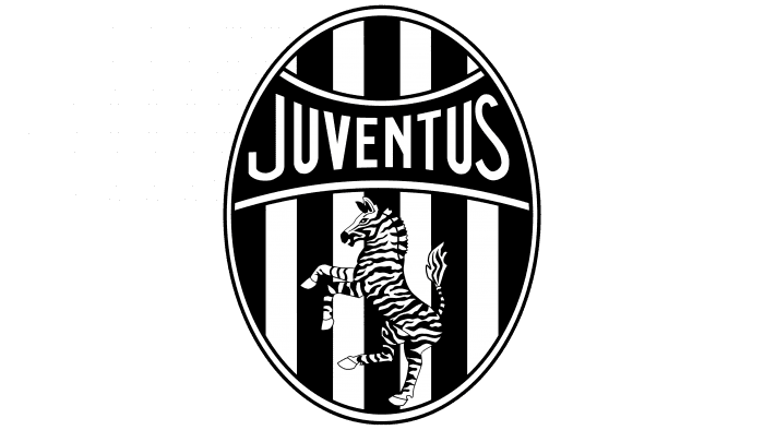
Almost all emblems used before 1970 are similar in structure. But the 1929 version was an exception. Italian journalist Carlo Bergoglio suggested replacing the Turin bull with a zebra to reflect the club’s unofficial nickname – Le Zebre. Designers listened to his idea and made minor adjustments. In 1929, the athletes returned to a monochrome black-and-white version of the logo, replacing the central bull with a zebra. The striped animal on the striped background looked unique and striking, so at that time, the team received the nickname Zebras.
1931 – 1977
After many years of the zebra’s presence on the logo, it was finally removed, replaced with a powerful, energetic bull with massive tufts. It stands on its hind legs, extending its head forward with sharp horns. Designers also enlarged the crown, giving it the appearance of an impregnable fortress wall, and changed the style of the letters, making them geometric. The developers abandoned the typical font and invented their own. The elements that were goldish-yellow in 1921-1929 are now light brown.
1977 – 1982
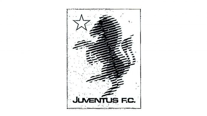
The stereo logo belongs to this period. It looks like a stereo, with blurred outlines that seem to overlap each other. Above the horse with a bull’s tail is a white five-pointed star, and below it is the inscription “Juventus F.C.,” formed from the football club’s full name “Juventus.”
1982 – 1989
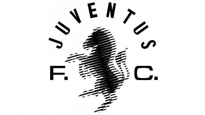
The developers changed the proportions of the logo elements. The horse became smaller. The animal is surrounded by the team’s name, with the letters “F” and “C” located to the right and left of the central stereoscopic figure.
1989 – 2004
After a slight modernization, the emblem returned to its roots. The crown is almost the same as on the 1905-1921 emblem. The bull is also similar to the old version, but the artists changed its shape, so it’s difficult to determine what animal it is by silhouette. A golden line runs along the outer contour, making the graphic sign similar to the 1921-1929 version. Two five-pointed stars, which were previously to the left of the zebra, are now positioned above the oval shield.
2004 – 2017
The new club emblem was developed by specialists from the agency Interbrand. They tried to create a stylized emblem while preserving the historical symbols of “Juventus.” The design meets the canons of our time: simple shapes, smooth lines, symmetry, and minimalism. This was achieved using only three colors: white for the background, yellow for the line under the team’s name, and dark brown for all other elements.
The variant from that time looks stylish and modern. It’s adapted to progressive features to look impressive on all electronic, print, and advertising media. The background consists of three black stripes that do not reach the edge of the oval. Above the center is the club, and below it is a yellow arc-shaped stripe. At the very bottom is a white bull inside the shield. All this is a 3D version. In the same year, other variants were also presented – in 2D with and without stars.
2017 – today
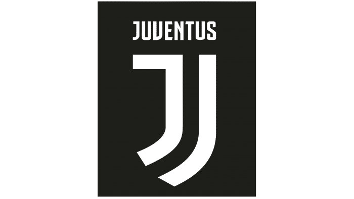
On January 16, 2017, the team presented a logo without a crown, Turin bull, zebra, or oval shield. Only the word “JUVENTUS” and two uneven black lines, separated by an empty white space, remain.
The current logo is the most stylish. It radically differs from its predecessors and looks like two parallel stripes bent in the shape of the letter “J.” The right symbol is associated with an uppercase letter, and the left is associated with a lowercase one.
It went through several stages of transformation that brought about significant changes. The first occurred in 1921 when color was introduced. The second was in 1979. Then, the white horse image appeared – the third – in 1989, returning to the previous design. The fourth was in 2017 when the logo radically changed from the original but maximally adapted to the requirements of the times. In any case, all of them have black-and-white stripes that reflect the club’s visual identity. Also, for most periods, a vertical oval with a crown is characteristic.
Juventus: Interesting Facts
Juventus Football Club, from Turin, Italy, is famous for soccer.
- Starting Up: Some students in Turin started the team on November 1, 1897. It’s one of the oldest soccer clubs in Italy.
- Team Colors: They’re known as “the Bianconeri” or “the Black and Whites” because of their black and white jerseys. They chose these colors in 1903 because they liked the look of England’s Notts County team.
- Champions of Italy: Juventus has won more Serie A (Italian league) titles than any other team, showing they’re good at soccer in Italy.
- Winning in Europe: They’ve twice won the UEFA Champions League, a big European tournament. They were champions in the 1984-1985 and 1995-1996 seasons.
- Famous Players: Some of the best soccer players, such as Michel Platini, Alessandro Del Piero, Gianluigi Buffon, and Cristiano Ronaldo, have played for Juventus.
- Their Stadium: In 2011, they moved to the Allianz Stadium, which is pretty modern and the first stadium in Italy owned by a soccer club.
- Winning Big Competitions: Juventus is the first Italian team to win all three major UEFA competitions, showing they’re good in Europe, too.
- The Agnelli Family: This family behind Fiat has been involved with Juventus since 1923, helping the club grow.
- A Sad Day: In 1985, a tragic event at the Heysel Stadium in Brussels led to the deaths of 39 fans before a game. It changed how stadiums and fan safety were viewed.
- A Big Scandal: In 2006, Juventus got caught in a match-fixing scandal, which was a tough time for the club. They were moved to Serie B and lost two titles but got one back later. They made a comeback to Serie A the next year.
Juventus’s story is full of big wins, famous players, and tough times, making it an important soccer club in Italy and the world.
Font and Colors
For the first seven decades, “Juventus” logos remained virtually unchanged, except for the period from 1929 to 1931 when the club’s visual identity was decided to be linked to the nickname Le Zebre. The zebra returned in the late 1970s but did not last long: the oval with a crown and bull remained the team’s honorary symbol until 2017. Eventually, the design agency Interbrand developed the infamous J logo, which sparked a wave of criticism.
Interbrand staff came up with an unusual font for the word “JUVENTUS.” Judging by the characteristic letter “N,” they were inspired by the old writing of the name that appeared on the logo back in 1921.
The Italian team’s name is written in an elegant, elongated font with serifs. All letters are uppercase. The primary club colors are a combination of black and white, dark blue, and golden yellow.
The modern club emblem is black and white. In previous versions, additional colors were used: blue (as on the coat of arms of Turin) and gold (a symbol of glory).
Juventus color codes
| Black | Hex color: | #000000 |
|---|---|---|
| RGB: | 0 0 0 | |
| CMYK: | 0 0 0 100 | |
| Pantone: | PMS Process Black C |

