Conservatism is reflected in the history of the formation of the “Liverpool” football club’s emblem, whose logo consistently features the image of a mythical griffin. In heraldry visualizations, symbols from the Hillsborough Memorial and the Anfield stadium arch are used, paying tribute to the club’s roots.
Liverpool: Brand overview
| Founded: | 3 June 1892 |
| Founder: | Fenway Sports Group |
| Headquarters: | Liverpool, England |
| Website: | liverpoolfc.com |
Meaning and History
Another two decades passed before the Liver Bird appeared on players’ uniforms. This first occurred in 1950. In the middle of the 1955-56 season, the Liver Bird finally took its place on the home uniform, but the design was changed. In the updated image, the red bird on a white oval patch still stood on a pedestal, but the initials L.F.C. were added below the drawing.
In the subsequent years, the emblem of “Liverpool” changed, but the bird remained an important attribute of the emblem.
In 2012, the “Liverpool” emblem with the yellow Liver Bird was returned, reminiscent of “Liverpool’s” golden years.
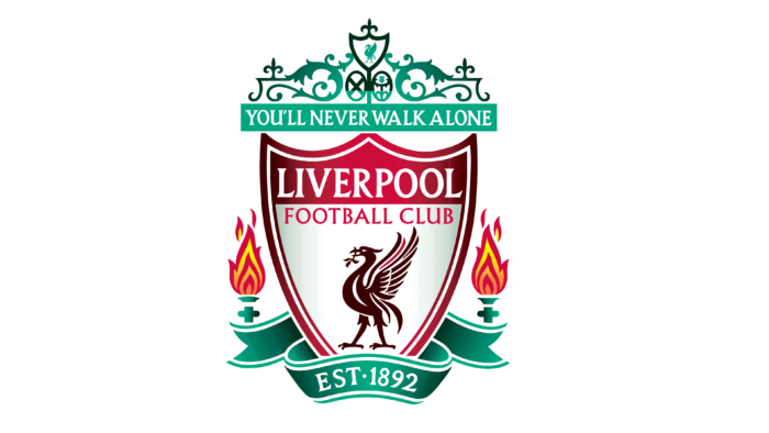
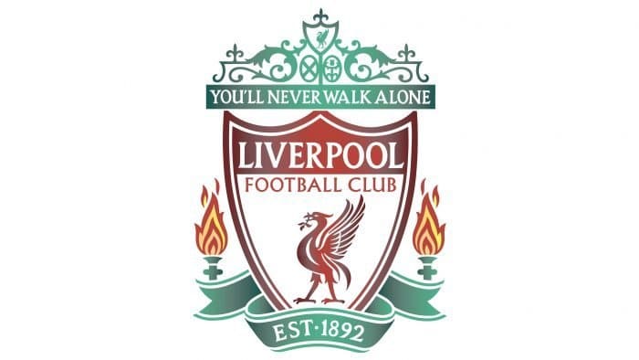
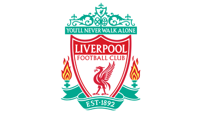
At the top of the emblem is a stylized image of the Shankly Gates arch from Anfield Stadium, adorned with the most famous words from the club’s anthem, “You’ll Never Walk Alone.”
The burning torches on either side of the shield are a symbolic image of the lights at the Hillsborough Memorial in Sheffield. On April 15, 1989, the eve of the FA Cup semi-final, a terrible catastrophe occurred at this stadium. In 1996, “Liverpool” fans died, including the cousin of the “Red Devils” captain, Gerrard.
The club’s founding year is depicted on a heraldic ribbon in the form of a fan’s scarf.
Since 1901, the team’s pennants have featured the mythical Liver Bird, after which the city of Liverpool was named. It’s the British equivalent of the Phoenix, though it more closely resembles a hybrid of a cormorant and an eagle. Officially, the image is borrowed from the old seal of the English king John Lackland.
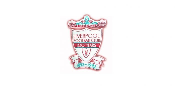
The triangular English heraldic shield with the club’s predominant red color forms the basis of the current “Liverpool” logo, adopted in 1992 (for the club’s 100th anniversary).
The football club “Liverpool” logos are easily recognizable. The central place on them is occupied by the Liverpool bird – a famous symbol of the city. This mythical creature first appeared at the club in 1901 – the bird was engraved on championship medals. Then, it was used on the flag. Only in the mid-20th century did the bird become part of the emblem.
What is Liverpool?
Liverpool is a football club named after its hometown. Founded in 1892, it competes in the Premier League. The club has dozens of championship victories and several prestigious international tournament wins to its name. It got the nickname “the Reds” due to its bright uniform.
1892
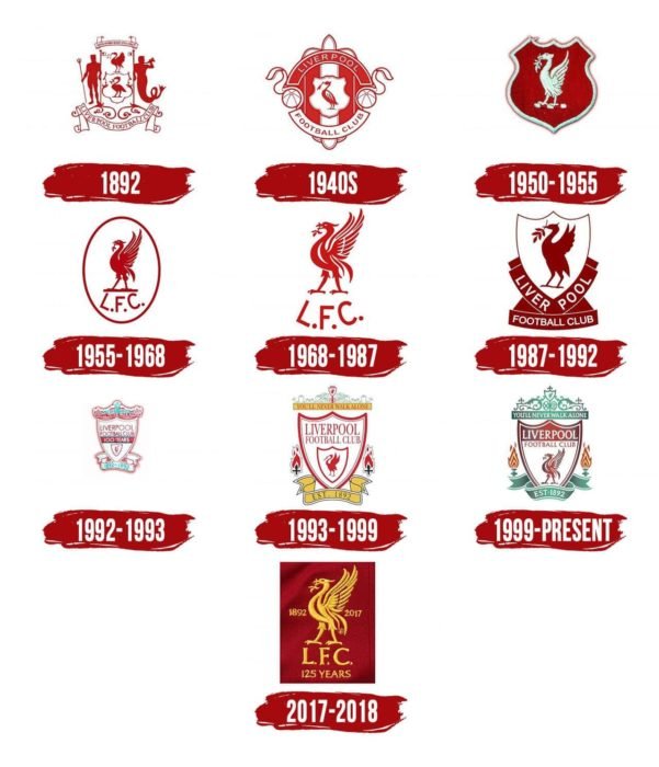
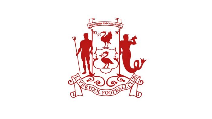
The debut club logo – a copy of the city’s coat of arms. It features marine symbols reflecting Liverpool’s port glory. In the center of the shield are two cormorants with seaweed in their beaks. Nearby are the ancient Greek gods Triton and Neptune. Above is the Latin motto “Deus nobis haec otia fecit” (“God has given us this peace”). Below is the inscription “Liverpool Football Club.”
1940s
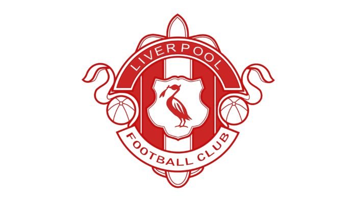
After World War II, the team changed its logo. In the center is a shield with a cormorant. On the sides are footballs. The background is adorned with vertical red and white lines. The club’s name is written inside a semi-circular frame.
1950 – 1955
In the F.A. Cup final of 1950, the “Liverpool” bird, the British equivalent of the “Phoenix,” first appeared on players’ shirts. It’s believed that the bird originated from an eagle. Officially, it was taken from the old seal of King John Lackland. Unofficially, it’s “crossbred” with a cormorant.
1955 – 1968
The red bird stands on a pedestal inside a white oval. It holds a branch in its beak as a symbol of the city’s maritime heritage. The club’s initials are written below L.F.C.
1968 – 1987
The oval and pedestal from the logo disappeared. The design of the bird changed slightly.
1987 – 1992
The emblem is stylized as a champions’ cup. The top part has the shape of a shield and is decorated with a bird. The bottom part consists of red geometric shapes on which the full name of the team is written.
1992 – 1993
The anniversary emblem depicts a large advertising shield with the inscription “Liverpool Football Club 100′ Years”. It features a smaller shield with a red Liver bird. The top is crowned by the Shankly Gates arch, installed at Anfield Stadium. On it is written a line from the club’s anthem: “You’ll Never Walk Alone.” Below is a white ribbon with the team’s years of existence: “1892 – 1992”.
1993 – 1999
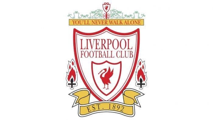
A year after the centenary, the eternal flame – a memorial to 1989 – appeared on the logo. The flame commemorates the tragedy at the Hillsborough stadium when 96 Liverpool fans died in a crush on the stand.
1999 – today
At the beginning of the new millennium, the emblem was modernized. The color palette changed: green was added (on the arch) and red (on the shield). At the bottom of the heraldic ribbon is written the founding year of the club: “Est. 1892”.
2017 – 2018
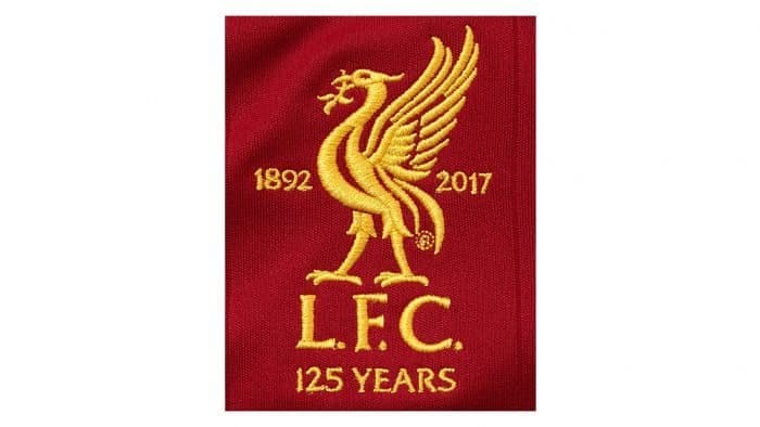
For the 125th anniversary, designers added the inscription 125th anniversary to the existing 2012 emblem. On either side of the bird is the team’s period of existence: “1982”, “2017”.
Liverpool: Interesting Facts
Liverpool Football Club is a famous soccer team with a lot of history and exciting moments.
- How They Started: Liverpool was created in 1892 because of a disagreement at Everton, another soccer team. They started playing at Anfield, which is still their home.
- Anfield Stadium: Anfield is famous for its amazing atmosphere, especially during big games. The Kop stand is a big part of this, named after a hill in a battle long ago because it looks like that hill.
- Their Song: In the 1960s, the song “You’ll Never Walk Alone” from a musical became the team’s anthem. Fans sing it before every game, creating a special feeling in the stadium.
- The Boot Room was a small room at Anfield where the team’s coaches discussed game plans. It’s a big part of why Liverpool was so good from the 1960s to the 1980s.
- Wins and Trophies: Liverpool is one of England’s top teams and has won many international tournaments and league and Champions League titles.
- Famous Managers: Bill Shankly and Bob Paisley were great managers who helped make Liverpool successful. Shankly improved the team in the 1960s, and Paisley won many trophies afterward.
- Incredible Comeback: In 2005, during a big game in Istanbul, Liverpool lost 3-0 but returned to tie 3-3 and then won in a penalty shootout.
- A Sad Day: In 1989, at a game, a terrible event happened where 96 fans died because of overcrowding. This tragedy led to changes to make stadiums safer.
- Jurgen Klopp’s Time: Since Jurgen Klopp became manager in 2015, Liverpool has been doing great. With his energetic coaching style, they’ve won the Premier League, Champions League, and other big tournaments.
- Fans All Over: Liverpool has fans all around the world. People love the team for its history, how it plays, and its spirit.
Liverpool’s story is full of big wins, a strong connection with fans, and moments that have changed soccer.
Font and Colors
The central image of modern “Liverpool” logos is the mythical Liverpool bird. It’s a “distant relative” of the phoenix, something between an eagle and a cormorant. On the football club’s emblem, the Liverpool bird holds a branch in its beak, signaling the proximity to the sea.
Artists depicted the mythical creature on shields of various shapes until they arrived at the final version: a triangular heraldic shield with a figure top. The bird’s drawing also changed several times, but this did not affect the minimalist style.
The modern logo contains many inscriptions: the motto “YOU’LL NEVER WALK ALONE” on a blue rectangle, the full team name “LIVERPOOL FOOTBALL CLUB” at the top of the shield, and the phrase “EST. 1892” at the bottom on a ribbon. All words consist of letters with serifs. This font is called Albertus MT and contains six styles. Its developer is Berthold Wolpe.
Most Liverpool emblems are red, and this color, according to the authors’ idea, should have a psychological effect: instill fear and symbolize power. However, in the current version of the logo, it is no more than blue or white. Yellow is also present but used in a limited amount. Meanwhile, the primary colors (red and blue) are represented in several shades, creating gradient transitions.
Liverpool color codes
| Foreign Crimson | Hex color: | #c8102e |
|---|---|---|
| RGB: | 200 16 46 | |
| CMYK: | 0 92 77 22 | |
| Pantone: | PMS 185 C |
| Light Sea Green | Hex color: | #00b2a9 |
|---|---|---|
| RGB: | 0 178 169 | |
| CMYK: | 100 0 5 30 | |
| Pantone: | PMS 3275 C |
| Maize | Hex color: | #f6eb61 |
|---|---|---|
| RGB: | 246 235 97 | |
| CMYK: | 0 4 61 4 | |
| Pantone: | PMS 101 C |
