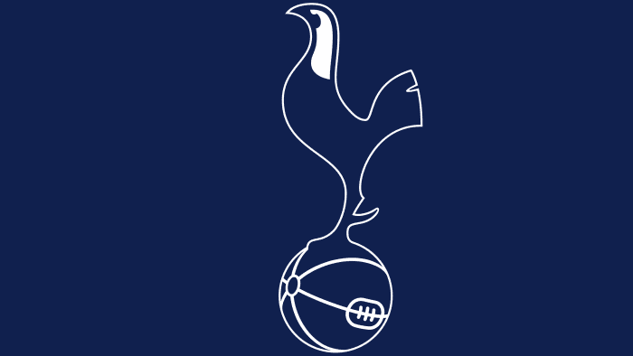
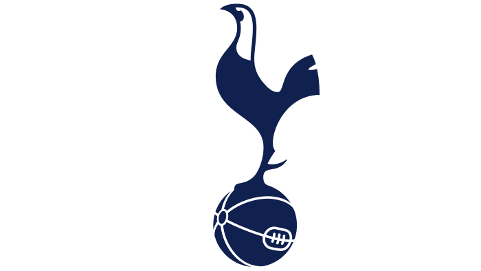
The Tottenham Hotspur logo expresses pride in many competition victories. This shows the fighting spirit and a clear threat to all rivals who dare to challenge the football club. The emblem openly declares that athletes are always on the alert and will not give away their main prize to anyone. And its minimalistic design speaks of a serious approach to business.
Tottenham Hotspur: Brand overview
| Founded: | 5 September 1882 |
| Founder: | ENIC International Ltd |
| Headquarters: | Tottenham, London, England |
| Website: | tottenhamhotspur.com |
The history of the glorious football club “Tottenham Hotspur” began on Tuesday, September 5, 1882, under a street lamp at the corner of Tottenham High Road and Park Lane. That day, several thirteen-year-old students from a local school decided to create their own football team. They immediately collected money and compiled a list of members for the new club.
The club’s motto in Latin sounds like “Audere est Facere” (in English, “To Dare Is To Do”). The “Tottenham Hotspur” logo depicts a cockerel standing on a ball. The club’s main rival is “Arsenal,” and the matches between these clubs are called the North London derby.
The history of the club’s name, Hotspur F.C., is quite interesting. It is believed that the name is linked to Sir Henry Percy (Harry Hotspur), known from William Shakespeare’s play “Henry IV,” who supposedly lived in these parts in the 14th century and whose descendants later owned the local lands. In 1884, the club was renamed to Tottenham Hotspur Football Club to distinguish it from another team, London Hotspur.
The team has special names among fans. The nickname “Spurs” is an abbreviation of the club’s name. Originally, the team was called Hotspur in honor of Sir Henry Percy, who lived in the 14th century and received such a nickname because of his fiery temper (Hotspur – Hot Spurs). From Sir Henry, the club received another, though less popular nickname – “Hot heads.” By the color of the uniform, the team has another nickname, “Lilywhites.” Of course, the color of the uniform is now slightly different, but the calling remains the same. In addition to the aforementioned nicknames, “Tottenham” is often called “the Jews” because the Jewish diaspora in London supported them for a long time.
Meaning and History
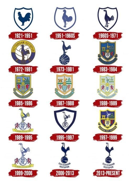
Throughout the club’s history, the main “Tottenham Hotspur” logo has changed. The constant emblem feature was the cockerel, depicted either enclosed in a shield or standing on a ball. Even today, the cockerel remains the main symbol of the team.
In 1882-1884, the symbol of the club was the letter H (the initial letter of Hotspur).
Starting with the FA Cup final in 1901, the “cockerel” (Harry Hotspur) became the new symbol of “Tottenham Hotspur.” In 1909, former player William James crafted a bronze model of a cockerel standing on a ball, which was installed atop the West Stand.
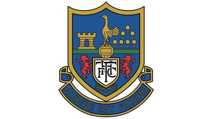
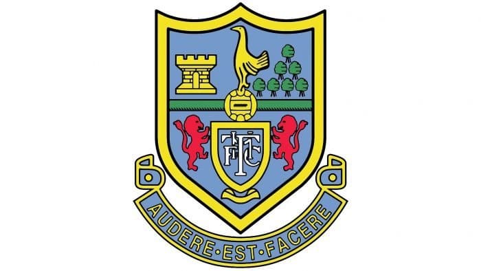
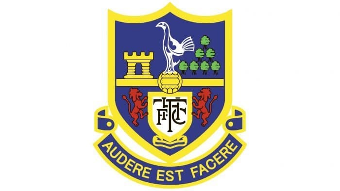
From 1956 to 2006, the “Spurs” used a crest that featured objects indicative of attachment to this area. Lions resting on the shield were taken from the coat of arms of the Northumberland family. They owned much of Tottenham’s lands, and Sir Henry Percy (Harry Hotspur) was a member of this family. The lions carried a shield with the inscription “THFC” (an abbreviation of the official club name). A mansion belonging to Bruce Castle was located 400 yards from the stadium. It now houses a museum. In the upper right corner, we see seven elms growing in the London grove of Page Green. Historians suggest that these plants indicate the place where witches were burned. The crest also bears the Latin saying “Audere Est Facere.”
In 1983, the “Tottenham Hotspur” emblem was simplified. The cockerel, lions holding the shield, and the motto ribbon remained the same. The emblem existed in this form until 2006.
In 2006, the old “Tottenham Hotspur” logo gave way to a new club symbol. Talented designers created a new stylish image of a cockerel on a ball. Also, the inscription Tottenham Hotspur appeared beneath it.
In 1882-1884, the “Tottenham Hotspur” players’ shirts were adorned with a red capital letter “H.” Only 39 years later, the club first used the famous emblem with the cockerel, which became its key symbol.
What is Tottenham Hotspur?
“Tottenham Hotspur” is a multiple champion and tournament winner, with several major European trophies behind it. The club competes in the Premier League and has its own “Tottenham Hotspur” stadium, where it has been hosting home matches since 2019. Since 2001, the sports organization has been owned by ENIC International Ltd.
1921 – 1951
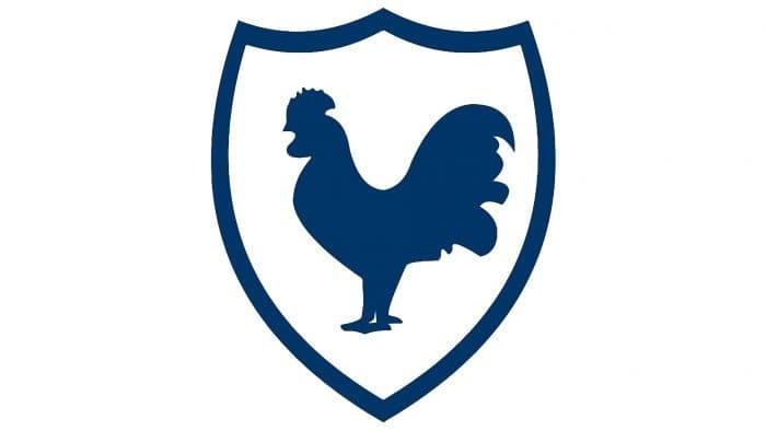
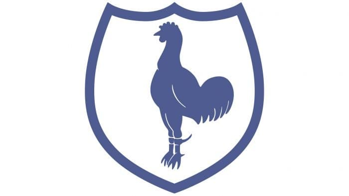
A dark blue cockerel appeared on the emblem in 1921 when “Tottenham Hotspur” won the FA Cup for the second time. Its ideological inspiration was the nobleman Henry Percy, nicknamed Harry Hotspur – a fan of long-haired and cockfighting. The bird is inside a white shield with a blue border.
1951 – 1960s
After receiving the first championship title in the First Division, the club carried out another redesign of the logo. The blue color became lighter. The silhouette of the cockerel is elongated, with two pairs of sharp spurs on its legs.
1960s – 1971
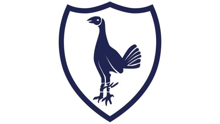
In the 1960s, the emblem again became dark blue. The shape of the bird was elongated.
1972 – 1981
The new emblem depicts a cockerel standing on a football ball. The prototype for the image was a bronze statue installed in 1909 above the west wall of the “White Hart Lane” stadium. The author of the statue is former player William James.
In the background is another ball. Two wide semicircles surround it with the inscription “Tottenham Hotspur F. C.”.
1973 – 1981 additional
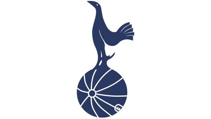
Designers removed the emblem’s circle, colored outlines, and the team’s name. Only the bluebird, proudly perched on the ball, remained.
1983 – 1984
The 1983 logo demonstrates the club’s historical heritage. To the left of the cockerel is depicted Bruce Castle. Below is a small shield with the monogram THFC, on which two red lions rest. These are the heraldic symbols of the Northumberland family, descendants of Harry Hotspur.
All elements are placed inside a blue shield with a yellow border. Underneath the shield is a scroll with the Latin motto “Audere Est Facere” (“To Decide Is To Do”).
1985 – 1986
To the right of the cockerel, seven trees appeared. These are elms from London’s Green Grove Park in North London. Legend has it that witches known as the Seven Sisters were burned there.
1987 – 1988
The logo changed slightly: the shades became lighter, and the drawing closer to animation.
1988 – 1989
Designers continued to experiment with style and colors. They used modern graphics in the logo and made the outlines lemon-yellow.
1989 – 1995
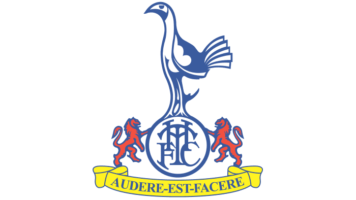
In 1989, the emblem was simplified. The trees, shield, and tower disappeared. Now, the cockerel stands on a ball with the abbreviation THFC. To the right and left are red lions. Below is a scroll with the inscription “Audere Est Facere.”
1995 – 1997
In the previous version of the logo, only the cockerel was on the ball. The cockerel is placed inside a white shield with a blue outline.
1997 – 1999
On the eve of the new millennium, “Tottenham Hotspur” returned to the 1983 emblem with minor changes.
1999 – 2006
The team returned to the 1989 emblem. The color of the bird changed from yellow to white.
2006 – 2013
In 2006, the emblem was reworked. The new version of the emblem resembles the one used in 1973-1981. The cockerel with a white head and long spurs stands on the ball. Below is the inscription “Tottenham Hotspur”. The font was specially developed for the club.
2013 – today
The designers removed the black outline on the logo and made the blue color darker.
Tottenham Hotspur: Interesting Facts
Tottenham Hotspur Football Club, located in North London, is a famous soccer team with a lot of history.
- How It Started: The team began in 1882 by some school kids who liked cricket and soccer. They named it Hotspur, then changed it to Tottenham Hotspur so as not to mix up with another team.
- A Big Win: In the 1960-1961 season, they were the first team in the 20th century to win both the League Championship and the FA Cup in the same season.
- European Success: In 1963, they were the first team from Britain to win a major European competition, beating Atlético Madrid.
- Always Trying New Things: Tottenham was the first team to number their shirts in 1921 and had an artificial field in the 1980s.
- Their Stadium: They opened a new stadium in 2019, which is fancy and big, fitting 62,850 people. It has steep stands for a great atmosphere and a field that moves for NFL games.
- London’s First: Their 1963 win was the first time a team from London had won a major European trophy.
- Top Scorer: Jimmy Greaves scored the most for Tottenham, with 266 goals from 1961 to 1970.
- Women’s Team: The women’s team became officially part of the club in 2017 and competed in England’s top women’s league.
- Big Rivalries: They have a big rivalry with Arsenal, and their matches are always exciting.
- Innovative Coaches: They’ve had some great coaches, like Bill Nicholson in 1961 and Mauricio Pochettino, who took them to the Champions League final in 2019.
Tottenham Hotspur is known for its long history, willingness to try new things, and strong fan community, making it one of England’s most loved soccer teams.
Font and Colors
The cockerel on the “Tottenham Hotspur” emblem embodies the team’s fighting spirit and its winning mindset. It’s inextricably linked to the team’s nickname, as the origin of the word “Hotspur” goes back to the history of cockfighting. Moreover, it’s a metaphorical image of a real person – a nobleman named Henry Percy, who became famous for his long spurs.
The logo creators tried to link the cockerel with football, at least on an associative level. They depicted a militant bird, proudly standing on a ball – as if it’s ready to defend it valiantly.
The English company Dalton Maag developed a sports font for “Tottenham Hotspur”, designed to modernize the club’s image. It harks back to the industrial era and consists only of uppercase characters with short serifs. It’s intended for various applications – from signs to promotional materials on the website. For the semi-circular inscription on the logo, the letters were slightly altered to make the composition look cohesive.
Not much attention was given to the color palette. Designers took a straightforward approach, choosing dark blue (#132257) as the main color and complementing it with a small amount of white.
Tottenham Hotspur color codes
| Dark Sapphire | Hex color: | #132257 |
|---|---|---|
| RGB: | 19 34 87 | |
| CMYK: | 78 61 0 66 | |
| Pantone: | PMS 2757 C |
