One of the best football teams in the world is “Barcelona,” whose logo illustrates the club’s rich history of success. Commitment to the club is symbolized by the virtually unchanged execution of the emblem, reflecting the stability in the sports leader’s worldview, strategy, and tactics.
Barcelona: Brand overview
| Founded: | 29 November 1899 |
| Headquarters: | Barcelona, Catalonia, Spain |
| Website: | fcbarcelona.com |
Meaning and History
The football club “Barcelona,” also known as “Barça,” was founded by Swiss businessman Joan Gamper. On October 22, 1899, he sent a note to the local newspaper proposing that all interested parties participate in creating a football club. Eleven people responded, and a month later, on November 29, 1899, they formed a team named FC Ball (Foot Ball Club Barcelona).
From the first day of the team’s foundation, the club’s uniform had a blue and maroon color scheme: one half of the shirt was blue, the other maroon and the shorts were colored white.
The famous “Barcelona” emblem appeared in 1910. With minor changes, it has been preserved to this day. Initially, the emblem of Barcelona was taken as the basis to emphasize the club’s belonging to the city. But later, the team decided to create its coat of arms.
Over the years, the team has had several versions of the same logo—the most radical and, at the same time, legendary- dating back to 1910. Subsequent years’ versions almost entirely replicate it, reflecting the club’s unchanging worldview.
For the first 11 years of the club’s existence, the coat of arms of Barcelona was used as the emblem, but in 1910, the founder of “Barça” decided it was time to acquire its team’s symbolism. A team player and medical student won the competition for the best emblem, Carles Comamala.
On the “Barcelona” emblem is depicted the cross of Saint George, the patron saint of Catalonia. In 2010, before signing an advertising contract with Qatar Foundation (150 million dollars), the club’s management changed it for Muslim fans. Thus, the horizontal stripe was removed.
The early 20th-century ball depicted on the “Barcelona” sign remained in its original form. Over 105 years, the emblem underwent minor changes 12 times.
In 2018, an attempt was made to update the club’s symbol. The new version of the logo looked more concise than the previous ones, as it lacks protruding elements and an abbreviation. Also, the “Summa” agency (which was tasked with updating the logo) enhanced the color of the ball’s borders, making it look golden. And the overall color palette shifted toward the bright spectrum. This emblem was presented to the club members to approve the changes. On October 20, at the general meeting of all club members, after voting – the emblem was rejected.
What is Barcelona?
“Barcelona” is a football club often referred to by fans as “Barça.” It was founded in 1899 and is named after the Spanish city where its home stadium “Camp Nou” is located. The team is part of La Liga and has won more than 25 league championships. Additionally, the team has won several FIFA Club World Championships, UEFA Champions League, Copa del Rey, and other major competitions. “Barcelona” is known as a symbol of Catalan culture: during matches, fans bring Catalan flags.
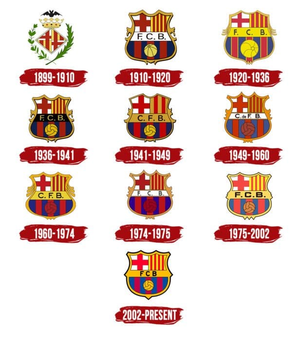
1899 – 1910
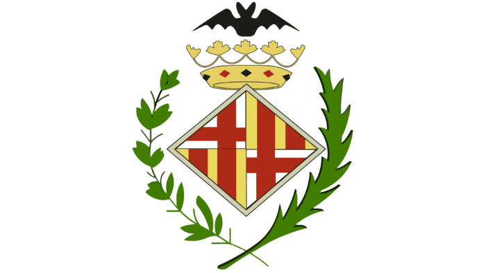
The debut symbolism is centered around a golden diamond positioned between two branches – laurel and palm. The central element is divided into four parts, two of which depict the Catalan flag (red stripes on a yellow field) and two – a broad crimson cross on a white background. Above the geometric figure is a crown with precious stones – embodying monarchical power and hinting at the noble roots of the club. Above is depicted a black bat with spread wings.
1910 – 1920
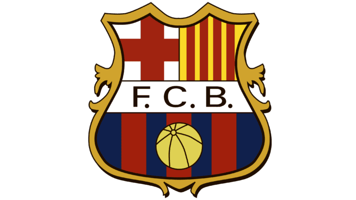
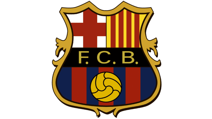
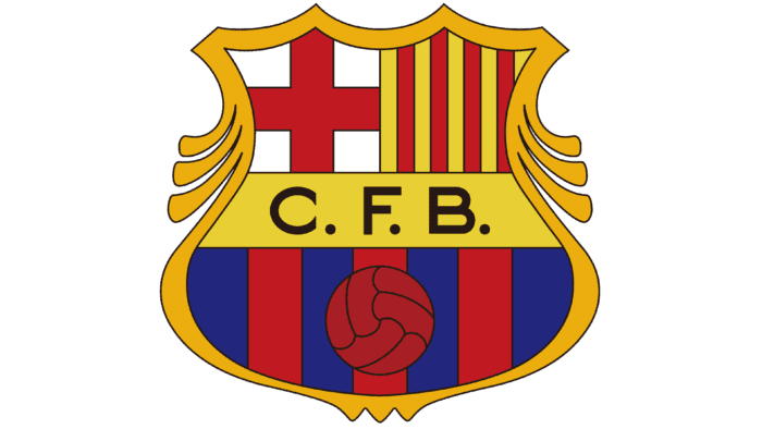
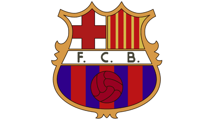
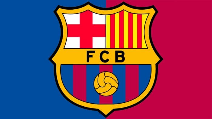
In 1910, the final logo of the “Barcelona” team, which is still relevant today, appeared. Subsequent changes (and there were several) did not affect its essence: minor adjustments concerned only small details. In particular, changes touched the style, outline, and arrangement of letters. But heraldic elements were precisely preserved: a large figured shield with four zones, on which are depicted the cross of Saint George, the flag of Catalonia, the club’s abbreviated name, the colors of the uniform, and a football.
1920 – 1936
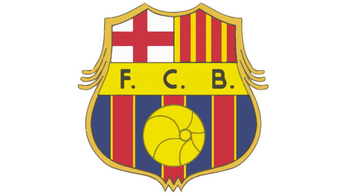
Ten years later, designers intensified the palette of key details, making the background of the letters and ball vividly yellow. They also worked on the ornament on the shield’s border and replaced complex elements with six strict lines – three on each side.
1936 – 1941
The abbreviation is placed on a dark blue ribbon crossing the shield in this version.
1941 – 1949
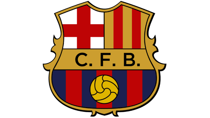
The logo of this period has much in common with the modern version, except for the thickening at the bottom and the intensity of the color.
1949 – 1960
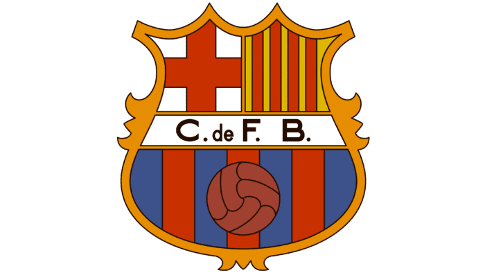
After the redesign, the emblem received a brown ball, a white background for the name, and an abbreviation supplemented with the Spanish preposition “de.”
1960 – 1974
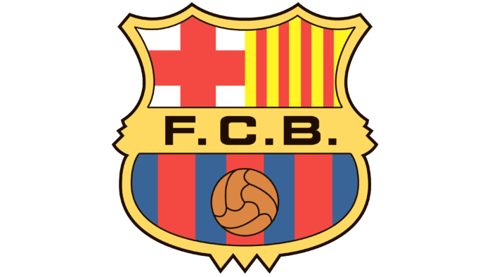
The logo of the 60s was squat. It was dominated by red shades, which replaced the brown ones. Another change concerned the return of the yellow color.
1974 – 1975
In this version, “FCB” once again had a white backdrop. Also, the side trim elements were changed.
1975 – 2002
A year later, the emblem gained brightness and clarity. The existing palette was enhanced, letters were highlighted in bold font, and the ball’s color was changed.
2002 – today
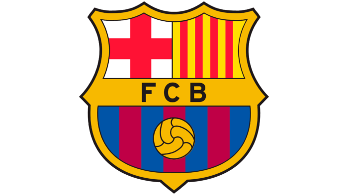
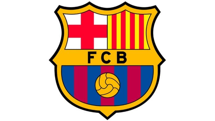
With the advent of the millennium, the club decided to modernize the emblem. The work was entrusted to designer Claret Serrahima, who removed the dots from the team’s abbreviated name, reduced the second half of the shield, and left one tooth at the bottom instead of three. He also removed the extra decorations from the outer edge.
Barcelona: Interesting Facts
FC Barcelona, or “Barça” as fans call it, is a famous soccer team that is known worldwide. It’s not just about soccer; it’s also a big part of the culture in Catalonia, Spain.
- How It Started: In 1899, Joan Gamper, led by some people from Switzerland, England, and Catalonia, decided to start a soccer club. This club was more than just about soccer; it symbolized Catalan pride.
- Camp Nou: They play games at Camp Nou, the biggest soccer stadium in Europe. It can hold over 99,000 fans and has seen some important matches.
- Lots of Wins: FC Barcelona is one of the top teams in the world. They’ve won many games and championships, both in Spain and internationally.
- La Masia: This is their youth academy, famous for training young players who become big stars. Some of the best players, like Lionel Messi, learned soccer here.
- Helping Out: In 2006, the team did something new by partnering with UNICEF. They put the UNICEF logo on their shirts to support children worldwide.
- Famous Players: Some of the greatest soccer players have played for Barça. Lionel Messi is one of them; many think he’s the best.
- Tiki-Taka Soccer: This is a special way of playing soccer that Barça is famous for. It’s about passing the ball, controlling the game, and playing as a team.
- Big Rivalry: FC Barcelona and Real Madrid games are big. These matches are about more than just soccer; they show the history and rivalry between Catalonia and the rest of Spain.
- Lots of Fans: In 1986, 120,000 people watched a game at Camp Nou. That’s a lot of fans in one place!
- Fans Are in Charge: The people who support Barça are the ones who run it. They vote for the team’s leaders, ensuring it stays connected to its fans.
FC Barcelona is more than just a soccer team. It’s about being proud of your origins, playing great soccer, and helping others. It’s a big part of Catalonia and a famous team worldwide.
Font and Colors
The team’s emblem has always consisted of several heraldic signs and was divided into four fragments. Each reflects a certain idea: the aspiration for development, occupation, respect for roots, and a close connection with the homeland.
The upper left corner occupies the cross of Saint George – the emblem of the patron saint of Catalonia. There, to the right, are four red stripes on a yellow background – the flag of the Catalan Senyera. Underneath stretches a broadband with the inscription “FCB” in uppercase. This is the abbreviation of the full name of the football club, “Barcelona.” Black letters on a golden backdrop separate the lower part, which depicts a yellow ball with three red lines on a blue field – the color of the players’ uniforms.
The swirling medieval shield unites all elements with a dark border.
There are three legends about the company’s blue and maroon color. Its founder, Hans Gamper, could not choose the team’s clothing color. He was torn between his native Swiss canton, Ticino, and his first club “Excelsior.” It is also said that at the founding meeting in 1899, one of the participants had a popular two-sided blue and maroon pencil.
The red and yellow stripes became the colors of Catalonia. During the times of Spanish dictator Franco (1939-1975), the four stripes were corrected to two because the Spanish flag has the same colors but fewer stripes. At the end of the 40s, political repressions relaxed, and in honor of the club’s 50th anniversary, the stripe was returned.
The font used on the logo is Sans Serif, one of its variants, designed by Tobias Frere-Jones. It is called Interstate Bold.
Barcelona color codes
| Saffron | Hex color: | #edbb00 |
|---|---|---|
| RGB: | 237 187 0 | |
| CMYK: | 0 21 100 7 | |
| Pantone: | PMS 7549 C |
| Blue | Hex color: | #004d98 |
|---|---|---|
| RGB: | 0 17 152 | |
| CMYK: | 100 49 0 40 | |
| Pantone: | PMS 2945 C |
| Big Dip O’Ruby | Hex color: | #a50044 |
|---|---|---|
| RGB: | 167 30 49 | |
| CMYK: | 5 100 71 22 | |
| Pantone: | PMS 7636 C |
| Red | Hex color: | #db0030 |
|---|---|---|
| RGB: | 219 0 48 | |
| CMYK: | 0 100 78 14 | |
| Pantone: | PMS 185 C |
| Sedona Red | Hex color: | #ffed02 |
|---|---|---|
| RGB: | 255 237 2 | |
| CMYK: | 0 7 99 0 | |
| Pantone: | PMS 102 C |
| Black | Hex color: | #000000 |
|---|---|---|
| RGB: | 0 0 0 | |
| CMYK: | 0 0 0 100 | |
| Pantone: | PMS Process Black C |
