


![]() Real Madrid Logo PNG
Real Madrid Logo PNG
The emblem of the Spanish football team, “Real Madrid,” is presented with bright, memorable graphics that reflect the title and invincibility. It embodies a commitment to the city’s history, royal status, and the club’s status acquired over the last hundred years.
Real Madrid was founded on March 6, 1902, as Madrid Football Club by a group of enthusiasts in the Spanish capital. In 1905, it won its first Copa del Rey, and in 1920, it received the title “Real” from King Alfonso XIII.
In 1929, the club became a founding member of La Liga and has remained in the top division ever since. Its rivalry with Barcelona developed early and grew into one of the most significant in world football.
A major transformation began in 1943 under President Santiago Bernabéu, who oversaw the construction of a new stadium in 1947 and built a strategy focused on top players.
From 1956 to 1960, Real Madrid won five consecutive European Cups, led by Alfredo Di Stéfano and later Ferenc Puskás. The 1960 final against Eintracht Frankfurt became a landmark match in football history.
After Bernabéu’s era, the club maintained domestic success but struggled in Europe. In the late 1980s, the “Quinta del Buitre” generation secured five league titles from 1986 to 1990.
In 2000, Florentino Pérez introduced the Galácticos policy, signing players like Luís Figo, Zinedine Zidane, and later David Beckham, followed by Cristiano Ronaldo in 2009.
Between 2016 and 2018, under Zidane’s coaching, Real Madrid won three consecutive Champions League titles. After a transitional period, the club added further European titles in 2022 and 2024.
Meaning and History
![]()
Some believe the famous crown on Real’s logo reflects its sports achievements. Indeed, the team’s reputation is defined by triumphant victories, as it established itself as a football superpower in the 1950s. The furor it caused is inscribed in the club’s DNA and expressed through a simple, confident emblem. However, Real Madrid’s branding style was more influenced by political factors, as its chronology dates back to the early 20th century.
Real’s first logo was a simple mix of the club’s initials: blue letters M, C, and F were set against a white background. The team often performed under the city’s emblem, which was required by the rules of most football competitions at the beginning of the century. It is erroneous to attribute the history of “Madrid” to the city’s coat of arms, although the rules of official competitions at that time obliged the club to use the city’s emblem.
In 1908, the Real Madrid emblem changed. As a result, the city’s coat of arms became the progenitor of the club’s modern emblem. Initially (in 1908), the club’s initials were superimposed on the shield borrowed from the city, so the “Galacticos” logo came to feature blue circles.
On June 29, 1920, King Alfonso XIII of Spain conferred the royal title “Real ” on Madrid. This event was reflected in the club’s emblem, a crown identical to the city’s coat of arms. In official matches, the team continued to perform under the city’s stylized emblem.
The revolution that overthrew King Alfonso XIII and marked the formation of the Second Spanish Republic led to the team being renamed “Madrid” Football Club again from 1931 to 1939. The emblem lost its crown due to the ban on using monarchical symbols. At the same time, the Real Madrid logo acquired a violet stripe, symbolizing the region of Castile, where modern Madrid is located.
At the end of the Civil War and the establishment of General Francisco Franco’s dictatorship, royal status was restored in Madrid, and the crown was added to the Galacticos logo. The Real Madrid emblem was redesigned and became colorful with golden tones. The Castilian stripe was retained on the Real emblem.
![]()
The Real Madrid logo remained in this form for over five decades, undergoing minor changes at the turn of the century. At the beginning of the century, Madrid’s coat of arms took its final form. Before embarking on the construction of the “Galacticos,” the bosses of the Madrid club maximized the letter M. They made the stripe blue, eliminating purple.
Opening a new chapter in history, the Madrilenians refined the logo, which acquired a modern look befitting the status of the best club of the twentieth century.
What is Real Madrid?
Real Madrid is a Spanish professional football club based in Madrid that plays in La Liga, the top division of Spanish football. It is recognized as one of the most famous teams on the international stage and has won numerous awards. The majority of its victories were achieved in the 1950s and 1960s, establishing itself as the vanguard of European football. By 2021, it had become the second-largest in the world, and in 2022, the most valuable. The club was founded in 1902, and its home stadium is Santiago Bernabeu.
1902 – 1908
![]()
On March 6, 1902, several like-minded footballers founded the “Madrid” football club. Its predecessor is considered Football Sky, created in 1896. The first logo of the new sports organization was a dark blue monogram. Artists combined the initial letters from the name of the Spanish team, Madrid Club de Futbol: “M,” “C,” and “F.” Initially, they were intertwined: the large “C” contained a medium-sized “M,” which merged with “F.” The monogram looked chaotic because the designers did not consider the harmony of shapes and proportions.
Along with the monogram, the coat of arms of the Madrid mayor’s office was used, as required by the football competitions of that time. However, the city’s symbol was not included in the official history of Real Madrid’s emblems, as it was common for all local clubs.
1908 – 1920
![]()
In 1908, the first changes to the FC “Madrid” branding style occurred. The team’s initials remained but acquired a new form. Developers significantly enlarged and rounded the letter “M.” On the other hand, the letter “C” became smaller and was placed in the center, between the side legs of “M.” The smallest letter “F” was positioned to intersect with the bottom edge of “C.”
Judging by the round blue frame in which the monogram was located, the city coat of arms became the progenitor of the logo. As far as is known, the football team’s initials were superimposed on a rectangular shield with a rounded base and dark-blue edging. Then the designers changed their shape to a circle.
1920 – 1931
![]()
The second version of the logo remained in use until 1920, when Pedro Parages assumed the presidency. Then, a large, blue-white monarchical crown first appeared on the drawing. This sign appeared because the football team received official approval from Alfonso XIII. In honor of the royal court’s patronage, the club changed its name to “Real Madrid”: the word “Real” means “Royal” and emphasizes the club’s connection to the crown. As before, in some matches, the city coat of arms was used.
1931 – 1941
![]()
After King Alfonso XIII and the entire Spanish monarchy were overthrown, the emblem designers removed the crown because the post-revolutionary government prohibited such symbols. At the same time, they left the blue ring, centered the letters, and placed a wide purple stripe inside the circle. The diagonal line symbolizes Castile, where modern Madrid is located.
1941 – 1997
![]()
When the Civil War ended in 1941, the club returned the crown to the emblem. Artists depicted it in a golden palette with precious blue, red, and white stones. The ring and letters are golden. The Castilian stripe was preserved; it was slightly unfolded and made violet.
1997 – 2001
![]()
The 1997 version differs from the previous one only in the color scheme. Gold turned from yellow to bright red to pale, and from violet to dark blue.
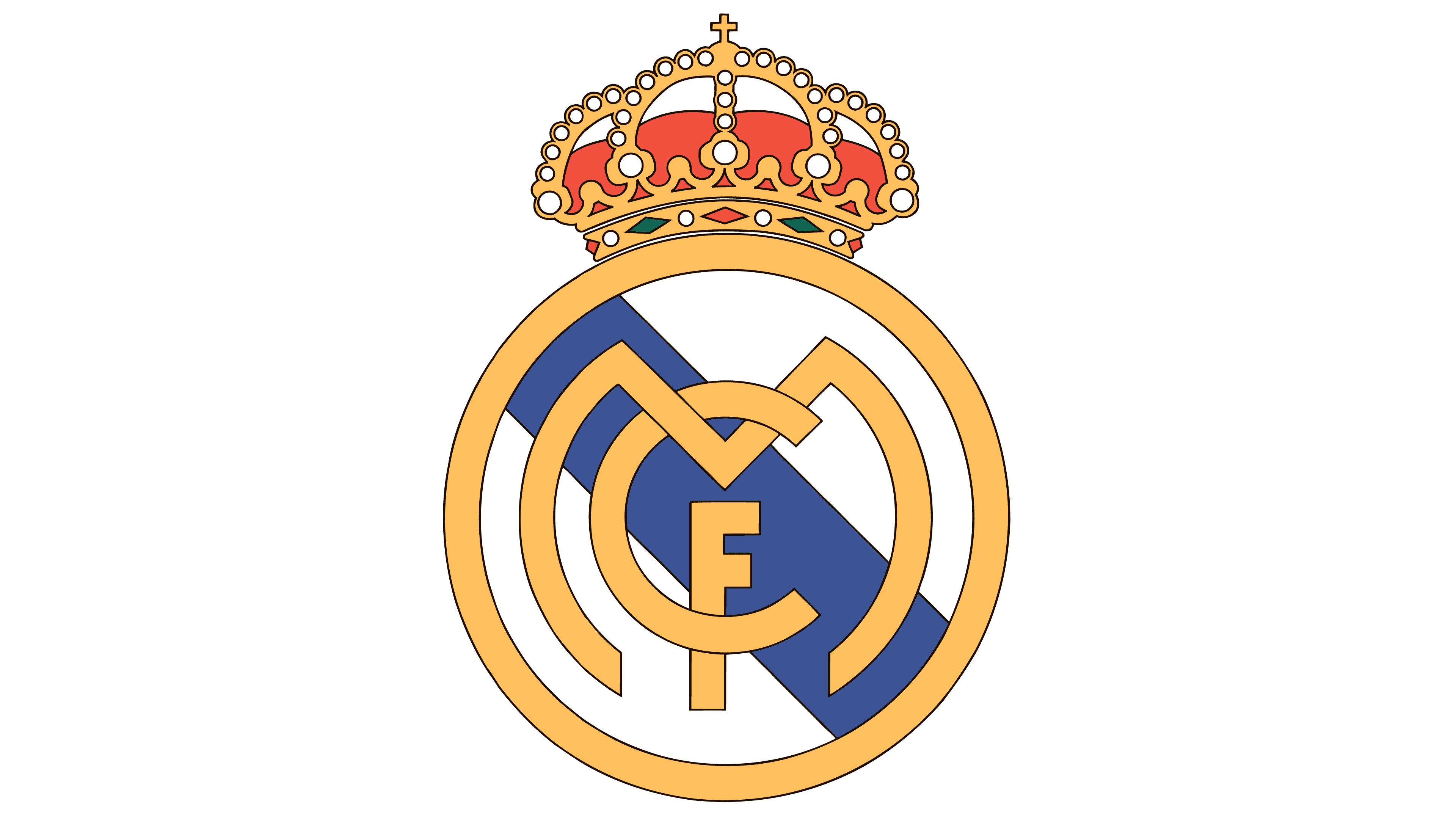
2001 – today
![]()
The final version of the logo was presented in 2001. It has a wider letter “M,” a narrow and shortened diagonal stripe, and a crown slightly raised above the ring. The primary color is yellow; all elements are outlined in dark blue contours.
Font and Colors

The current brand name corresponds to the status of the best club of the 20th century and is used to promote “Real Madrid” as a brand. It reflects all the symbols the team has acquired over the last hundred years: the crown granted by Alfonso XIII and the abbreviation “MCF,” formed from the first name Madrid Club de Futbol, and the Castilian stripe.
In creating the logo, designers disregarded existing fonts and relied solely on their imagination to make the monogram unique. “C” looks standard, “F” has shortened horizontal strokes, and “M” is noticeably rounded. The palette contains red (#EE324E), blue (#00529F), and yellow (#FEBE10).