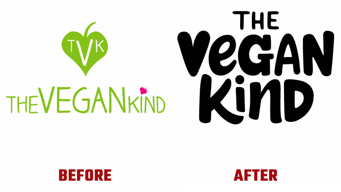
British vegan retailer, The Vegan Kind, has introduced a brand new identity to its customers. The visual identity developed in collaboration with B&B studio should provide the UK’s largest and most popular vegan online retailer with a better reflection of the changes that have taken place, which will allow it to be called the store of the future. The changes were aimed at creating added convenience for customers and simplifying site use, ordering, and subscription to meet the nutritional needs of those who prefer vegetarian food.
The new brand identity has become a demonstration of adherence to the trends of the times, the ability to change according to modern conditions. Offering more than 5,000 products in the manufacture of which no animal was harmed, the company provides an opportunity to purchase food and clothing, and other vegan products. As the UK’s number 1 service in this area, The Vegan Kind ships over 10,000 orders a month, aiming to make each shipment highly anticipated by its customers.
Provides such a desire and a new corporate identity, logo, and packaging design. Designers at B&B, imbued with the idea of the brand to help people appreciate the benefits of a vegan lifestyle, have focused on the theme of compassion. Its reflection was the original performance of the letter “V” – the capital letter of the first word of the name. Its graphics very closely resemble a stylized image of a heart, visually confirming this direction of the brand’s activities.
A special font has been created by hand to emphasize the effect of friendliness, kindness, and ease of building an atmosphere in the seller-customer relationship. Moreover, each letter “hints” at any of the offered vegan products. This made it possible to create our visual language that is effective for all conveying information – text or in the form of images.
The use of black in the execution of the text creates an indescribable effect when applied to bright and cheerful but slightly muted background colors. Such performance fills with energy and naturalness any element of the brand’s visualization, both in digital versions and when applying self-advertising on printed forms.
To enhance the message of kindness and respect for all living things, a unique set of playful icons has been created – Planetkind, Animalkind, and Humankind. Their use allows the consumer to navigate easier and faster in a large assortment of products offered by the brand, remember their visual identification better, and make the right choice among similar offers from other manufacturers, but not a vegan recipe.


