


The Council on Tall Buildings and Urban Habitat is expanding its focus from skyscrapers to the broader structure of cities and changing its name to the Council on Vertical Urbanism. The organization announced the name change on October 6, 2025. Chicago agency Multiple Inc. developed the name and identity, with the rollout scheduled for October.
Founded in 1969, the council establishes criteria for measuring tall buildings and certifies world height records. That expertise informs its study of urban density and living conditions at different levels of a city. Its work now encompasses the relationships among buildings, transportation, public spaces, infrastructure, and communities. This broader scope responds to growing urban populations, affordable housing shortages, climate risks, and pressure on city systems.
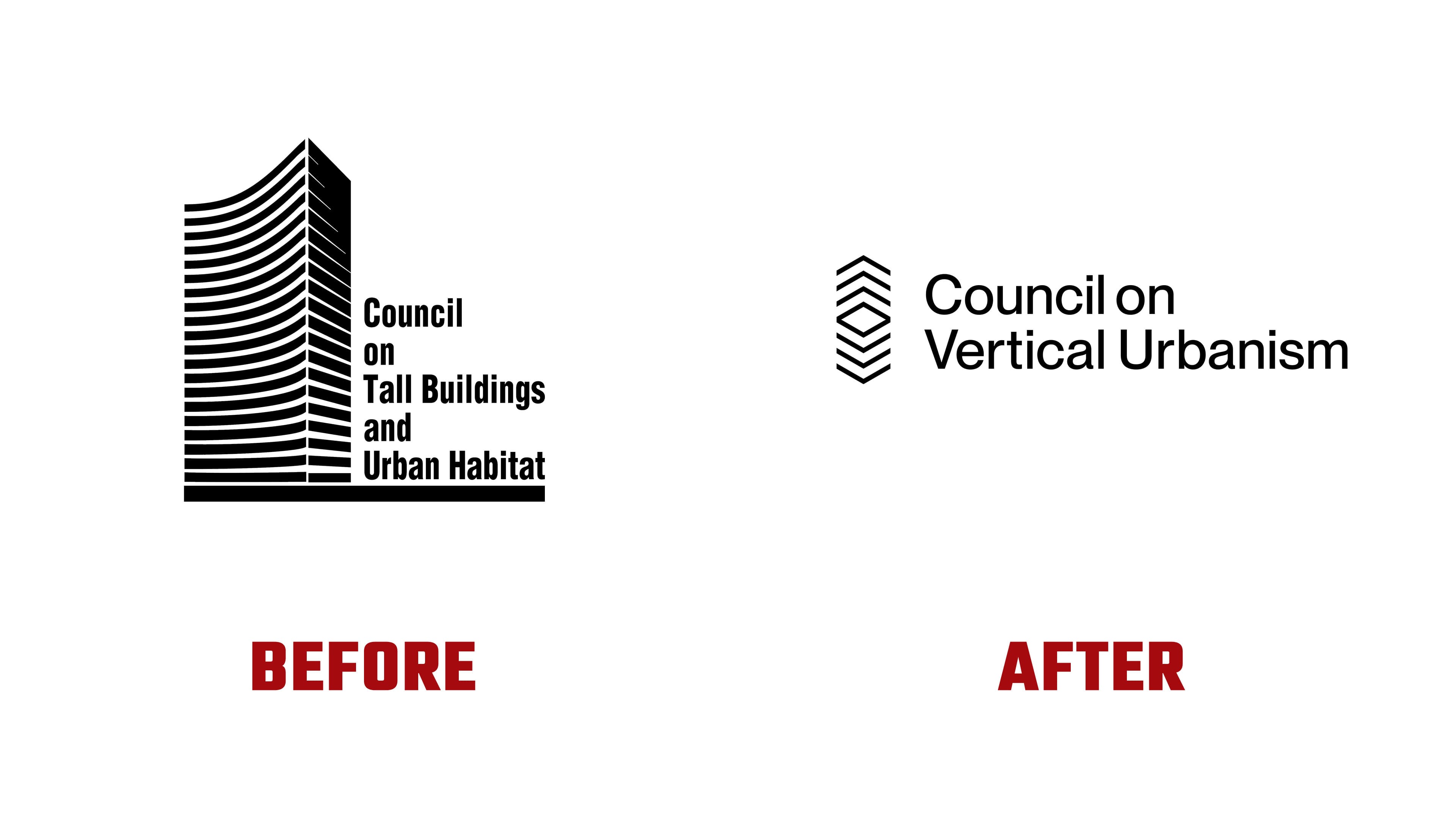
The new emblem shifts focus from the individual building to the urban environment. Multiple constructed it from vertically stacked angular lines. The upper group points upward, while the lower group mirrors it and points down. A diamond-shaped outline emerges between them. Uniform strokes, separated by even gaps, suggest open tiers. The architectural reference comes through in these levels and their arrangement.
In CVU’s official explanation, the angular bands, or chevrons, represent verticality, density, and a city’s three-dimensional structure. The upper angles refer to upward urban growth. The lines converging toward the center express collaboration and connections among urban spaces. The interpretation also includes human interaction at ground level, allowing the emblem to encompass the city from the street to its upper floors.
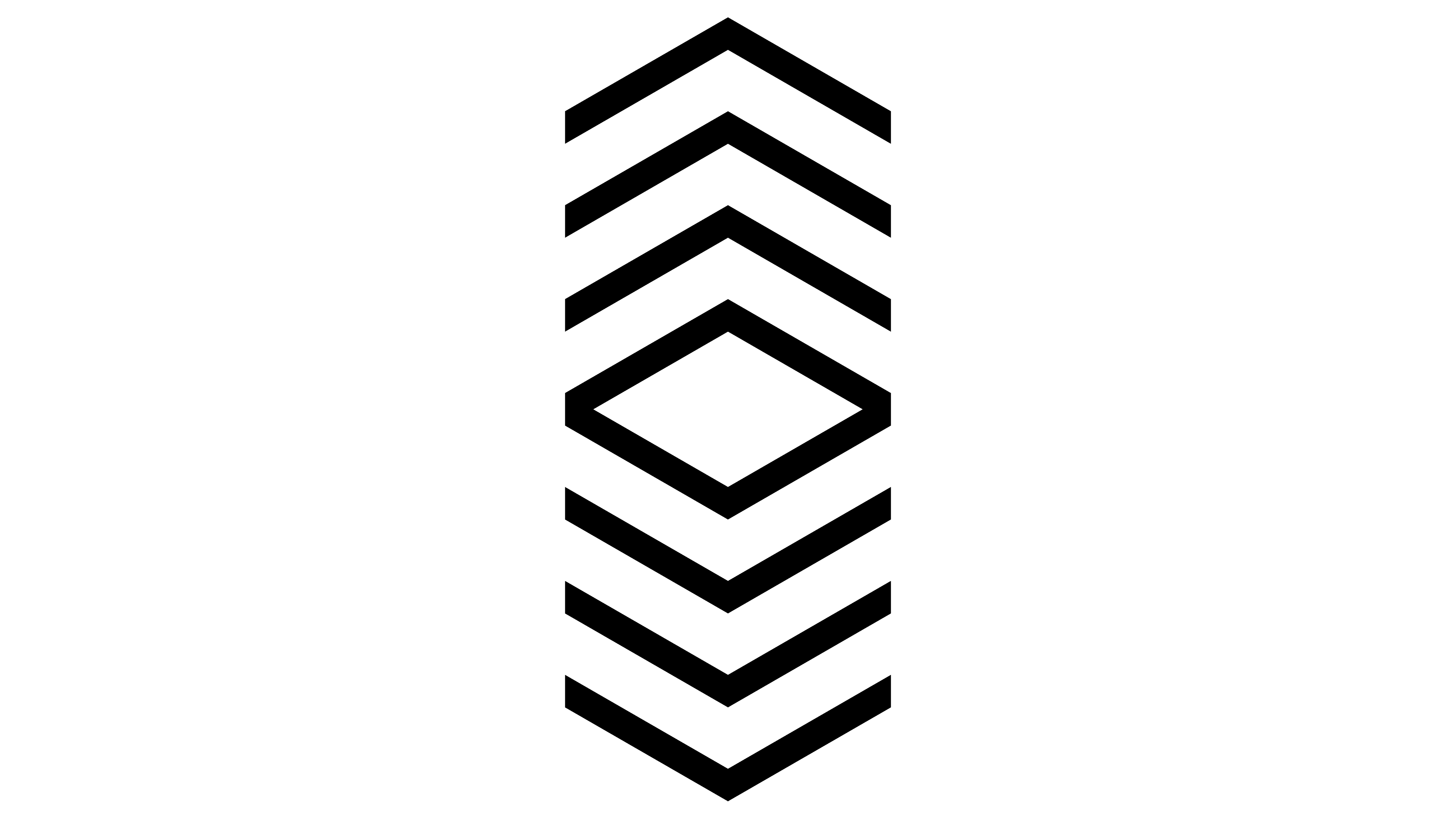
The previous logo conveyed the council’s specialization through a black silhouette of a tall building with a curved facade. White horizontal bands represented floors and converged at the tower’s vertical edge. To the right, the name appeared on five lines in bold, condensed sans-serif lettering. A lower band joined the image and text into a compact block. The new version replaces the tower with an arrangement of lines that still references multistory architecture.
The abbreviation CTBUH has become CVU, and the full name now occupies two lines, with Council on above Vertical Urbanism. The wordmark usually sits to the right of the emblem. The letters have more open proportions and lighter strokes, retaining a sans-serif style. Primary versions appear in black on a light background or white on black. The system also includes a standalone emblem and a version with the name on the left. Geographic identifiers distinguish the organization’s chapters.
The project began after the international board of directors voted to review the brand and consider a new name. Multiple members gathered views and interviewed stakeholders. The research helped address the needs of the architects, engineers, urban planners, and builders in the council’s international network. The project covered naming, messaging, and design guidelines for publications, the website, and conferences.
Elsewhere in the identity, enlarged chevrons repeat in rows to form patterns. A bright yellow-green accent complements the black-and-white foundation, with additional colors provided for charts. The phrase “Building tall better” continues to emphasize the council’s professional focus. It appears alongside messages about the future of growing cities and the exchange of knowledge to help build them. CVU uses the identity across its publications, digital materials, and events.