



The Detroit Red Wings hockey club celebrated its centennial anniversary by unveiling a completely new logo, which fans greeted with genuine enthusiasm. The team, whose identity is deeply intertwined with hockey history, chose to refresh its legendary winged wheel by integrating it into the anniversary number “100.” The result is a symbol that elegantly blends tradition with boldness and innovation.
Over the past hundred years, the club has experienced triumphs, victories, and periods of anticipation, yet its visual identity has remained consistently recognizable. The updated design successfully highlights the greatness of the past and the ambition for the future, maintaining the historic Red Wings motif of the wing and wheel, symbolizing the club’s inseparable link with Detroit, known as the Motor City.
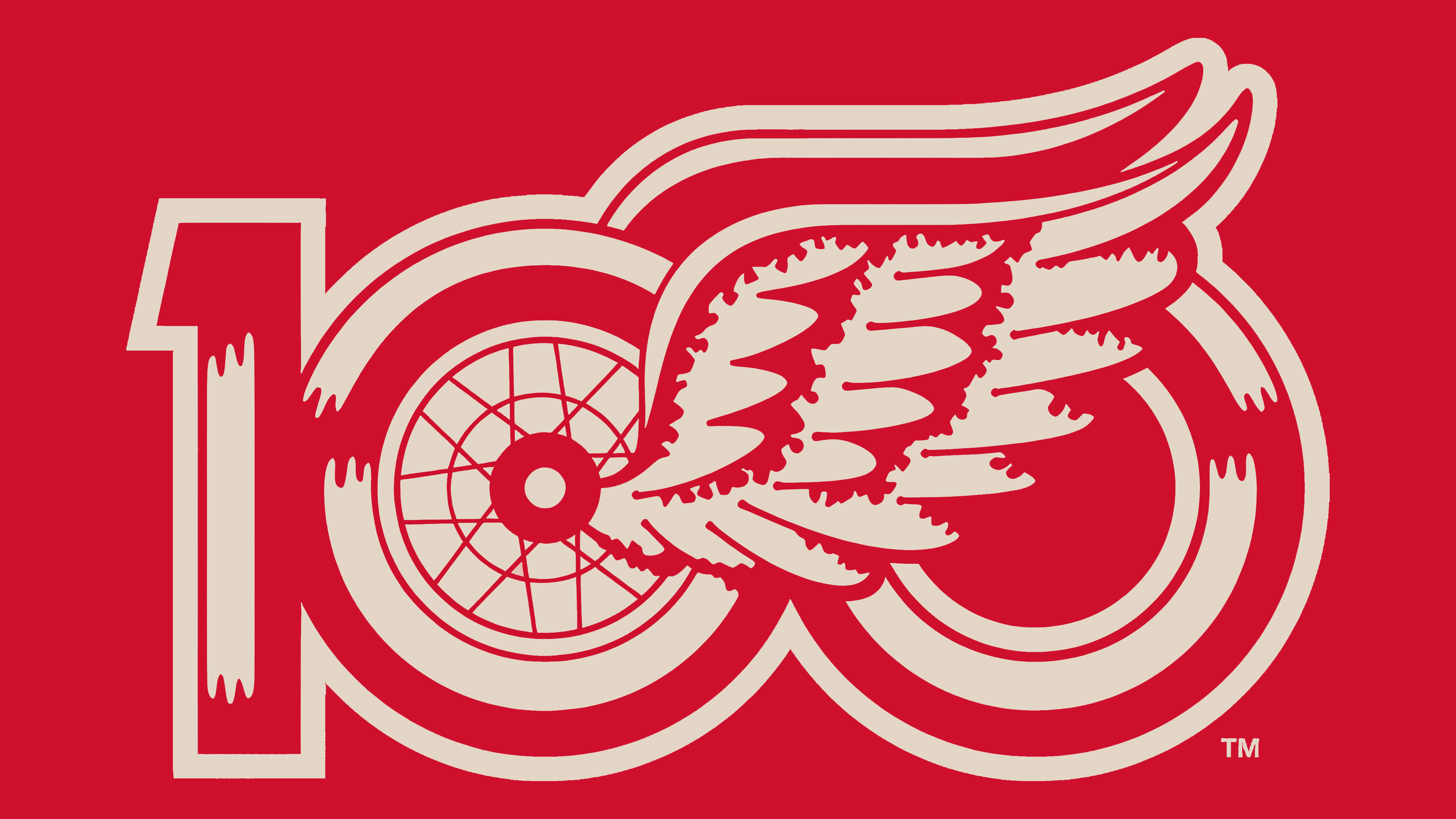
In the redesigned logo, numbers and symbolism are intertwined neatly and clearly. The wheel is integrated into the first “0,” while the wing gracefully rests across the other digits, unifying the overall composition. This emphasizes how hockey is an integral part of Detroit’s identity.
The anniversary emblem has received numerous positive reactions on social media. Fans noted the absence of excessive commercialization, a common issue in many modern sports branding projects. Some called it “elegant,” others “stylish,” but all agree that the commemorative symbol honors the club’s legacy and naturally continues its traditions.
The design demonstrates how precise yet careful work with legendary sporting images can create a powerful symbol that connects generations of fans. With this update, the Red Wings embark on their second century, ready for new victories while firmly holding onto the club’s rich history.