London-based Output studio developed a new corporate identity with vibrant images and pleasing shapes.
If you are not already familiar with Marshmallow, then the type of activity will surprise you – conscious insurance. The unusual name for the insurance company has become the highlight of the entire brand. Buying insurance is a simple necessity, which turns the whole process into a boring, not the most pleasant trip to a company or online registration. Marshmallow’s goal is to bring humanity, understanding, and interest back to the industry, putting customers first, not only with quality service but also with a recognizable, soothing brand identity.
Marshmallow is a startup founded in 2017. Twin brothers Oliver and Alexander Kent-Braham, together with David Goate, have set themselves to make the insurance process fast, quality, cheap and inclusive. Rebranding has become a necessity due to the rapid development of the company. Building on the original design, the Output team created a new style that expresses the evolution and ambition of Marshmallow.
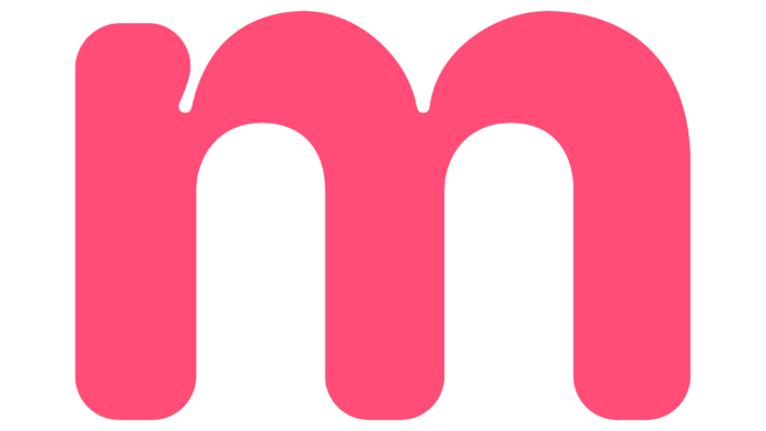
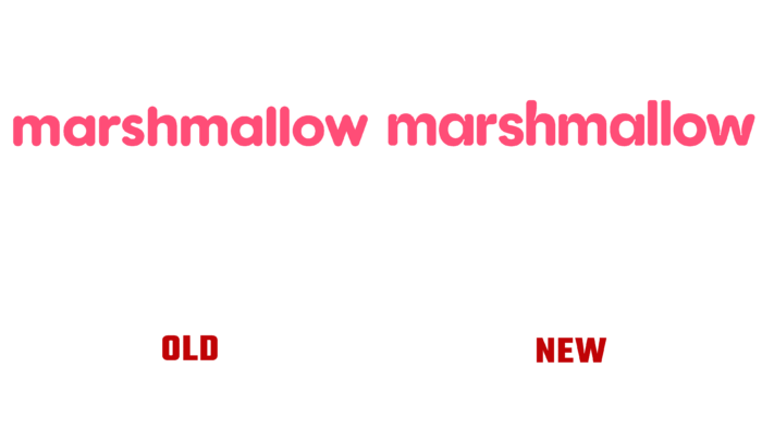
The basic idea of the logo has remained the same, but with minor improvements. The font for the logo has become playful and friendly. The designers have added indentations in each letter and “depart” from the typical bold, rounded type. The roundness of the letters reminds of Marshmallow, its softness, and airiness. Even geometric shapes are made in the shape of a marshmallow. The color palette has also changed slightly, consisting of bright pink, dark blue, and pleasant grays. Pleasant illustrations complement the corporate identity with thin lines. The combination of all shapes, colors, and fonts grabs attention and creates a friendly brand.
Despite this playfulness and friendliness, Marshmallow does not forget about its mission and objectives. For some people, getting insurance is a rather complicated and exciting process, so the company challenges stereotypes and wants to gain the trust and sympathy of customers.


