The so-called “smartwatch” in our time is no longer an object of close attention of consumers. When this product first appeared on the market, it immediately fell in love with its convenient functionality, various design tricks, and ease of use. Those who love sports or just an active life are happy to acquire new models to be in trend and not lose their shape, both in terms of health and current technological innovations.
Such a well-known brand as Amazfit is today the sales leader in the niche of devices for a healthy lifestyle. Zepp Health already has over 100 million devices under this brand.
In mid-October, the company decided to introduce a new corporate identity, which emphasizes the importance of self-expression, values , and customer comfort.
The modern world is full of movement. An active life is not just a value for some people; it is the air they breathe. Therefore, Zepp Health decided to create a new image for its brand and embody new ambitious ideas, highlighting the individuality of its consumers.
The new identity style is characterized by bright colors that have soft, unobtrusive gradients. With a new color scheme, the initiators of the redesign wanted to emphasize that each client will be able to find his device, which will reflect his inner potential, will show the world the energy, vitality, and cheerfulness of the owner of the device.
We started with updating the logo, which determined the further direction of the rebranding.
A colorful world, value inclusiveness, good spirits – that is what lies in the new logo, according to Huang Wang, CEO of Amazfit.
The main message of the design was the idea that everyone could make themselves better.
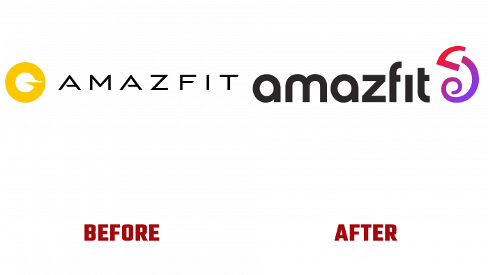
Comparing the old and new logos, it becomes clear that the brand has taken a course towards positive and adventurous play with the target audience. And the thing is this: earlier, the logo was very formal, had pointed outlines, a font with a “sharp” and daring character. Sharp corners showed that there was business and time trouble. And the unhappy client wants to buy a device that will keep him informed of all the affairs without the threat of disrupting the deadline.
The yellow circle with a sharp white detail extending beyond the contour looked like a space object, not to mention the company’s type of activity. On the one hand, brand logos are interesting, abstract, and elegant but do not hint at their specialization. On the other hand, a brand like Amazfit is more likely to show its consumers what it wants to say through the logo. The message is unclear, and the black font looks modern and bright but not related to the brand and products. There is no focus on people; there is not enough communication with the audience.
The new logo is another matter. A stylized lizard was used as a concept image. It has a slight gradient overflow from red to pale purple. The font is dark, but not with capital letters, as before, but with lowercase, rounded, and pleasing to the eye.
No cognitive dissonance occurs. The logo seems to tell the client:
- Everything will be fine with you.
- You will have time everywhere.
- You will call everyone.
- You will be able to save your nerves from stress.
A good period begins for the brand because its new image is very colorful and “kind,” conducive to communication. Therefore, the Amazfit team can safely expect an influx of buyers and sales growth shortly.


