


![]() Orlando Magic Logo PNG
Orlando Magic Logo PNG
The name of the basketball club from Florida, founded in 1989, reflects childhood impressions of urban recreation zones and parks. The Orlando Magic logo conveys the team’s unique spirit, its close connection with the region, and the brand’s sports orientation.
The history of the Orlando Magic began in 1985 when businessman Jim Hewitt proposed bringing an NBA team to Orlando. After several years of preparation, the franchise was officially established in 1989, alongside the Minnesota Timberwolves. The team’s name was inspired by the atmosphere of Walt Disney World.
The Magic played their first-ever game on November 4, 1989, against the New Jersey Nets, losing, but earned their first victory two days later against the New York Knicks. A breakthrough occurred in the early 1990s with the arrival of Shaquille O’Neal and Penny Hardaway, who led the team to the 1995 NBA Finals against the Houston Rockets. However, O’Neal’s departure soon afterward marked a challenging period for the franchise.
The team found a new leader in Tracy McGrady, although he was unable to achieve significant postseason success. Another successful era began with Dwight Howard, who led the team back to the NBA Finals in 2009. Following Howard’s departure, the team entered another rebuilding phase.
In 2010, the franchise moved into its new home arena, Amway Center. Today, the Orlando Magic continues to develop young talent to repeat its past success.
Meaning and History
![]()
In 1985, basketball fans in Florida could only dream of having their own NBA team. Just one year later, the league approved the creation of two local franchises, beginning a rivalry that, while notable, wasn’t the most intense.
Fans in Miami and Orlando were asked to choose the names for their new teams. Both cities had similar suggestions, such as “Heat” and “Floridians.” However, the Orlando vote, organized by the local newspaper Sentinel, featured many space-related names. This was due to the tragic event in January 1986 when the space shuttle Challenger exploded shortly after launch near Florida, resulting in the deaths of all seven astronauts onboard and deeply impacting the U.S. space program.
Wanting to honor the memory of those lost, fans made “Orlando Challengers” a popular choice. Other space-themed names included “Astronauts” and “Orbits.” Among the non-space-related favorites were “Juice,” “Tropics,” “Sentinels,” “Aquamen,” and “Magic.”
Ultimately, the name was suggested by the general manager’s child, much like the Chicago Bulls’ name. Pat Williams’ seven-year-old daughter visited Orlando’s amusement parks and described the city as “magical,” inspiring her father to choose “Magic” as the team’s name.
The Orlando Magic aimed to preserve a sense of enchantment through their image and logo. The unique style of their emblem helped the franchise stand out and become memorable to fans. Chosen from more than 5,000 fan suggestions, the logo evolved from a cartoonish design to a more refined, realistic appearance over time.
What is Orlando Magic?
This professional basketball team, based in Orlando, Florida, competes in the NBA. The franchise is well known for developing several legendary centers, including Shaquille O’Neal and Dwight Howard. They have reached the NBA Finals twice but have yet to win a championship. The team’s home games take place in a modern sports arena located in Orlando. The club’s management primarily focuses on developing young talent, consistently drafting promising players, though they have not always managed to retain their star athletes long-term.
1989 – 2000
![]()
The first logo for the Orlando Magic basketball team appeared shortly before their debut in the 1989–1990 season. Artists from Walt Disney World created it in collaboration with The Advertising Works, an Orlando-based advertising agency. The project was led by Doug Minear, whose agency was responsible for collecting and selecting the best visual concepts for the future NBA franchise. Disney’s designers proposed a concept closely tied to the iconic imagery of the “Magic Kingdom,” aligning perfectly with Disney’s brand image.
The creative collaboration resulted in a vibrant, memorable emblem centered on the theme of magic and enchantment. The visual composition prominently featured the word “Magic,” stylized in large, saturated blue letters, with a distinctive inner shadow effect that added depth and a sense of movement. The letter “A” was replaced by a prominent five-pointed star, reinforcing the magical theme of the team.
The name of the city, “Orlando,” appeared at the top of the logo in black, handwritten-style lettering, also incorporating a star instead of the letter “a.” Thanks to the designers’ personalized approach, none of the typography elements used standard fonts; all glyphs were handcrafted specifically for the team’s unique identity.
On the right side of the emblem was a basketball designed in the same blue-and-silver color palette, surrounded by a trail of stars. The silver outline of the ball created an illusion of motion resembling a comet or meteor streaking forward, emphasizing the team’s drive toward victory.
The blue-and-silver color scheme evoked professionalism and energy, while the numerous stars further heightened the magical atmosphere. Integrating stars directly into the lettering also helped make the logo instantly recognizable among other NBA franchises.
At the time of its debut, the Orlando Magic’s logo was viewed as innovative and fresh, clearly standing out from more traditional sports logos. It became fondly remembered by fans as a vibrant symbol of the team’s early years, closely connected with legendary players such as Shaquille O’Neal and Penny Hardaway.
2001 – 2010
![]()
The new Orlando Magic logo was a continuation and reinterpretation of the franchise’s original emblem. Designers maintained a sense of continuity by keeping core visual elements such as the word “Magic,” star motifs, and the basketball image, while significantly altering their execution to enhance depth and motion.
The primary lettering “Magic” remained custom-made and hand-drawn, not based on standard fonts. The letters gained greater visual impact through wide, bold outlines, highlighted by strong black-and-silver borders, creating a three-dimensional appearance. The five-pointed star that replaced the letter “A” was enlarged and stood out prominently because of its contrasting silver fill.
Above the main lettering, the city name “Orlando” retained its stylized handwritten script, now featuring thicker lines and darker contours to reinforce its integration within the overall dimensional design.
A notable update was the new visual interpretation of the basketball, now depicted in silver and blue tones and leaving a comet-like trail. Its curved black tail was decorated with stars of varying sizes, effectively communicating speed, power, and purpose. The comet imagery is directly tied to the team’s name, symbolically expressing the franchise’s magical energy.
The primary color of the logo, officially known as “Magic Blue,” traditionally represented the team and conveyed confidence, ambition, and athletic aggressiveness. Secondary colors, black and silver-gray, provided visual contrast and emphasized the dynamic character of the logo’s elements.
This logo became a prominent symbol during a successful period for the team, associated with stars such as Tracy McGrady, Dwight Howard, Steve Francis, and Jameer Nelson. Wearing uniforms with this emblem, the team reached the NBA Finals in the 2008–2009 season under head coach Stan Van Gundy.
Although the designers sought to modernize and strengthen the team’s visual presence, they carefully preserved the emblem’s recognizability and maintained a connection to its historical version. This approach highlighted the richness of the club’s visual heritage while adapting the brand to meet the demands of the early 21st century.
2011 – 2025
![]()
After moving into their new home at Amway Center during the 2010–11 season, the Orlando Magic introduced an updated logo to the public in June 2010. The new emblem marked the start of another chapter in the team’s history and aimed to represent a franchise focused on future success and professionalism.
The main change from previous designs was the dramatic shift in style for the word “MAGIC.” The new font abandoned the previous handwritten aesthetic, becoming more structured and geometric. Letters took on a taller, more vertical form with angular serifs and a prominent double outline in black and white. The star previously used in place of the letter “A” was removed entirely, reinforcing the new identity’s serious, business-like nature.
The city name “ORLANDO” was placed above the main lettering in a separate, compact block. A bold, sans-serif font was chosen, featuring thick, smaller letters to balance the composition and emphasize the primary wordmark.
The basketball remained a significant design element but took on a more abstract and dynamic appearance. Depicted moving along an arc resembling a comet’s trajectory, the ball featured three stars of varying sizes, symbolizing speed and forward momentum. The ball itself was designed in silver-blue, with black lines that visually highlight its motion.
The logo’s color palette continued to feature the club’s trademark “Magic Blue,” symbolizing reliability and energy, complemented by silver, black, and white for contrast and visual impact.
Alex Martins, one of the team executives, noted that the new emblem was intended to symbolize the beginning of a new era and the franchise’s aspirations for greater sports achievements. The logo remained in active use for 15 years until the team’s rebranding in 2025.
During the period this logo was used, the team continued its tradition of creating special commemorative emblems celebrating its 10th, 15th, and 20th seasons in the NBA, emphasizing historical continuity and brand stability.
2025 – present
![]()
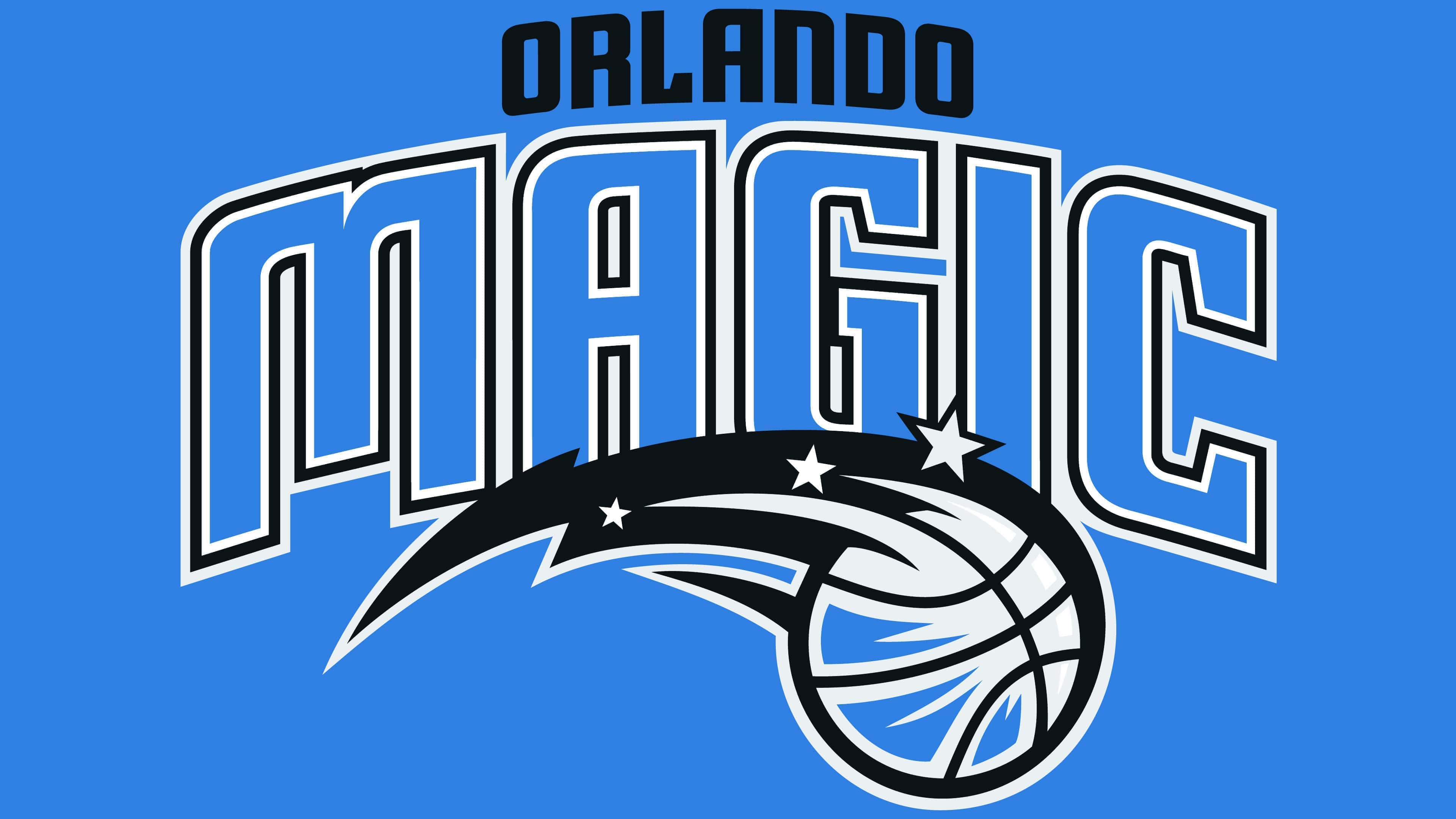
In June 2025, the Orlando Magic basketball team underwent a rebranding, unveiling an updated logo to the public. The new design brought back the image of a basketball comet with stars, reinterpreting elements from the original 1989–2000 emblem. The official presentation took place on June 3 at the Kia Center. It was accompanied by the introduction of three new uniform sets featuring a retro-inspired look with traditional vertical stripes and the return of the star replacing the letter “A” in both “Magic” and “Orlando.”
The logo itself conveys dynamic motion through a basketball stylized as a comet that moves rapidly forward. The outlines of the ball and accompanying stars are rendered in vibrant blue and white tones, emphasizing the club’s traditional color palette.
A significant aspect of the logo is the circular frame, inside of which the club name “Orlando Magic” is displayed in white, sans-serif letters arranged in a clear, evenly spaced manner, creating a professional brand appearance. The contrast between the white letters, the dark black background, and the bright blue outline enhances visual clarity and recognition.
The reintroduction of the star within the lettering highlights a symbolic connection to the franchise’s original identity and history. This new logo blends nostalgia with contemporary branding trends, carefully considering fan feedback and the franchise’s rich visual heritage. The club has filed about 15 trademark applications for various iterations of its branding elements, underscoring the star’s importance as a key symbol of the team.
Font and Colors
The color palette of the updated logo builds upon the club’s traditional colors, first selected at the team’s founding. The main shade is vibrant blue, associated with the team’s energy and dynamic style. Complementary colors include white, used for text and accent lines to enhance visibility and expressiveness, and a black background, which provides solidity and authority. Silver elements within the basketball and stars highlight motion, adding a modern touch.

The logo’s font is designed in a strict, geometric sans-serif style. The white lettering is arranged in a circular layout around the central symbol, standing out clearly against the dark background and conveying a sense of professional restraint. The minimalist and contemporary approach to typography emphasizes the team’s status and confidence.