



Driver has introduced a new logo built around light cutting through a dark letter “D.” Play, a studio based in San Francisco and Brooklyn, connected the identity to an everyday task for the platform’s users: understanding code written by someone else. A beam of light became a metaphor for uncovering connections within software.
Founded in 2023 and headquartered in Austin, Texas, Driver has raised $8.77 million from investors including GV and Y Combinator. The platform uses artificial intelligence to turn source code into documentation, relationship maps, and changelogs. It keeps product information up to date and delivers it to engineering teams and AI agents through MCP, APIs, and a web app.
Play started with a familiar scenario for developers: inheriting an unfamiliar codebase. Before making edits, a developer needs to understand how the software is structured and how a change in one area will affect the rest. Driver helps users trace those connections and assess the impact of their edits. The team expressed that purpose through light entering a dark shape.
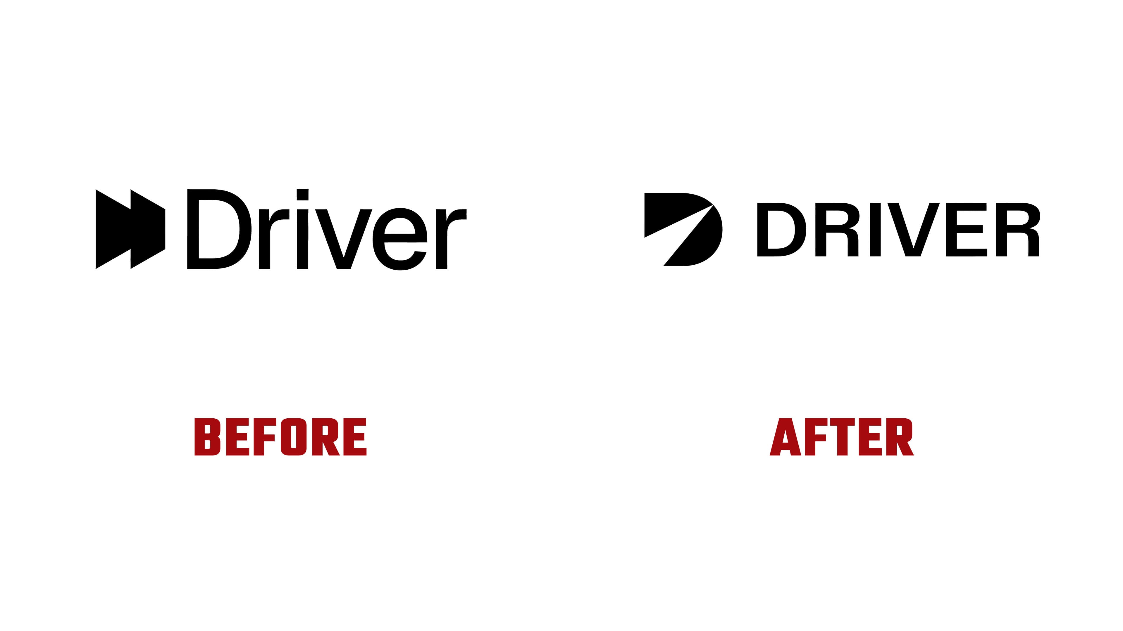
The new symbol is a bold “D” with a rounded right side. An open triangular cut replaces the enclosed counter. Its base opens onto the lower-left edge, while its tip points up and to the right, toward the letter’s curved side. The dark area represents the codebase awaiting exploration, and the light wedge reveals the connections within it. In motion, the opening sweeps across the letter like a spotlight.

This is Driver’s third logo in 3 years. The first symbol combined the outlines of a steering wheel and a pie chart. It appeared alongside widely spaced uppercase lettering and a separate AI label. In 2024, an abstract “D” made from overlapping angular shapes replaced it. Their arrangement suggested depth, and the Driver wordmark used an initial capital followed by lowercase letters. In Play’s version, the symbol’s outer contour more closely resembles a conventional “D,” and the name returns to all caps.
The DRIVER wordmark uses an upright sans-serif typeface. It complements the beam-of-light symbol, which carries the core idea behind the redesign. Black and white are the primary colors, extending the light-and-shadow theme. Blue, orange, and purple provide accents.

Play’s work spanned brand identity, art direction, animation, and interfaces. The visual system includes diagrams with connections that gradually appear and an X-ray mode that reveals objects’ internal layers. Patterns use symbols drawn from programming code, including plus signs, short dashes, vertical lines, and circles.