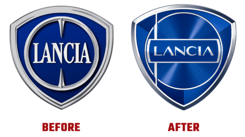
Car brand Lancia has upgraded its logo to be used on flagship models. This will happen in 2024, and until then, the updated identity will be presented at the corporate level. The fresh development symbolizes the beginning of the company’s electric era, its premium character, and Italian charm with elements of eclecticism.
The author of the innovative image is Jean Pierre Ploue, as well as the Turin team from Lancia’s Centro Stile. They created a new visual style of cars, calling it Pu + Ra Design from the words “pure” and “radical.” It will determine their appearance in the next century. So, this is how the logo is made. The brand is classified in the Progressive Classic category because it has both retro and modernity.
As the manufacturer himself noted, this is the eighth emblem in the 116-year history, and it will be actively used in early 2024 when it will decorate the Ypsilon model. The badge will be aluminum. As before, it will get the shape of a shield and an inner circle. But the background will be blue and shiny, with a tint and a gradient. In addition, a modern font has been chosen – elegant and smooth, with a chrome sheen. The thin lines of the ring and frame of the shield will form a single whole: they will link the internal and external elements of the cars, forming a perfect balance.
On the left, there is another strip – vertical. This is a spear taken from the 1957 logo. It embodies the roots of the automotive company and its historical past, which becomes the present. The silver element is filled with the spirit of chivalry and ancient tournament battles. He emphasizes the key importance of the origins of the Italian enterprise.


