The emblem symbols put the company’s machines in the spotlight. The brand is an example of the style, quality, and balance. Indicates the Lancia logo for smooth, coordinated work of all parts and guarantees safe movement.
Lancia: Brand overview
| Founded: | November 27, 1906 |
| Founder: | Vincenzo Lancia |
| Headquarters: | Turin, Italy |
| Website: | lancia.com |
Lancia is an Italian automotive brand that is part of the Stellantis group. It specializes in the Ypsilon premium passenger car series, a five-door supermini. Previously, the company was engaged in the production of rally sports cars. Moreover, it was opened twice: in 1906, when Vincenzo Lancia and Claudio Fogolin were founded, and in 2007, when the work of its parent corporation Fiat was reorganized. The first time the company was named Lancia & C. Fabbrica Automobili, the second – Lancia Automobiles SpA. Its head office is still located in Turin.
The founders of the company were two friends of the racer – Vincenzo Lancia and Claudio Fogolin. They produced their first car under the Lancia brand in 1907. It was the Tipo 51, later renamed Alfa. She had a 4-cylinder engine with 28 horsepower. In 1910, its parts were sent to the United States, assembled from scratch, releasing the SGV car. Then the Italian company got its first truck – Jota (in 1915).
In 1937, Vincenzo Lancia died, and his wife and son took over the company’s management.
Adele Miglietti Lancia and Gianni Lancia offered the position of engineer Vittorio Jano, who was already well known in professional circles for his projects, including Alfa Romeo and the successful sports cars of the 6C, P2, and P3 series. In 1955, the management passed to Carlo Pesenti, and in 1969 the company was incorporated into the Fiat concern and became its subsidiary.
After 1990, car sales plummeted, and the parent company changed Lancia’s range to buy Chrysler’s stake. So she decided to combine and update products to increase demand in the European market. Lancia’s current legal entity was incorporated in January 2007 when Fiat reorganized its business. But nothing helped: the level of sales continued to decline, so in 2015 the concern refused to sell Chrysler under the Lancia brand. He focused on the Ypsilon model, which found widespread demand in Italy. This car became the best-selling car in 2019.
Following the merger with the Stellantis group, the Italian brand and subsidiaries Alfa Romeo and DS Automobiles designs new premium cars. Their release is scheduled for the 2024th year. It is expected that they will once again show off the Lancia personal badge.
Meaning and History
The first Lancia car, created in 1907, had neither a name nor a logo. And to roll the car out of the workshop, I had to demolish the wall. The famous spear badge first appeared on the bonnet of the Gamma 20 HP in 1911. Since the word “lancia” means “spear” in Italian, the ingenious authors of the emblem decided to use this element as a flagpole for the flag, which featured the brand name.
Such a visual pun has become an excellent marketing tool and has attracted the attention of car enthusiasts. A similar technique is used in the Shell logo, which features a stylized clam shell. But, unlike the oil and gas company, the car manufacturer eventually abandoned its main symbol’s image, replacing the spear with abstract elements.
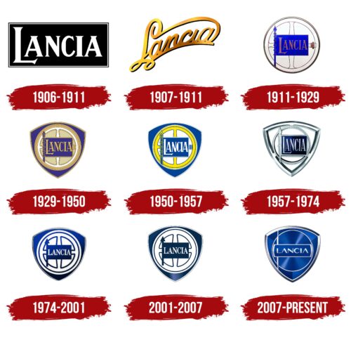
1906 – 1911
As already known, Lancia did not have an official logo at the beginning. Various brass plates were used to identify the cars, indicating the model and manufacturer. One of the options contained the brand’s name, written in a strict bold font with triangular serifs. Even though all the letters were in capitals, the first “L” stood out prominently. It was enlarged and moved down a bit, causing its horizontal line to be below the “A.” The basis for the inscription was a long black rectangle with a double border.
1907 – 1911
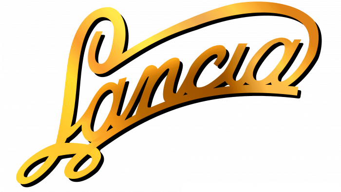
A laconic emblem in the form of an inscription belongs to this period. It was a copper or brass plate with the name of the manufacturer. It contained cursive handwritten text and was placed on the radiator grille. The letters were ornate, with curly curls that blend harmoniously into the underline and the upper half-arc. The main color of the logo is yellow.
1911 – 1929
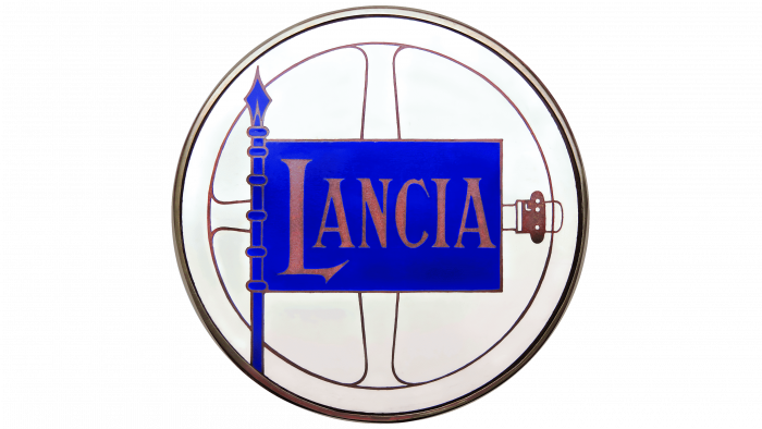
At the request of Vincenzo Lancia, Italian artist and designer Carlo Biscaretti di Ruffia took over the development of the real logo. As a result, he presented six sketches to choose from. The brand’s founder liked the option with a round rim or with a steering wheel divided by a cross into four parts. On its background was a flag with a pole made of a sharp spear and a golden inscription “Lancia” on a blue cloth. The fact is that the name of the company in translation means “spear.” There was also a manual choke on the right side of the figure. The font consisted of elongated letters with thin serifs. In “L,” it was large and hooked. This emblem first appeared on the Gamma 20 HP.
1929 – 1950
In 1929, the seal with the flag, spear, and choke was enclosed in a shield – a geometric figure called the “reuleaux triangle.” This version was also one of six sketches proposed by Carlo Biscaretti di Ruffia. In this form, the icon has become much more solid and presentable. The shield, like the flag, was painted blue. In addition, he received a frame consisting of thin double lines. Although this emblem was first used in 1929 on the Dikappa, it was not permanently used until 1936 on Aprilia cars.
1950 – 1957
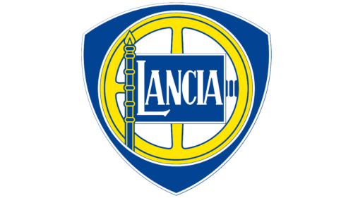
To make the Lancia logo more visible, the designers added a touch of color to it. The blue color has become lighter, richer, and more saturated. And the pale gold with a brown tint has been replaced with a sunny yellow. At the same time, it was used only for the steering wheel and some spear fragments. The central part of the image, the brand name, the flag’s border, and the thin line drawn along the edge of the triangular shield were repainted white. This made it possible to distinguish them from the background of the colorful elements of the emblem.
1957 – 1974
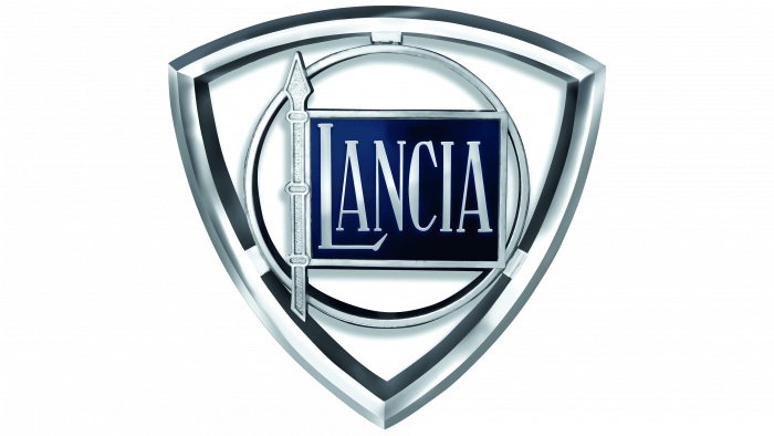
Since 1957, Lancia began to equip its cars with a full-width horizontal grille. Therefore, the transformed look required an improved logo. It has been replaced by a three-dimensional openwork version in chromed metal and moved a little further to the grille. The designers painted the steering wheel and shield in silver, adding shadows and highlights. They also modernized the wheel by removing the cruciform division into four parts. The only recognizable detail was the flag on the spear with the name of the trademark: as before, it was blue. For the first time, such a logo shone on Flaminia models.
1974 – 2001
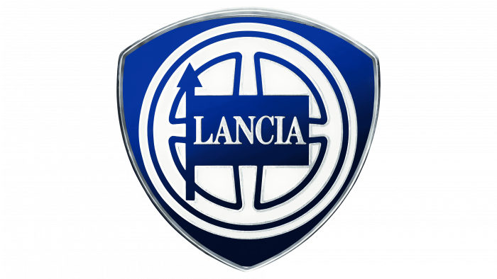
The developers changed the emblem at the request of Umberto Agnelli and returned it to the silver-white-blue color and the 1929 uniform. But there were also differences. For example, the designers unified the flag and spear, making it look like a straight pole. They also removed the throttle on the right side, removed the wide bezel, and changed the color to blue with a gradient. The lettering has also been changed, so instead of an elongated type with sharp serifs, there is a classic typeface with tightly spaced letters. The frame on the shield remains chrome-plated. In this form, the emblem debuted on the Delta car.
2001 – 2007
After a cosmetic redesign, the shape of the gradient has changed. It continued to be used only for the shield, and the flagpole, flag, and steering wheel outlines became two-dimensional. The light blue highlights have moved down, making the side corners more evenly colored. In addition, the designers have made some of the lines thinner to make the logo look sleeker. But this did not affect the upward arrow: it, as before, was wide.
2007 – today
The actual logo was presented at the Geneva Motor Show. Its author is the Robilant Associati studio. The designers have replaced the old steering wheel with a modern, chrome-styled wheel with two sharp spikes at the top and bottom that point towards the center. Another change affected the flag and spear: they were removed by the developers. From past versions, only the traditional blue shield and chrome edging remained.
2022 – today
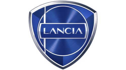
Car enthusiasts first saw the new Lancia logo on November 29, 2022. It was unveiled at the Lancia Design Day event along with the Pu+Ra Zero concept car and marked the brand’s debut in the electric vehicle sector. This emblem was designed by Jean Pierre Ploue, inspired by the old Flaminia badge from 1957.
The French car designer, who in the past rehabilitated the Citroën brand, successfully emphasized the modern style of Lancia. Now the logo symbolizes premium, innovation, and Italian sophistication. In the modernized version, there are a lot of gradients, which diverge from the center in uneven stripes, resembling rays.
The triangular shape of the shield has been preserved, as has the silver-gray chrome frame. A ring takes the place of a stylized steering wheel, and a long line is used as a flagpole, expanding in the middle and not at all like a traditional spear. The quadrangular figure with the brand name also almost does not resemble a flag because its side parts are rounded.
The font of the inscription was changed for the first time in many years. Jean Pierre Ploue felt that the new emblem needed futuristic letters of an unusual shape. He shortened the serifs and made them multi-directional to create internal dynamics. The slightly flattened “C” resembles a horseshoe. But the most original are the two capital “A,” which lack the central horizontal strokes.
Lancia: Interesting Facts
Founded in 1906 by Vincenzo Lancia, the Italian carmaker Lancia is distinguished by its trailblazing designs and advancements in the auto industry. Despite facing financial hurdles and ownership changes, Lancia’s record of ingenuity and achievement in consumer vehicles and motorsport is unmistakable.
- Groundbreaking Beginnings: The Lambda, introduced by Lancia in 1922, was the first vehicle featuring a monocoque chassis, enhancing the car’s structural integrity and decreasing weight, revolutionizing automotive design.
- Rally Icons: Lancia’s mark on rally racing is profound, especially with the Stratos, Delta, and 037 models. The Delta Integrale, in particular, stands out as a rally legend, securing six consecutive World Rally Championship titles from 1987 to 1992.
- Ahead of Its Time: Lancia’s cars often showcased pioneering features, like Aurelia’s debut of the first production V6 engine in 1950 and the introduction of the first five-speed gearbox in a production car.
- Elegance and Sophistication: Lancias weren’t just mechanically advanced; they also exuded style and luxury. The Aurelia and Flaminia are prime examples, celebrated for their exquisite design and luxury.
- Financial Challenges and Fiat Acquisition: Lancia encountered significant financial difficulties, leading to its acquisition by Fiat in 1969. Although Lancia continued creating unique models under Fiat, its international footprint shrank.
- The Thema 8.32: The high-performance Thema 8.32, powered by a Ferrari V8 engine, underscored Lancia’s dedication to merging speed with luxury, as hinted by its name, indicating eight cylinders and 32 valves.
- Beyond Rally Glory: Lancia also excelled in sports car racing, with the Beta Montecarlo clinching the World Sportscar Championship in 1981 and the LC2 being one of the 1980s’ fastest series cars, despite not winning the 24 Hours of Le Mans.
- Design Innovation: Collaborating with celebrated designers and coachbuilders like Pininfarina, Bertone, and Zagato, Lancia produced some of the industry’s most iconic and forward-thinking car designs.
- Focusing on Home: In the 21st century, Lancia’s production has mainly focused on the Italian market, with the Ypsilon recently being its sole model.
- Looking Ahead: Despite its narrowed scope, plans to rejuvenate Lancia, including launching new and electrified models, signal a hopeful future chapter for this storied automaker.
Lancia’s enduring legacy is a testament to its engineering prowess, design innovation, and motorsport achievements, continuing to inspire car enthusiasts globally.
Font and Colors
The idea to decorate the logo with a flag on a spear appeared immediately because the founder’s surname, Vincenzo Lancia, translates exactly as “spear.” It is not only in the modern version – in the rest, it is present in various modifications.
Early versions were dominated by a retro typeface with elongated letters and sharp serifs. Now the commercial font News 706 Roman is used – modern, printed, with classic serifs. Its free counterpart is Bienetresocial Bold.
The corporate palette includes metallic colors – all shades of silver. Usually, it was complemented by blue and white. The debut logo used a golden gradient.
Lancia color codes
| Air Force Blue | Hex color: | #002d87 |
|---|---|---|
| RGB: | 0 45 135 | |
| CMYK: | 100 67 0 47 | |
| Pantone: | PMS 661 C |
| Dark Navy Blue | Hex color: | #001154 |
|---|---|---|
| RGB: | 0 17 84 | |
| CMYK: | 100 80 0 67 | |
| Pantone: | PMS 2755 C |
| Dark Gray | Hex color: | #b1b2b4 |
|---|---|---|
| RGB: | 177 178 180 | |
| CMYK: | 2 1 0 29 | |
| Pantone: | PMS Cool Gray 5 C |
| Onyx | Hex color: | #424243 |
|---|---|---|
| RGB: | 66 66 67 | |
| CMYK: | 1 1 0 74 | |
| Pantone: | PMS 446 C |
