


Gilcrease Museum in Tulsa, Oklahoma, has updated its logo and identity ahead of its new building’s opening. Created by Ologie and unveiled on May 4, 2026, the identity centers on an open “G” that invites visitors into a conversation about history. The museum plans to welcome its first visitors in early 2027.
The update is intended to introduce audiences to the full breadth of the Gilcrease collection. Best known for art of the American West, the museum holds more than 300,000 objects spanning 12,000 years. Its artworks, historical documents, and cultural objects tell the stories of peoples across North and South America. Ologie’s task was to convey the collection’s scope and the connections among the histories it represents.
Development took about a year. The agency’s team traveled to Tulsa, explored the museum’s grounds and facilities, and spoke with staff, leadership, donors, museum community members, and community advisors. The designers also studied Tulsa’s cultural institutions and comparable museums across the United States. This research helped shape how Gilcrease would introduce itself to future visitors.
Ologie brought the project together under the concept “Unparalleled.” A prism became the museum’s metaphor, offering different perspectives on the past. The identity draws on the juxtaposition of cultures, histories, and interpretations. Visitors engage with the collection through curiosity, personal experience, and their own understanding of what they see.
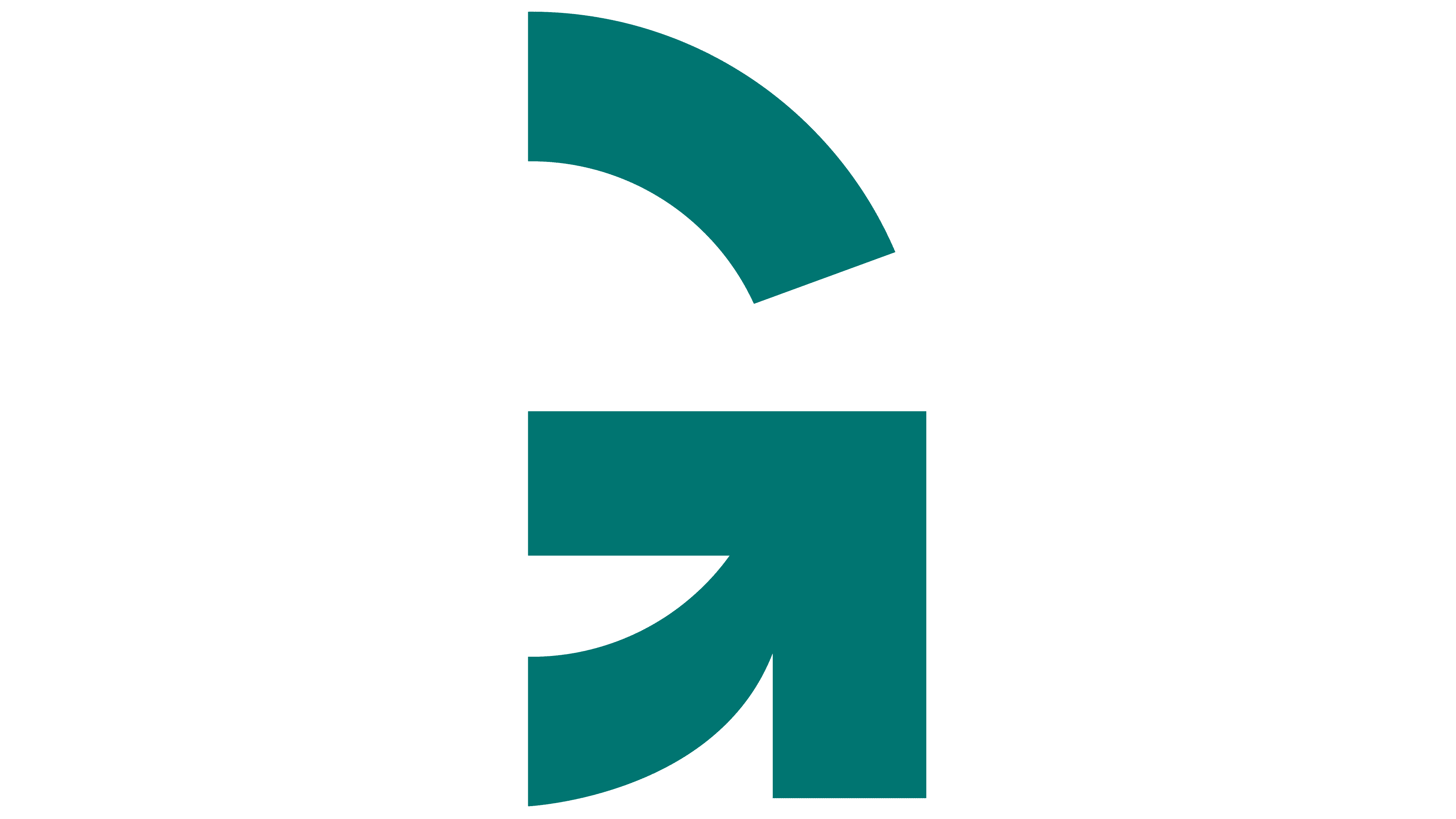
The open “G” expresses this idea. Its upper curve is separated from the lower section, leaving a gap on the left. At the bottom, the curve flows into a vertical stroke on the right and a horizontal crossbar. According to Ologie, the breaks in the outline suggest that history remains open to further exploration and interpretation. The visitor’s contribution becomes part of the museum experience.
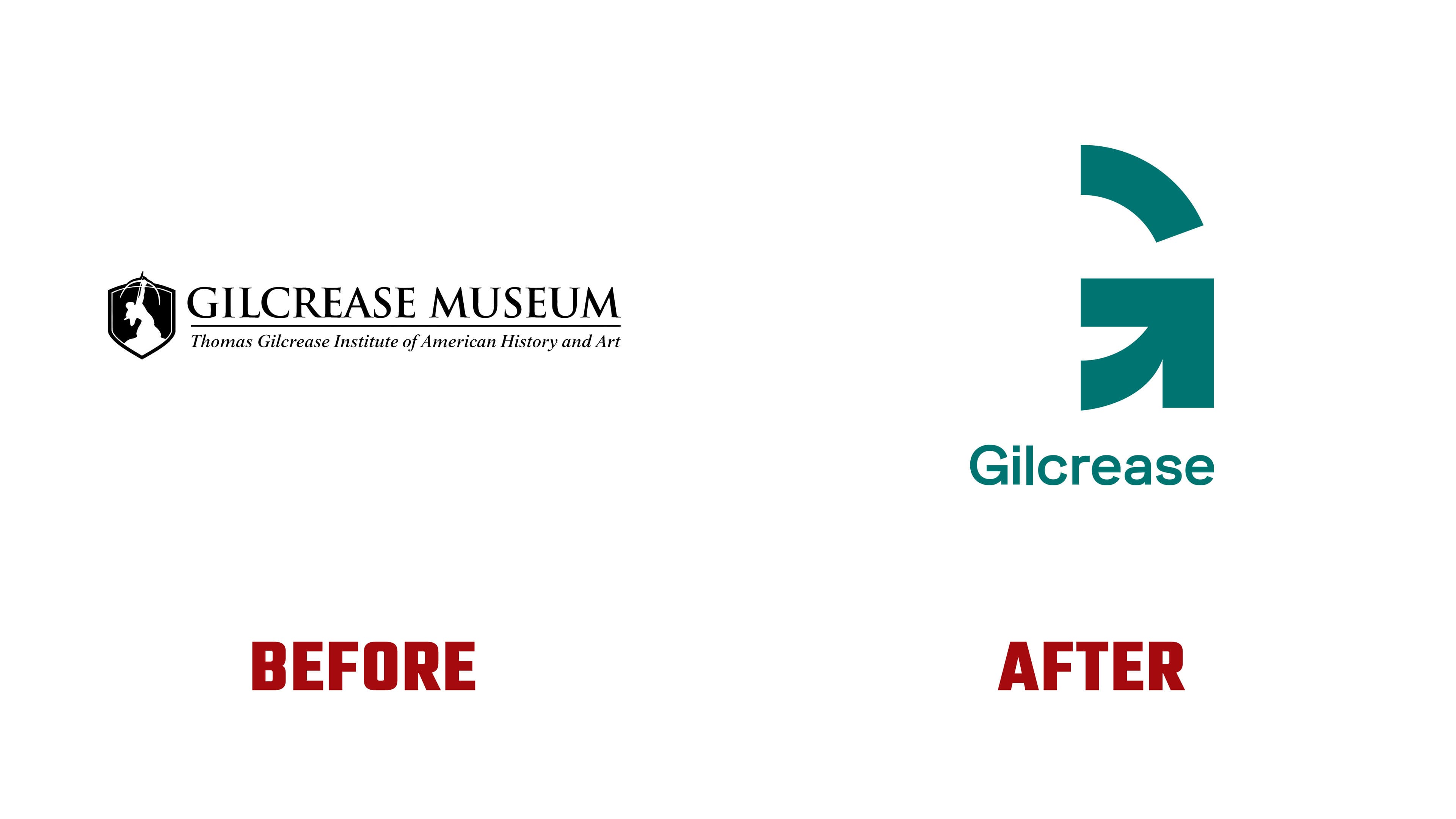
The previous emblem referenced a specific work in the collection. Inside a shield was the archer from Allan Houser’s sculpture Sacred Rain Arrow. The 1988 bronze connected the museum’s symbolism to the legacy of the Chiricahua Apache artist. The 2016 identity guidelines described the emblem as reflecting Gilcrease’s traditions. The new logo focuses on engagement with the collection as a whole.
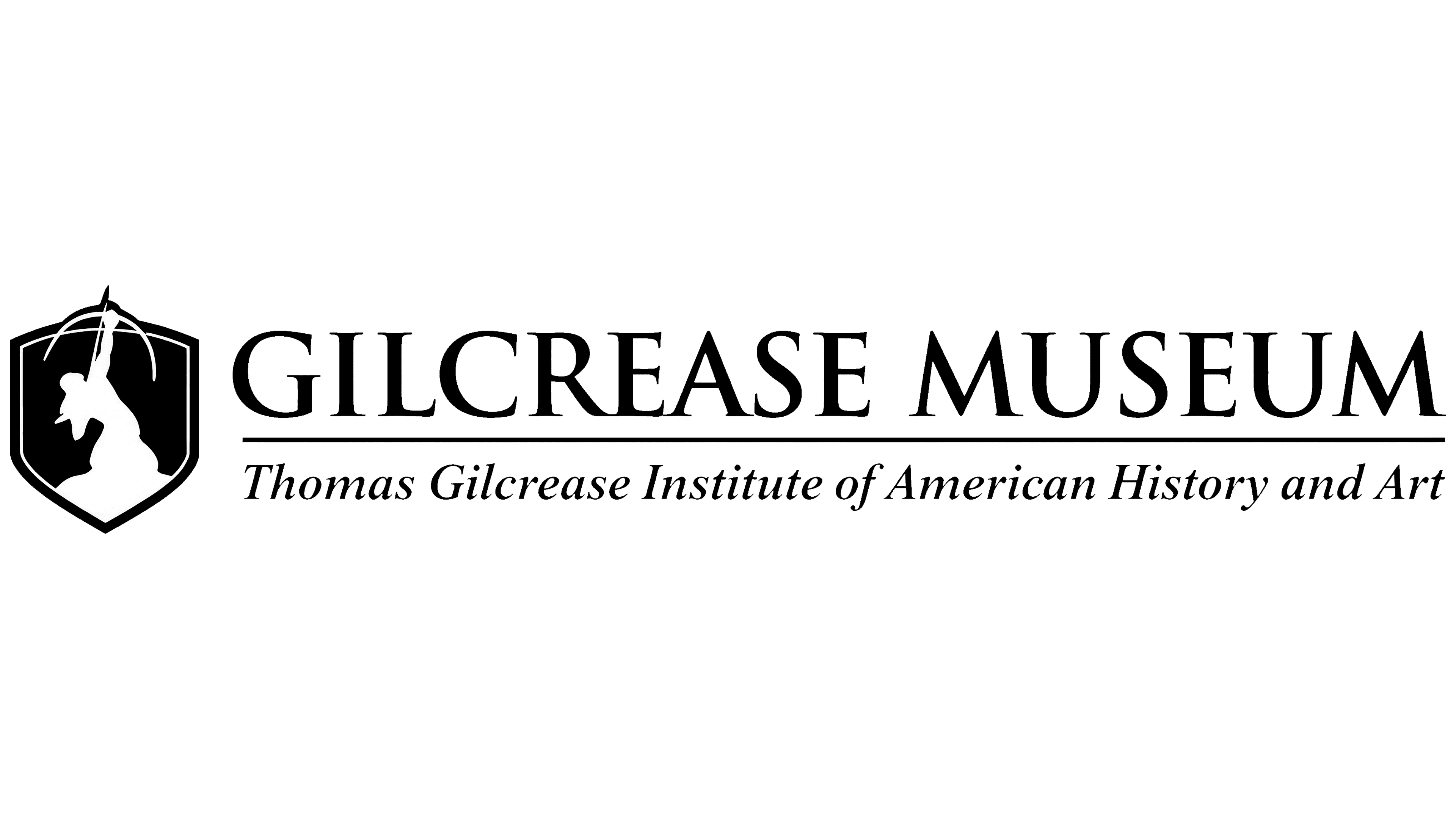
The name has also been shortened. Gilcrease has replaced the former uppercase serif GILCREASE MUSEUM wordmark with a sans-serif typeface. The initial “G” remains uppercase, while the other letters are lowercase. The horizontal rule and italic descriptor, “Thomas Gilcrease Institute of American History and Art,” have been removed from the primary version. Ologie included an additional Museum line for certain applications. The open “G” appears both beside the name and on its own.
Beyond the logo, overlaps, cropped images, and juxtapositions of collection objects develop the prism concept. Reproductions and photographs from different periods come together in layered layouts. Dark teal is paired with cream and white, with bright yellow-green accents. The identity appears on posters, billboards, and printed and digital materials supporting the museum’s reopening.