


![]()
Wagtime, a pet creche and entertainment center nestled in the green suburbs of Kolkata, India, has introduced a fresh visual identity designed by Studio Ping Pong. Known for its fun, pet-friendly approach, Wagtime offers a vibrant space where pet parents and their dogs can enjoy activities like play sessions, training, and swimming. The new look reflects the brand’s growth, embracing a modern, friendly vibe while keeping the warmth and charm that have always defined it.
The old logo leaned heavily on pet-themed graphics, featuring a dog’s face tucked into the letter “O” and a heart replacing the dot over the “I.” While these playful details captured the love and care at the core of the brand’s values, the design felt a bit crowded, which made it tricky to use across different platforms.
![]()
The new logo takes a cleaner, minimalist approach, focusing on typography. One standout feature is the letter “G,” subtly shaped like a dog’s snout—a clever, playful nod to the pet center’s identity without making the design feel busy. The simple, streamlined style makes the logo easy to read and flexible enough to work anywhere, from digital screens to physical signs.
The bold, geometric font with thick, rounded lines feels strong yet friendly, balancing professionalism and the lighthearted nature of the space. Removing extra decorative elements makes the new design easier to recognize and more adaptable to different uses.
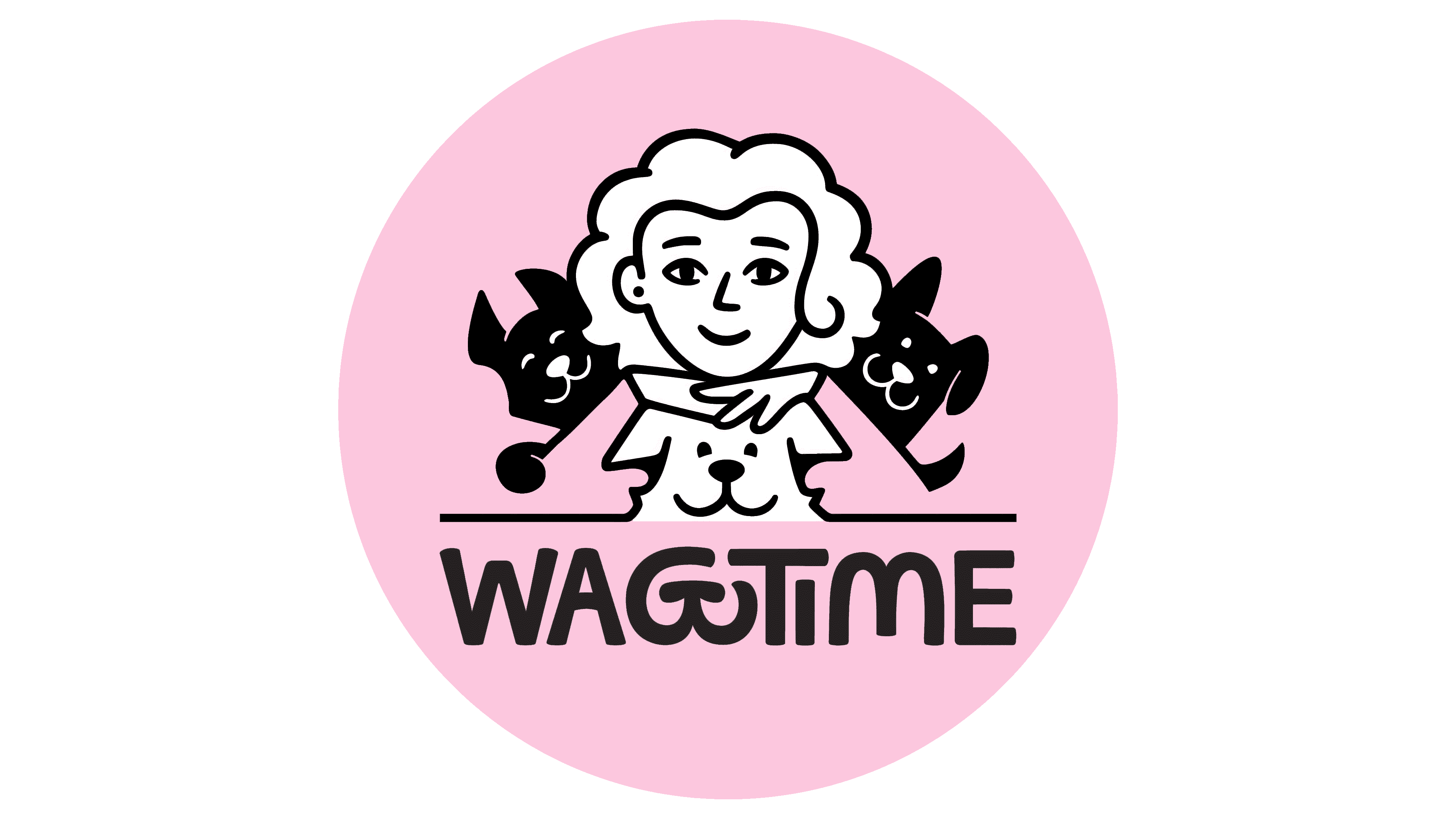
The visual system reflects the company’s playful spirit with a personal touch. The branding features illustrations of founder Anugruhita “Anu” Bardhan and her three dogs. These illustrations are framed within house-shaped outlines, echoing the cozy, home-like feel of the physical space. This element adds authenticity, showing that the pet center isn’t just a business—it’s a place rooted in real connections between people and their pets.
The communication style has a fun, educational twist. Different spaces are named with the word “time” (like playtime, naptime, and coach time), giving each area its own identity. Handwritten notes in a casual script font add a friendly, informal vibe, often sharing pet care tips or explanations about activities.
![]()
The palette is bright and lively, designed to capture the joyful energy of a kindergarten for puppies. Each section has its color scheme, creating a playful, dynamic feel while keeping everything visually connected. This colorful approach brings the brand’s nurturing, fun-loving ethos to life.
The bold typography, thoughtful details like the dog-shaped “G,” and vibrant colors create a fresh, engaging look. It reflects Wagtime’s growth and evolution, but it stays true to what the brand has always been about: joy, care, and creating a welcoming space where pets and their people feel right at home.