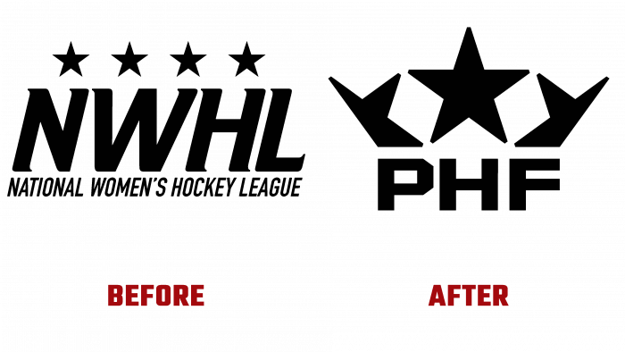
In early September 2021, the National Women’s Hockey League North America – NWHL, founded in 2015, changed its name and logo. She received professional assistance from the leading professional sports design studio Quberten (San Francisco, Moscow). The changes in external identity reflected the changes in the organization’s structure and objectives ahead of the 2021-2022 season. With its renewal, the brand opened a new era in its development. By becoming PHF – Premier Ice Hockey Federation, the organization has demonstrated its gender neutrality. The new name is a demonstration of self-determination based on professional skills rather than gender-based. The new identity communicates that all members of the association have undeniable talent, regardless of their gender.
The new name is a radical turn in the history of all sports. PHF revolutionized sports by eliminating the use of the word “women” and any gender in the name and visual markers for the first time in sports history.
While developing the new logo, the designers focused on the brand’s history, keeping the black and white shades of the color palette with stars. Productive, creative work was carried out, which ensured a unique graphic solution for logo visualization. In it, the stars form a crown, symbolizing the achievements and ambitions of all brand members. The original vision of the composition made it possible to depict the outline of the crown in such a way that it formed the shape of the letter W, which can be seen in thin intersecting lines. This sign symbolizes the ascension of the “weaker sex” to the top of sporting achievements, and not only. At the same time, the combination of two such original elements in the logo became the personification of the readiness to continue the growth and development of both the organization itself and its members. An innovative approach, creativity, and modern technologies made it possible to clearly and reflect the main philosophy of the organization – women in sports and life are not inferior to the stronger sex.
Clear geometry and laconicism have opened up great opportunities in the development of the brand’s web design. It is effectively combined in situational marketing and as an accent element of video, photos, any image. The trademark and the main harmoniously complement each other, making the composition complete and saturated with maximum information. The dynamics and interactivity of visual image elements added to the web version provides attractiveness and memorability, which is especially important for materials on the eve of seasons and in the process of passing championships.


