Known for the sophistication of its whiskey flavors, Wild Turkey 101, a Kentucky brand, has revolutionized its identity. The author’s brand of the brothers Riley – Irish winemakers was formed from two of their favorite hobbies – hunting birds and making their whiskey, the appearance of which was always greeted with delight by their hunter friends. The favorite drink on the hunt for a roasted turkey gave the name to the new production, which the brothers opened in the USA in 1869. But only 24 years later, a stunning success came to the drink, which continued until the introduction of Prohibition. The secret of success was hidden in the formula for preparing the drink, which strictly adhered to the minimum composition of the distillate based on corn, the timing, and the method of storage.
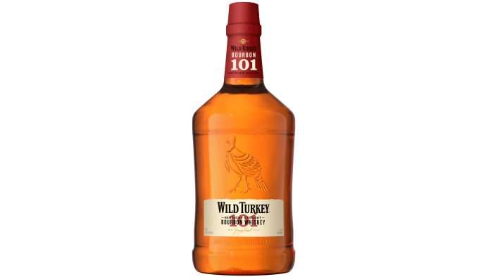
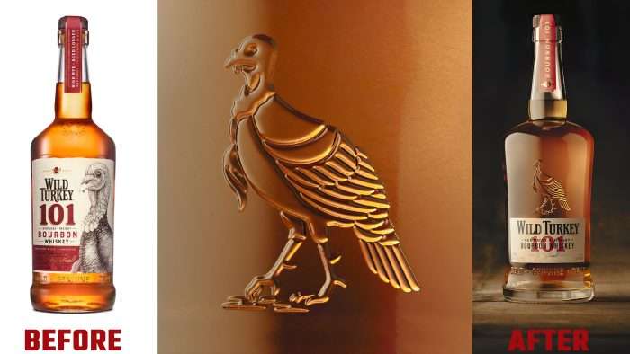
Today, the time has come for Wild Turkey to rethink many positions, including its visual identity, which was developed and updated by the Pearlfisher branding agency. More than eight years of working with the brand’s portfolio have opened up the opportunity for designers to gain a deeper understanding of the company’s prospects and potential. It was decided to start by changing the shape of the bottle, which acquired wider “shoulders,” and its shape became more reminiscent of a large bourbon glass. The sophistication of the neck, smoothly turning into “shoulders,” began to resemble the silhouette of a turkey’s neck itself, tapering downward, resembling a bird’s spur.
The label has become several times smaller, representing a quality mark to enhance the visual impact of the original Jimmy Russell’s signature. The label now carries only the Wild Turkey brand name – optimized for the current visual changes. Bold type emphasizes the name, and numbers 101, made in red, become an accent element of the logo. The numbers are superimposed on the Kentucky Straight Bourbon Whiskey lettering. The decor on the edges of the label draws attention, like the antique in the good old days. An important feature that should improve consumer attention to the product is using only natural paper for labels.
The creation of a unique video supported the new style. In addition, several virtual assets have been developed with flexibility and agility. This solution left room for additional actions, allowing the brand’s visual identity to constantly evolve and harmoniously use them to create attractive interactions with other types of brand products.


