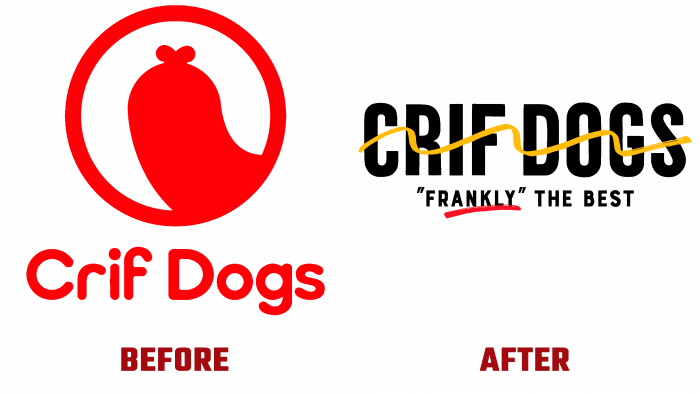
Crif Dogs celebrated its twentieth anniversary by creating a new identity, abandoning the light but not very mature humor of the past corporate identity. At the same time, the new visual form ensured the most rational use of space. With its help, the brand has acquired a spectacular and coveted appearance, so attractive to all eager to try the delicious hot dogs from Crif Dogs. The decision was taken by the company’s new manager – Jeff Bell, who recently became its full-fledged owner. To update the brand’s style and visual identity, the owner turned to the creative team at Design Bridge, who could create a lucrative look at the iconic NYC store serving the most delicious hot dogs in town.
Design Bridge has carried out a complete rebranding of the company, including the interior. That said, the changes retained a commitment to the brand’s history of its New York roots. The new visual language, skillfully woven into all corporate identity elements, also included successful photographs taken on the city’s streets. These images were so successful that they were simple and easy to remember thanks to their playfulness and skillful display of NYC’s special activities and cheerful spirit.
The original solution – the application of playful painted hot dogs in mustard yellow, sprinkled with red ketchup, creates the atmosphere of paintings made by a street artist. Each action in the images is unfinished, depicted at its beginning or moment in its current continuation. Thus, a symbolic reminder was formed that NYC is a city in the stage of constant formation, change, and future development. All elements of the logo, packaging signs and related products, website, and social media pages were focused on maintaining the effect of playfulness and fun with which employees and customers could spend their time. Some are cooking and offering. Others are waiting for readiness and tasting the delicious Crif Dogs hot dog. All of this brings the brand to life, providing an emphasis on its constant change and relevance.
The lowercase bold black sans serif font used in the logo provides the required perception of the product’s shape. The soft roundness of the letters and an ornate stripe of mustard of the corresponding color runs like a serpentine create a certain festivity of the visual atmosphere. The placement of the “FRANKLY” THE BEST slogan under the brand name, in a smaller print, is accented with a red stroke under the first word, symbolizing a trace of ketchup. In this design, the logo is very well combined with many elements, both in printed materials and digital ones.


