Scots Labor Pairty is democratic socialist and social-democratic in its political orientation. It was founded in 1994, with its headquarters located in Glasgow. In the last decades of the last century and the first years of the 21st, the party was in a leading position, receiving most of the votes in UK elections. The peak of its popularity was in 1999 when it held 56 seats in Parliament. Things have changed over time, and the party has lost a significant portion of the vote. It wants to regain today by making adjustments to its program that take into account current political trends and changes in the country and around the world. Among the steps taken for this purpose, one particularly important one was the new look at the formation of its own identity, which led to a significant change in the visualization of the brand.
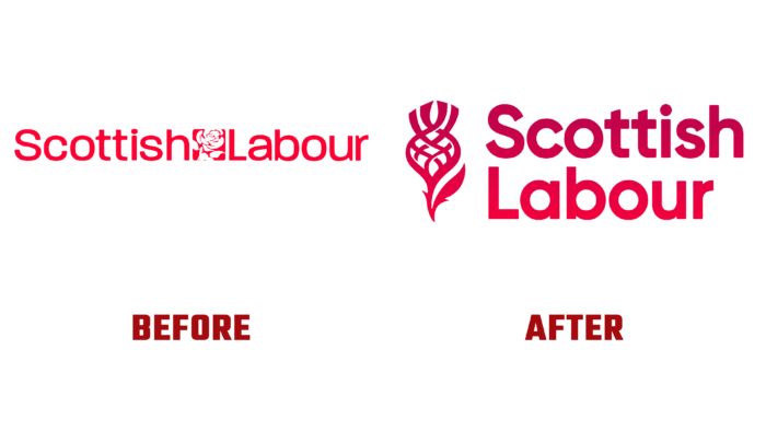
The new emblem of the party was presented in light of the main changes made to the party’s program and the reassessment of its strategic plan for further development. Particular attention was paid to the compliance of the visualization with modern trends and the specific perception of the presented information, characteristic of the new generation “Z.” While keeping its commitment to its core values and paying tribute to its history, the party left its color unchanged – bright red, which gained more saturation and clarity thanks to the use of modern technologies during the rebranding. Its choice as a party symbol was determined by the emotions it evoked. Expressive, passionate, exciting red is the most active and energetic, which evokes a feeling of warmth while increasing pressure and breathing rate. Rich in associations, expressing vitality, striving for success perfectly reflect the main ideas and the brand’s focus.
The symbolism of the party was slightly changed. Having kept the stylized image of a flower as its symbol, the brand revised its shape and visual representation. The new version with clearer graphics and more perceptible form ensured the ease of visual perception, which symbolizes the clarity and accessibility of the new program, the ease of understanding of the goals and objectives to be achieved.
The main element of the logo, the company name, has also changed, and a round sans serif font Gilroy was used to reflect it, which is simple and easy to read. The execution clarity distinguishes it in print and digital versions. Applying different combinations of contrasting red and white as filling of the background or reflection of the composition elements made it possible to design several variants of the logo. Such color variations created the desired emphasis and formed the attractiveness of the logo, which plays an important role in attracting new members.


