Founded in 2015 in Detroit, apparel company StockX has completed its rebranding. The need to change the visual identity was dictated by changes and features of the development of the brand itself and trade in modern conditions. Created as an interactive sneaker marketplace, StockX has gradually expanded its range to sell all kinds of apparel and accessories. But in a pandemic, when ground-based stores began to close everywhere, and the buyer rushed to shop using the Internet, the brand decided to cover electronic product offerings.
Visual reconstruction has touched many areas in the design of an interactive platform. These changes are an attempt to reflect the enterprise’s success, which in such a short time – already in 2000, showed an increase in attendance by 90% more than in the previous year. The sales turnover was $ 1.8 billion, and the company’s value rose to $ 3.8 billion. These many indicators of brand success needed to be reflected in the new logo and renewed image of StockX.
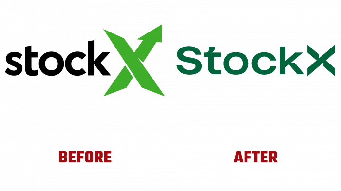
The new brand mark successfully fulfilled the task, effectively reflecting the enterprise’s main values and historical roots. At the same time, the emblem was able to strengthen the new image as an option with a future perspective, demonstrating maturity and stability. An important change was the new filing of the accent mark – the letter “X,” the size of which was somewhat reduced. The contours of the letter have gained clarity, and the arrow that was in the old version has been removed. The design of the element has acquired a visual similarity with the “%” sign. Free space on both sides of the sign allows you to “see” two arrows pointing towards the center. In this way, the company demonstrates equality between buyers and sellers, united under the protection of the brand.
The title was made in a new custom-designed font. The graphic formation of the text was based on the accent mark. When creating letters “t” and “k,” the same approach was used to form their segments in the upper segment and legs in the form of arrows. This ensures the visual unity of the logo elements with a clear perception, despite some complexity. Improves visualization and original selection of colors, which, together with images, provides attractiveness and memorability. Emerald green font combined with coral, mustard yellow, blush pink, used to fill the background, create an indescribable atmosphere of comfort with visual variety and appeal.


